13 High-Converting Tips That Fix SaaS Landing Pages

Is your SaaS landing page turning ad clicks into customers? Or is it quietly burning through your budget?
Most SaaS landing pages fail at the one job they have. The numbers tell the story - the average landing page converts just 2.35% of visitors. That means almost everyone who clicks your ads leaves without taking action.
I've fixed dozens of SaaS landing pages since 2023, and here's what I've learned: small, targeted changes often lead to the biggest wins. One client quadrupled their conversion rate in two weeks using what I'm about to share.
In this guide, I'll show you 13 proven ways to fix your SaaS landing pages. Here's what you'll discover:
- The visual continuity secret that keeps visitors from hitting the back button
- How to craft headlines that instantly communicate value instead of confusion
- The counterintuitive approach to product visuals that builds trust faster
- A simple form technique that can double your signup rate overnight
- The psychological trigger that turns hesitant visitors into eager trial users
Now let's dive into the first solution that can immediately boost your conversion rates...
Want to get all your marketing and funnel work done—without the headaches of hiring a team? Download our free guide: 33 Marketing Projects You Can Delegate to Growbo and discover how to save 100+ hours a month, grow faster, and scale without the overhead.
High-Converting Tip #1: Match Your Ad and Landing Page for Higher SaaS Conversion Rates
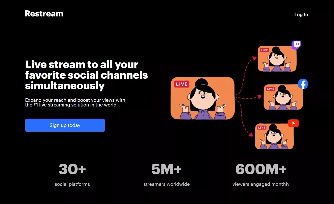
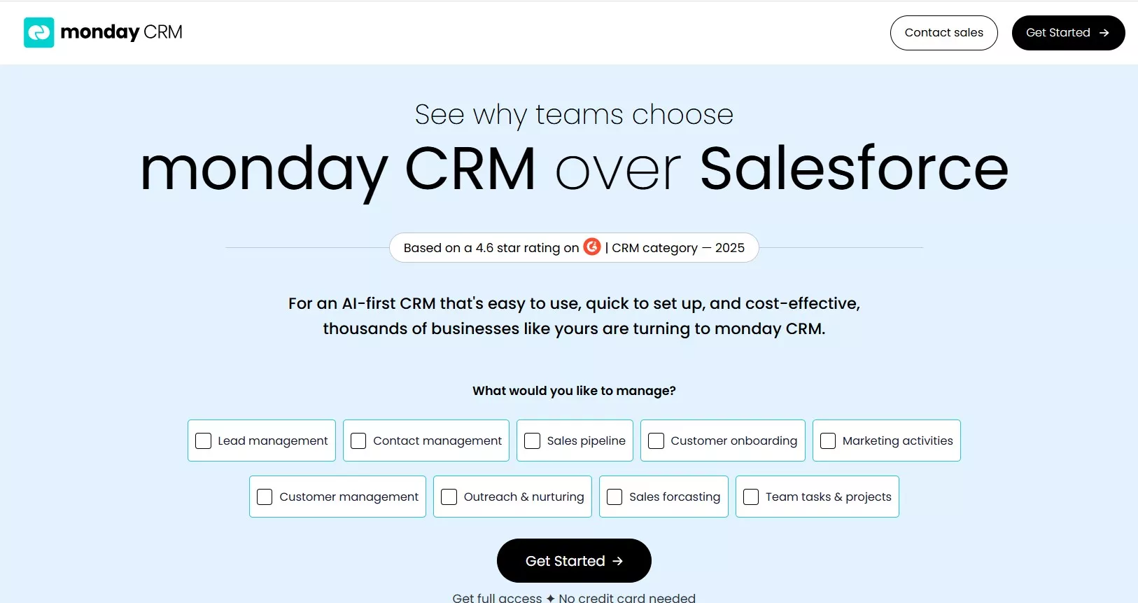
Optimize SaaS landing page ads by making sure the first thing visitors see matches the ad they clicked. Consistency in visuals, messaging, and tone between your ad and landing page builds trust instantly. For example, Zapier uses the same headline and color scheme from its Google Ads on its trial landing page, creating a seamless user journey. When there’s a disconnect, visitors hesitate or leave, costing you valuable leads.
Many SaaS teams overlook this alignment. They use generic landing pages or change headlines and colors, thinking it won’t matter. In reality, even subtle mismatches can drop your conversion rate. According to statistics, the average landing page conversion rate across all industries stands at 6.6%. Matching your ad and page can help you beat this benchmark.
Your landing page should feel like a seamless extension of the ad. This means using the same headline, colors, and core offer. When prospects see what they expect, they’re more likely to take action. This approach is especially important for SaaS, where trust and clarity drive sign-ups.
Quick Implementation Guide
- Use the same headline or call to action from your ad on the landing page.
- Match colors and main images between your ad and page.
- Check that your logo, offer, and tone are identical.
- Test the experience by clicking your own ad and comparing both screens.
Key Insights
- Brand and message alignment between your ad and landing page is essential for trust and higher conversions.
- Small changes in headline or color can make a measurable difference.
- Tailoring landing pages to each ad group can double your conversion rate.
Is your landing page a perfect match for your ad? Click through your own ads and spot-check for inconsistencies.
High-Converting Tip #2: Craft Headlines That Instantly Communicate Value
Start with a headline that clearly tells visitors what they get. In SaaS, clarity beats cleverness every time. A headline like "Automate Your Invoicing in Minutes" is far more effective than a vague slogan. If your headline doesn't answer "What's in it for me?" in five seconds, you're losing sign-ups.
Research shows that landing pages with a strong, benefit-driven headline outperform those with generic or confusing messages. According to 99firms, first five seconds of loading time have the most significant impact on conversion, with rates dwindling by 4.42%, so your message must be clear and fast.
Test your headline with someone unfamiliar with your product. If they can't explain what you do, rewrite it for clarity.
Quick Implementation Guide
- Write your headline in one short sentence.
- Ask a non-expert to read it and describe your offer.
- If they hesitate or guess, rewrite for clarity and benefit.
Key Insights
- Clear, benefit-focused headlines drive higher conversions.
- Testing with outsiders reveals confusing language.
- Specificity always wins over cleverness in SaaS headlines.
How would a stranger describe your product after reading your headline?
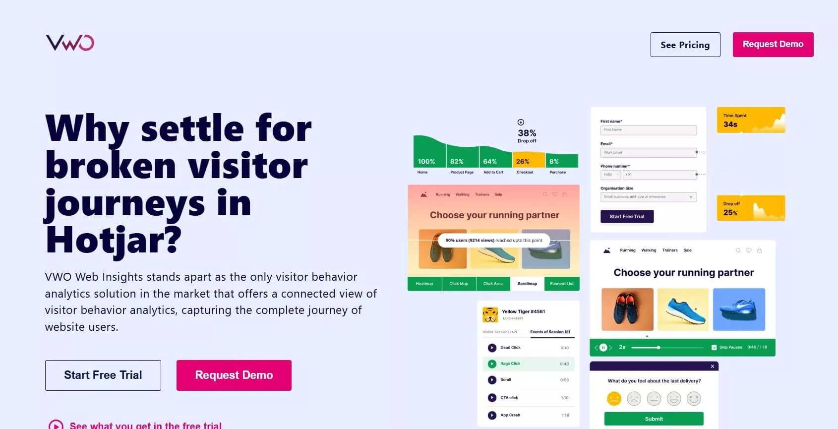
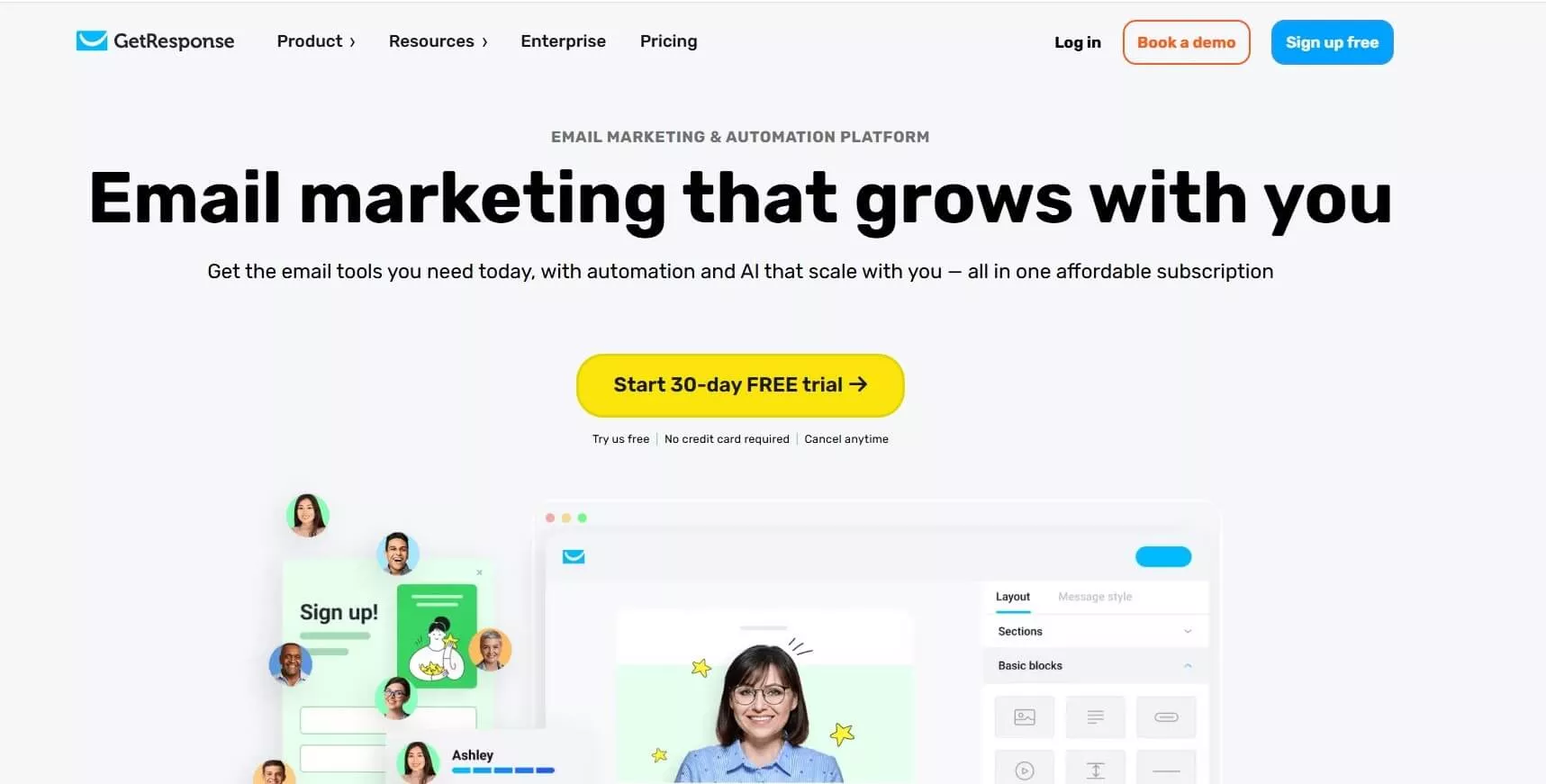
High-Converting Tip #3: Use Product Visuals to Build Trust and Speed Up Decisions
People process images much faster than text. A real screenshot or video of your product doing its job helps visitors quickly "get it". Authentic visuals build trust and lower anxiety about what they're signing up for.
Stock photos of smiling people don't work for SaaS. Visitors want to see the actual interface, dashboard, or workflow. According to a study by EyeView, including video on a landing page can increase conversions by up to 80%.
Try A/B testing a static screenshot versus a 10-second demo video. Let the data show what your audience prefers.
Quick Implementation Guide: Visual Selection
- Choose a screenshot or record a short product demo.
- Place it above the fold, near your headline or CTA.
- Test static versus video to see which gets more engagement.
Key Insights
- Real visuals speed up understanding and increase trust.
- Video can dramatically improve conversion rates.
- Always test which visual format your audience prefers.
What visual best shows your product's value? Try a side-by-side test this week.
High-Converting Tip #4: Leverage Customer Reviews With Photos for Instant Credibility
Optimize SaaS landing page ads by adding real customer testimonials, complete with names and photos. Social proof is critical in SaaS, where buyers want to know others have succeeded with your solution. Reviews with specifics—like "We doubled productivity in 30 days"—are far more convincing than generic praise.

Trust increases when testimonials include a real name, company, and photo. According to KlientBoost, social proof is rooted in behavioral psychology, and it’s been scientifically proven to increase landing page conversion rates.
Place testimonials close to your sign-up form or CTA. This reassures prospects right when they're deciding.
Quick Implementation Guide
- Collect 2-3 short reviews from happy customers with permission to use their name and company.
- Add real names, company, and a headshot for each.
- Feature testimonials near your CTA or form.
Key Insights
- Customer photos and specifics make reviews credible.
- Social proof works best near your conversion point.
- Update testimonials regularly for freshness.
Which customer story could you feature on your landing page today?
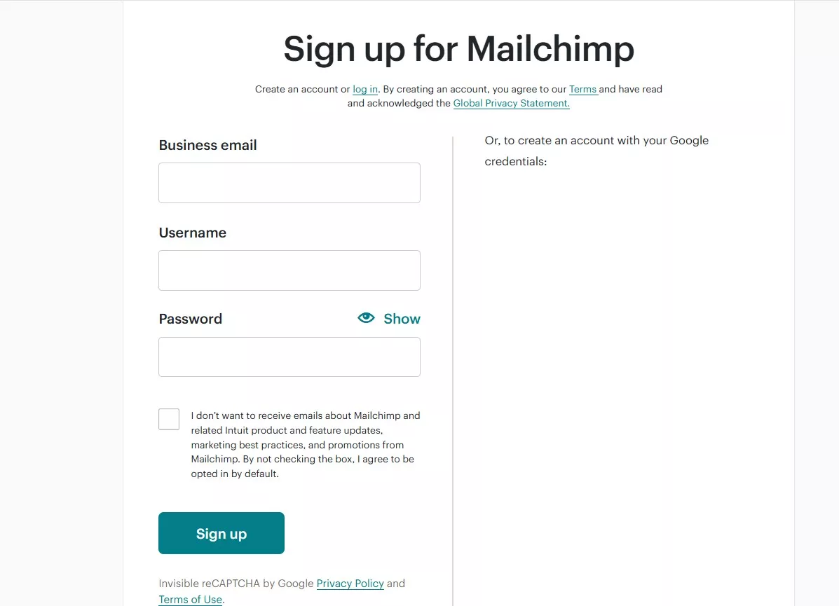
High-Converting Tip #5: Shorten Your Sign-Up Form to Remove Friction and Boost Conversions
Shorten your SaaS landing page sign-up forms to boost ad performance and conversions. Every extra field increases drop-off. In SaaS, asking only for an email (and maybe a first name) is usually enough to get started. You can collect more details later in your onboarding flow.
Long forms feel like work and can scare off trial users. Short forms lower the barrier to entry and increase your chances of capturing leads.
Review your current form and cut any non-essential fields.
According to industry data, reducing form fields from four to three has been shown to increase conversion rates by almost 50% in some cases.
Quick Implementation Guide
- List every field in your current form.
- Ask: Is this required to start a trial?
- Remove anything non-essential. Test the short version for two weeks.
Key Insights
- Shorter forms mean more sign-ups with less friction.
- Only collect what you absolutely need up front.
- Test and measure changes to see what works best for your audience.
What could you remove from your current sign-up form to make it even easier?
High-Converting Tip #6: Design CTA Buttons That Drive Action and Set Expectations
Make your SaaS landing page CTA button highly visible and explicitly communicate what users can expect after clicking. In SaaS, the CTA is where visitors decide to engage or leave. A button that stands out visually and uses direct, benefit-driven language consistently outperforms generic options. For example, “Start Free Trial” or “Get My Demo” works better than “Submit.”
Color, size, and placement all matter. The key is contrast: make your button pop against the rest of the page.
Test different CTA texts and colors to see what resonates with your audience. A statistic by WiserNotify shows that using a specific, clear CTA can increase conversion rates by 161%.
Quick Implementation Guide
- Choose a button color that contrasts with your background.
- Use specific, benefit-focused text (e.g., “Start Free Trial”).
- Place the button above the fold and near your form or headline.
- Run A/B tests on both color and copy for two weeks.
Key Insights
- High-contrast, specific CTA buttons drive more clicks.
- Action-oriented language sets clear expectations.
- Test color and copy to maximize results.
What CTA text would make you want to click right now?
High-Converting Tip #7: Showcase Your Effortless Onboarding Process in Three Steps
Show new users how simple it is to get started with your SaaS product on your landing page ads. Many prospects worry that SaaS tools are complicated or time-consuming. Overcome this by breaking down your onboarding into three simple, visual steps right on your landing page. This approach removes friction and helps users picture their own success.
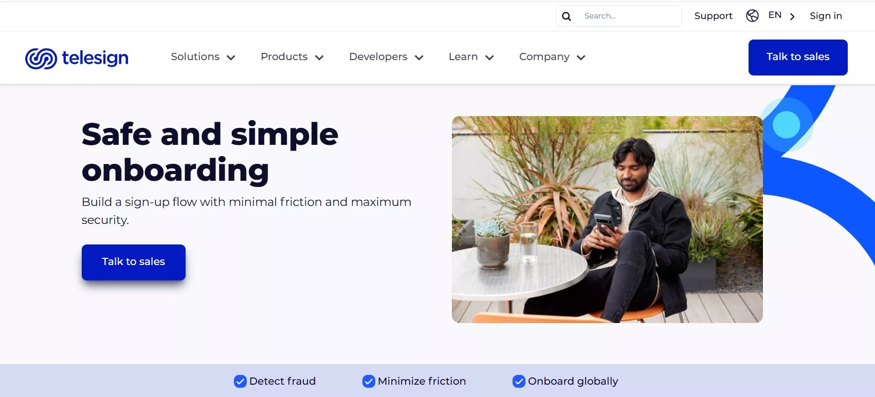
Use icons or short text to walk visitors through the process. For example: “1. Sign Up. 2. Connect Your Data. 3. See Results.”
Position your step-by-step process near your form or CTA so it’s impossible to miss.
Step-by-Step
- Step 1: Sign up with your email (takes less than 1 minute).
- Step 2: Connect your account or import your data (guided, no tech skills needed).
- Step 3: Start using your core features and get instant value.
Key Insights
- Three-step onboarding visuals lower anxiety and boost sign-ups.
- Position your process near the form for maximum visibility.
- Keep each step short and benefit-focused.
Would your onboarding process fit on a sticky note? Try simplifying it today.
High-Converting Tip #8: Address Common Questions Directly With a Smart FAQ
Address your visitors' main concerns directly on your SaaS landing page. Objections about price, security, or cancellation can stop conversions cold. A concise, well-placed FAQ section tackles these concerns before they derail a sign-up.
Gather the top 3-5 questions your sales or support team hears most. Answer each in one or two sentences, using plain language. This shows transparency and builds confidence.
Place your FAQ below the form or near your CTA for easy access. Update it regularly as new questions arise.
Quick Implementation Guide
- Ask your team for the three most common pre-signup questions.
- Write clear, honest answers with no jargon.
- Display the FAQ section prominently, ideally below your sign-up form.
Key Insights
- Addressing objections up front keeps prospects moving toward sign-up.
- FAQs reduce support load and increase trust.
- Keep answers short, specific, and visible.
What is the most common objection you hear before a signup? Make it your first FAQ.
High-Converting Tip #9: Remove Signup Risk With a Clear Guarantee or Free Trial
Optimize SaaS landing page ads by removing risk for new users with a visible money-back guarantee or no-strings free trial. SaaS buyers are hesitant to commit without proof that your product delivers. A clear, upfront offer lowers anxiety and boosts signups. If your guarantee is hidden or full of conditions, prospects will hesitate and look for alternatives.
Highlight your risk-free offer near your CTA. Use simple language: "Try free for 14 days. No credit card required." .
Make your offer visual with a badge or colored box. Set expectations about what happens after the trial ends to avoid surprises.
Quick Implementation Guide
- Decide on your guarantee (money-back or free trial).
- Write a one-sentence, plain-language promise.
- Display it near your form and CTA, using a badge or bold text.
- Clarify next steps after the trial or guarantee period ends.
Key Insights
- Visible guarantees remove signup anxiety and increase conversions.
- Keep the offer simple and place it close to your main CTA.
- Transparency about post-trial steps prevents churn and support issues.
What guarantee or trial offer would make you say yes today?
High-Converting Tip #10: Optimize for Mobile to Capture Every Click
Make sure your SaaS landing page displays perfectly and functions smoothly on mobile devices. Over half of all SaaS ad clicks come from smartphones. If your landing page is hard to navigate on a phone, you’ll lose potential signups instantly. Responsive design, fast load times, and big, easy-to-tap buttons are must-haves.
According to 99firms, mobile-optimized landing pages convert at 11.7%, compared to 10.7% for non-responsive pages. Test your landing page on multiple devices and prioritize fixes that remove friction for mobile users.
Make sure forms are short, text is readable, and buttons are thumb-friendly. Page speed is critical—each extra second of load time costs you conversions.
Quick Implementation Guide
- Open your landing page on several phones and tablets.
- Check that forms and buttons are easy to use with one hand.
- Use tools like Google PageSpeed Insights to test load time and fix slowdowns.
- Shorten copy and remove any elements that require horizontal scrolling.
Key Insights
- Mobile-optimized pages capture more leads from ad traffic.
- Fast load times and simple forms are crucial for mobile success.
- Regular testing on real devices uncovers hidden conversion barriers.
How does your landing page look on your phone right now? Pull it up and see for yourself.
High-Converting Tip #11: Eliminate Distractions to Keep Visitors Focused on Signup
Optimize SaaS landing page ads by stripping away navigation menus, extra links, and anything that pulls attention away from your main call to action. Every extra link is an exit ramp for your visitor. SaaS landing pages that focus on one action, like starting a trial, consistently outperform those with multiple choices.
Audit your landing page for distractions. Remove top navigation, footers, and sidebar links. Keep only what’s necessary for signup. Use white space to draw attention to your form and CTA.
According to conversion experts, reducing distractions by through mproved page design yields 201% increase in conversion rates.
Quick Implementation Guide
- List every clickable link on your landing page.
- Remove or hide anything not essential for signup.
- Increase white space around your form and CTA.
- Test your page by asking: Is there only one clear action to take?
Key Insights
- Every extra link lowers your conversion rate.
- Minimalist design keeps visitors focused on your goal.
- One clear action per page is best for SaaS ad campaigns.
What could you remove from your page to keep visitors focused on signing up?
High-Converting Tip #12: Prove Value Instantly With Data and Visuals
Display real data and results that prove your SaaS product's value on your landing page. Prospects want proof, not promises. Numbers make benefits tangible and help visitors quickly understand what they can achieve. For SaaS, showing "Saved 5 hours a week for 80% of users" is far more compelling than saying "Saves time."
Use before-and-after charts, percentages, or concise case study stats. Visuals like bar charts or infographics make your data easy to scan and remember.
Survey your users for concrete outcomes, then display these results near your CTA or signup form. This approach builds credibility and sets you apart from competitors who rely on vague statements.
Do This / Not That Comparison Table
- Do This: Show "Reduced churn by 27% in 3 months"/Not That: Say "Improves retention"
- Do This: Use a simple bar chart with real user data/Not That: List generic benefits with no proof
Key Insights
- Concrete data builds trust and drives action.
- Visuals make results easy to understand at a glance.
- Specific numbers outperform broad claims in SaaS.
What metric would best showcase your product's impact? Add it to your landing page today.
High-Converting Tip #13: Create Genuine Urgency To Motivate Action
Give visitors compelling reasons to take immediate action on your SaaS landing page. Genuine urgency—like a limited-time offer or a true deadline—encourages prospects to sign up rather than delay. Fake urgency, such as timers that reset or false scarcity, damages trust and hurts conversions long-term.
Use urgency sparingly and honestly. For example, "Get 20% off your first month—expires Friday" or "Only 10 spots left for our onboarding webinar." Make sure your urgency is tied to an actual event or limit. According to a study by HubSpot, 47% of buyers will not make a purchase unless they feel a sense of urgency.
Place urgency elements near your CTA, and always follow through on your promises. If the offer ends, update your page so visitors know you mean it.
Quick Implementation Guide
- Decide on a real, time-limited offer or cap (discount, bonus, or limited seats).
- Write a clear, honest statement about the deadline or limit.
- Display this message near your CTA and update it when the offer ends.
Key Insights
- Genuine urgency motivates action without harming your reputation.
- Always tie urgency to a real event or limit.
- Update urgency messages promptly to keep credibility high.
What urgency message can you add to your landing page that is honest and compelling?
Ready to put these insights into action? Here are 9 additional quick fixes you can implement right now to boost your conversions.
Want to get all your marketing and funnel work done—without the headaches of hiring a team? Download our free guide: 33 Marketing Projects You Can Delegate to Growbo and discover how to save 100+ hours a month, grow faster, and scale without the overhead.
Conclusion
Let's be honest - most SaaS landing pages aren't working as hard as they should. I've seen companies spend thousands on ads only to send traffic to pages that leak conversions.
The good news? You don't need a complete redesign. The strategies in this guide are things you can start implementing today.
Here's what you should focus on first:
- Make your landing page match the ad people clicked (same colors, headlines, and promises)
- Cut your form down to just email and maybe name
- Add real customer photos and specific results near your signup button
- Show actual screenshots of your product instead of stock photos
- Remove navigation links that distract from your main goal
Not sure where to start? Our team at Growbo can help you identify which landing page elements need immediate attention. Book a free 15-minute consultation today and we'll review your current landing page together.
Try Growbo today! For just $7, try our full marketing team for 7 days and get expert help implementing these exact strategies. This gives you unlimited marketing requests - not just for landing pages, but for any marketing task you need.
Which landing page tactic are you most excited to implement? Let us know in the comments!
Keep Growin', Stay Focused,

Image Credits:
1. https://www.hootsuite.com/lp/plans?gad_source=1&gad_campaignid=1719549579&gbraid=0AAAAADmTdtXg-5hyB9RaCj16wlOJenZgP&gclid=Cj0KCQjw64jDBhDXARIsABkk8J785p-nswZjn1GlKbuq4FJBfnUc_ZHGqCy4QH361P1Yz8jQrhfa8k0aApLWEALw_wcB
2. https://www.logopony.com/#:~:text=Logopony%20is%20a%20new%20kind,of%20them%20play%20nicely%20together.
3. https://restream.io/lp/get-started?utm_campaignid=13352733519&utm_adgroup=&utm_adgroupid=123468672175&utm_device=c&utm_adposition=&utm_source=google&utm_medium=cpc&utm_campaign=Search_Brand_Core_Generic_APAC_Desk_v1_R&utm_content=525351958764&utm_term=restream&hsa_acc=6098119570&hsa_cam=13352733519&hsa_grp=123468672175&hsa_ad=525351958764&hsa_src=g&hsa_tgt=kwd-344170068867&hsa_kw=restream&hsa_mt=p&hsa_net=adwords&hsa_ver=3&gad_source=1&gad_campaignid=13352733519&gbraid=0AAAAADNgEK8UPqIrC75DWHuu6p7UYsIqo&gclid=Cj0KCQjw64jDBhDXARIsABkk8J4AXVcTqyBXd4aVQJj45hwQmdrwI6oNNjgz8Nrwc8nYjNpAdVAJdUAaAk6jEALw_wcB
4. https://www.atlassian.com/software/jira/service-management?campaign=20339374942&adgroup=152515848844&targetid=kwd-299942559523&matchtype=b&network=g&device=c&device_model=&creative=696443548925&keyword=help%20desk%20software%20saas&placement=&target=&ds_eid=700000001721198&ds_e1=GOOGLE&gad_source=1&gad_campaignid=20339374942&gbraid=0AAAAADAVAKeeiUIK15Ve4jvuOPgW7J36w&gclid=Cj0KCQjw64jDBhDXARIsABkk8J6UGeLLX7Jo1NViGTSSJHDg_0tKl-YOp6-cEI3Wy4a3fZ_QqmctxmYaAmi_EALw_wcB
5. https://login.mailchimp.com/signup/?plan=standard_monthly_plan_v0&discount_id=6846eb900ced8&locale=en&subscribers=500
6. https://vwo.com/campaign/vwo-vs-hotjar/?utm_source=google&utm_medium=paid&utm_campaign=apac-rest_webinsights_search_gold_bof_hotjar_brand&utm_content=750845029907&utm_term=hotjar&mobile=&network=g&device=c&gad_source=1&gad_campaignid=22518522843&gbraid=0AAAAADGBh2i9eSKPkuAY-8hZwP8Didrur&gclid=Cj0KCQjw64jDBhDXARIsABkk8J4c2O42_Pr53eeKG19Zoes8itA_JWtu-GNbwJE3JJj2gQAu2WqyeeYaAve6EALw_wcB
7. https://www.telesign.com/solutions/onboarding?utm_source=google&utm_medium=cpc&utm_campaign=Digital+Identity+-+APAC&utm_term=saas%20onboarding&utm_content=Onboarding+-+APAC&_bt=706009477406&_bk=saas%20onboarding&_bm=p&_bn=g&_bg=164933787116&gad_source=1&gad_campaignid=12263933229&gbraid=0AAAAADC-MxDhJef-MvgUuJLNj9IKONtp1&gclid=Cj0KCQjw64jDBhDXARIsABkk8J6QNIHpoU_mK9DHj2DrhRlQzSD9_v4BVNLiicy8rGI4Lg6_dOIIwuoaAujPEALw_wcB
8. https://monday.com/ap/crm/comp-salesforce?cq_src=google_ads&cq_cmp=21157638371&cq_term=salesforce&cq_plac=&cq_net=g&cq_plt=gp&utm_medium=cpc&utm_source=adwordssearch&utm_campaign=ww2-en-prm-crm-search-comp_crm_salesforce-h-desktop-core-aw&utm_keyword=salesforce&utm_match_type=e&cluster=crm&subcluster=&ati=salesforce&utm_adgroup=salesforce&utm_banner=731499846921&gad_source=1&gad_campaignid=21157638371&gbraid=0AAAAADeiQJtYEVbQh11Re6x1aqrcJlbCc&gclid=Cj0KCQjw64jDBhDXARIsABkk8J4JDOiBqUZiJetc6y4TYLpi_8LF7CeKg5YoU4txaY5g3096ij_M7t4aApOREALw_wcB
9. https://mailchimp.com/landers/email-marketing-platform/?ds_c=DEPT_AOC_Google_Search_ROW_EN_Brand_Acquire_Omega_Manual-50off_T3&ds_kids=p81005570465&ds_a_lid=kwd-2285511033&ds_cid=71700000120288580&ds_agid=58700008803527148&gad_source=1&gad_campaignid=21865450997&gbraid=0AAAAADh1Fp1mvlWNjK9w8_NYOFK2zIDZr&gclid=Cj0KCQjw64jDBhDXARIsABkk8J6ZAyEVYdfzbw02wCi-9WMNcGXvKRQ18HdwFVm2zf4X3vpodeiTtcoaAhISEALw_wcB&gclsrc=aw.ds
10. https://clevertap.com/ppc/customer_engagement/?utm_medium=ppc&utm_source=google&utm_term=customer%20retention%20management%20software&utm_campaign=APAC_EN_Generic_Engagement-Search_LG&hsa_acc=6435276240&hsa_cam=18652083594&hsa_grp=161540069517&hsa_ad=729994665982&hsa_src=g&hsa_tgt=kwd-298297592810&hsa_kw=customer%20retention%20management%20software&hsa_mt=p&hsa_net=adwords&hsa_ver=3&gad_source=1&gad_campaignid=18652083594&gbraid=0AAAAADmxwRxxlCML0w6bGj5y6EJgAzivl&gclid=Cj0KCQjw64jDBhDXARIsABkk8J7rvldu4aJ1TFRpsUbds_lPdz_1NW73On0ImjhKNhFOwEoLchI3k7oaAjVtEALw_wcB
11. https://www.getresponse.com/?camp=ROW5_EN_Search_Brand&kw=Getresponse&type=e&crtn=Brand_Core&utm_source=google&utm_medium=cpc&utm_term=getresponse&utm_campaign=ROW5_EN_Search_Brand&hsa_acc=1471644613&hsa_cam=18937274530&hsa_grp=141410333457&hsa_ad=654168201253&hsa_src=g&hsa_tgt=kwd-31563162&hsa_kw=getresponse&hsa_mt=e&hsa_net=adwords&hsa_ver=3&gad_source=1&gad_campaignid=18937274530&gbraid=0AAAAAo8vvTZcYkw7mJ3ZhPY102WFwokPg&gclid=Cj0KCQjw64jDBhDXARIsABkk8J7haSYl-4W8VGJy4J8Z2ce3RkI4M5rAhJU_0kDy4VR_APqWBaqEkEsaAn3TEALw_wcB