
9 Mobile Design Fixes That Boost Revenue Fast

Is your mobile e-commerce store letting you down when it comes to sales and email signups?
You're not alone. Most online stores look decent on phones but fail to turn mobile visitors into buyers or subscribers.
The hard truth? 53% of mobile shoppers leave sites that take longer than 3 seconds to load. Yet the average mobile store takes over 15 seconds to become fully usable.
That gap is costing you money right now.
I've helped hundreds of store owners fix their mobile experience, and I keep seeing the same issues. Buttons placed where thumbs can't reach them. Product images that load at a snail's pace. Checkout processes with way too many steps.
These aren't just annoying for your customers – they're killing your conversion rates and stopping people from joining your email list.
The good news? You can fix these problems faster than you think. And when you do, the results can be amazing.
With the fall shopping season just around the corner, now is the perfect time to optimize your mobile store. In this article, I'll show you exactly how to do it.
Here's what you'll discover:
- The secret "thumb zone" technique that makes your buttons impossible to miss
- A 3-step image system that keeps shoppers engaged without slowing down your site
- The counterintuitive checkout method that captures more emails by asking for less
- How to turn failed searches into golden subscriber opportunities
- The tiny interaction tricks that create emotional connections with shoppers
- The personalization system that turns browsers into buyers
- The speed optimization hack that works even on slow connections
- The mobile-first email capture strategy that doubles subscription rates
- The social proof method that builds trust in seconds
Let's start with the most basic but often overlooked aspect of mobile design: making your buttons easy to tap...
Want to get all your marketing and funnel work done—without the headaches of hiring a team? Download our free guide: 33 Marketing Projects You Can Delegate to Growbo and discover how to save 100+ hours a month, grow faster, and scale without the overhead.
Mobile Design Fix #1: Make Buttons Easy to Tap with Thumbs
When mobile users can't easily tap your buttons, they leave your site. It's that simple. According to Baymard Institute, 63% of mobile users abandoned a product or site at least once during testing solely due to preventable mobile usability issues.
Phones are bigger now (over 6.8 inches on average), so where people can comfortably reach has changed. Buttons in the lower middle and bottom corners of the screen get more taps than buttons that are hard to reach.
Online stores with thumb-friendly button placement see better sales compared to stores that don't optimize for thumbs.
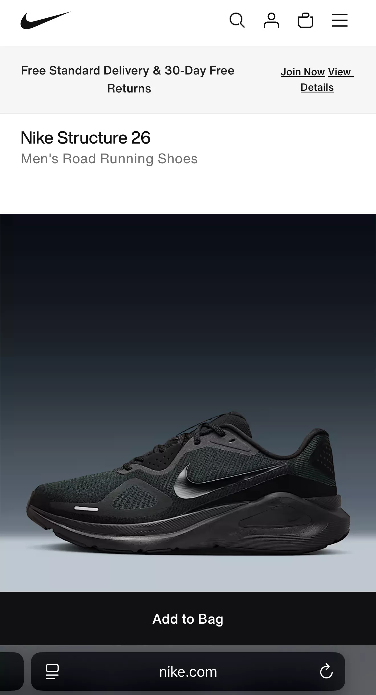
Most designers only think about buying buttons, but your email signup button needs to be thumb-friendly too. If it's stuck in a corner where people can't easily tap it, you're losing potential customers every day.
The bottom line: Put your most important buttons where thumbs naturally go, and you'll see more sales and email signups.
The Thumb-Friendly Button Placement System
1. Map Your Critical Conversion Points
- Identify your three most important buttons (typically "Add to Cart," "Checkout," and "Email Signup")
- Track current tap rates for each button using analytics
- Note their current positions on your mobile layout
- Measure completion rates for actions starting with these buttons
2. Implement the 75% Rule
- Place primary buttons within the bottom 75% of the screen
- Position email capture forms no higher than 75% up from screen bottom
- Ensure buttons are at least 44×44 pixels (minimum size for reliable tapping)
- Add 12-16 pixels of padding between tappable elements
- Test button placement with actual users on different phone sizes
3. Create Adaptive Button Positioning
- Implement buttons that move to thumb-friendly zones as users scroll
- Use "sticky" add-to-cart buttons that follow users down product pages
- Create email signup forms that slide in from bottom corners
- Design hamburger menus that open from bottom rather than top
- Test each implementation with session recordings
Key Insights
- Thumb-friendly button placement can increase mobile conversion rates while simultaneously boosting email signup completions.
- The optimal placement for critical buttons has shifted downward as phone screens have grown larger—what worked in 2022 likely needs adjustment in 2025.
- Focus your optimization efforts on the three most important buttons in your mobile conversion path rather than trying to optimize everything at once.
Now that you've optimized your buttons for easy tapping, let's look at how product images can make or break your mobile shopping experience.
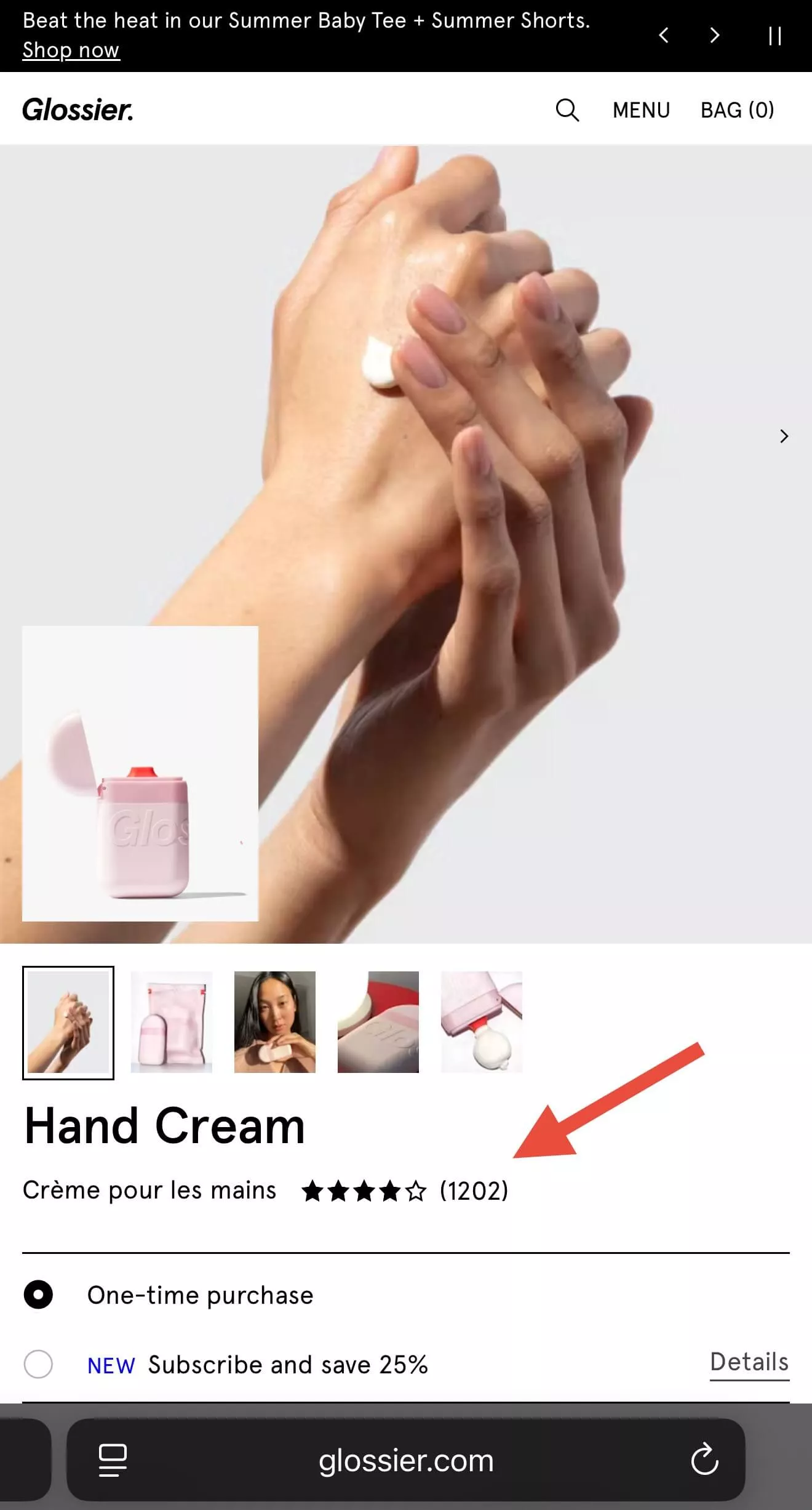
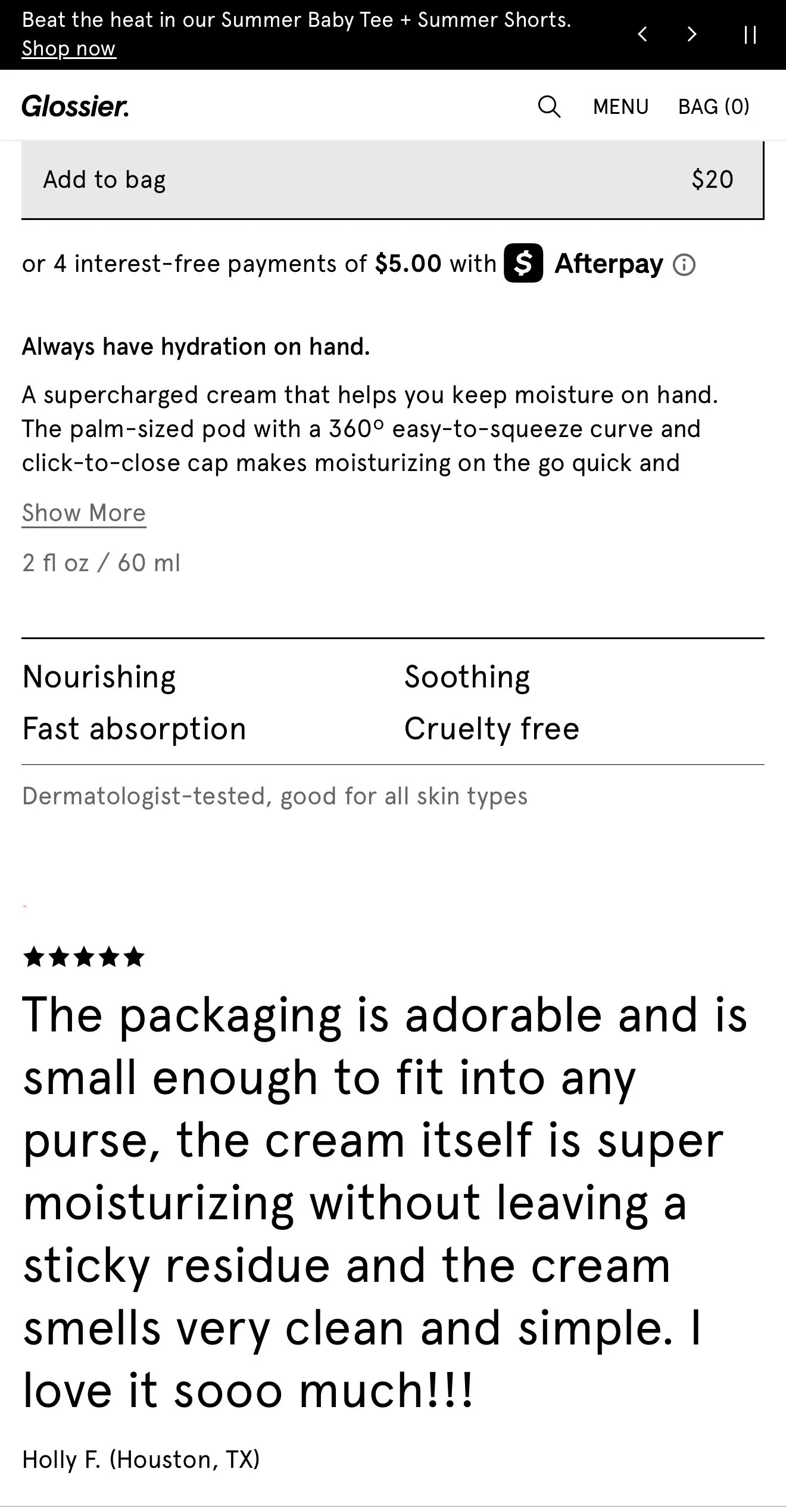
Mobile Design Fix #2: Make Product Pictures Better
When mobile shoppers can't clearly see your products, they leave. A survey by Shopify revealed that larger and better-quality images can increase conversion rates by as much as 30%.
Your product photos aren't just decoration—they're what actually sell your items. Stores with swipeable photo galleries that let customers see multiple angles sell more than stores with just one photo.

Here's the tricky part: slow-loading images make people leave, but low-quality images make people not trust your products. You need to find the sweet spot between fast loading and clear, detailed photos.
Don't just shrink all your images to make them load faster. Instead, use good compression tools that keep images looking sharp while loading quickly. Test your site on your phone to make sure photos load fast and look good.
Remember: On mobile, your photos do the selling. Make them count.
The 3-Point Product Image Optimization Method
1. Optimize Image Technical Specifications
- Use WebP format instead of JPEG or PNG (30-40% smaller file size with same quality)
- Keep total image weight under 200KB per product image
- Set dimensions to 1.5x the display size to account for high-resolution screens
- Implement lazy loading for all but the first product image • Use content delivery networks (CDNs) to serve images from servers close to users
2. Enhance Visual Presentation
- Show products from multiple angles (minimum 3-5 views per product)
- Include at least one lifestyle image showing the product in use • Use consistent lighting and backgrounds across all product images
- Add zoom functionality that works with pinch gestures
- Include size reference images for products where scale matters
3. Create Lead-Generating Image Features
- Add "Get more photos by email" buttons beneath primary images
- Offer style guides or lookbooks in exchange for email addresses
- Create "notify when back in stock" options for out-of-stock items
- Implement AR try-on features that require email registration
- Add video demos that require email opt-in to view full length
Key Insights
- High-quality, fast-loading product images can increase mobile conversion rates by up to 40% while simultaneously creating opportunities for email capture.
- The ideal mobile product image in 2025 loads in under 1.5 seconds, offers multiple angles, and includes interactive elements that add value while capturing leads.
- Focus your image optimization efforts on your top 20% best-selling products first, as these will deliver the highest return on your time investment.
With your product images now optimized for mobile, let's examine how to create a checkout process that converts mobile browsers into buyers.
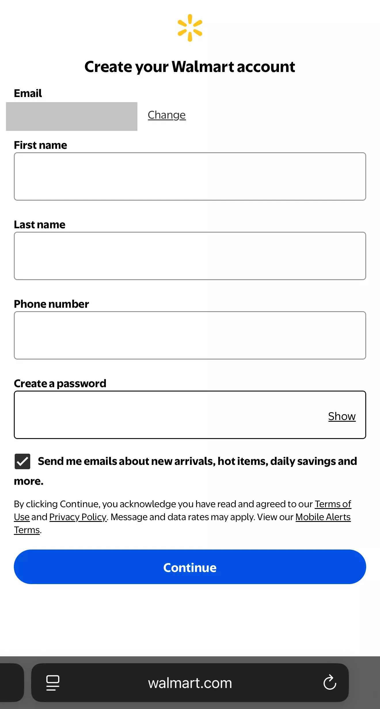
Mobile Design Fix #3: Make Checkout Simple
As stated by Asee, mobile shoppers abandon their carts 85% of the time, compared to 73% on computers. The main reason? Checkout is too complicated.
Mobile users expect to buy something in under 45 seconds once they decide to purchase. Every extra step you add increases the chance they'll quit. Every form field you make them fill out reduces sales.
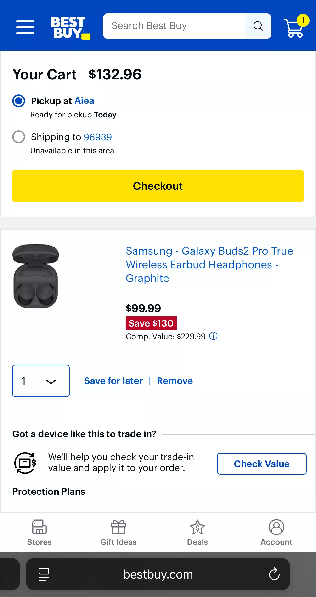
Many stores force people to create accounts before buying. This kills sales. People just want to buy quickly, not fill out forms.
Let people buy first, then ask for their info later. Get the sale, then worry about getting their email or creating their account.
Keep It Simple
- Minimize steps
- Reduce form fields
- Don't force account creation
- Let people checkout as guests
The easier your checkout, the more people will actually buy instead of giving up.
Mobile Checkout Optimization Process
Step 1: Audit Your Current Checkout Flow
- Time how long it takes to complete a purchase on your mobile site
- Count the number of taps required from product page to purchase confirmation
- Identify which form fields are absolutely necessary vs. nice-to-have
- Test on at least three different mobile devices and connection speeds
- Record abandonment points using analytics tools
Step 2: Implement Guest Checkout Options
- Make guest checkout the default option, not an alternative
- Move account creation to after purchase completion
- Require only email and payment information initially
- Offer incentives for post-purchase account creation
- Implement single-field email capture before abandonment
Step 3: Add Digital Wallet Integration
- Integrate Apple Pay and Google Pay as primary options
- Add PayPal One-Touch for cross-device shoppers
- Implement Shop Pay for returning customers
- Display wallet options prominently above card entry
- Test wallet placement for optimal visibility
Step 4: Create Abandoned Cart Email Sequences
- Send first recovery email within 1 hour of abandonment
- Include one-click return to cart functionality
- Test discount vs. urgency messaging
- Segment sequences based on cart value
- Add SMS recovery for high-value carts
Step 5: Test and Optimize
- A/B test checkout page layouts
- Measure completion time improvements
- Track conversion rate changes by device type
- Monitor email capture rates from abandonment
- Calculate ROI of checkout optimizations
Key Insights
- Simplifying your mobile checkout process can reduce cart abandonment rates while creating opportunities to capture emails from those who do abandon.
- The ideal mobile checkout in 2025 requires fewer than 5 taps, offers digital wallet options prominently, and captures emails even during abandonment.
- Focus your optimization efforts on reducing friction rather than adding features, as each additional step costs you in potential conversions.
Now that your checkout process is streamlined for conversions, let's look at how to show shoppers exactly what they want to see.
Mobile Design Fix #4: Show People What They Want
When mobile shoppers see products that match what they're interested in, they buy more. A statistic reveals that personalized product recommendations increase conversion rates by 288%.
Don't overwhelm people with 20 random products. Show 3-5 items that actually match what they want. Too many choices make people give up and leave.
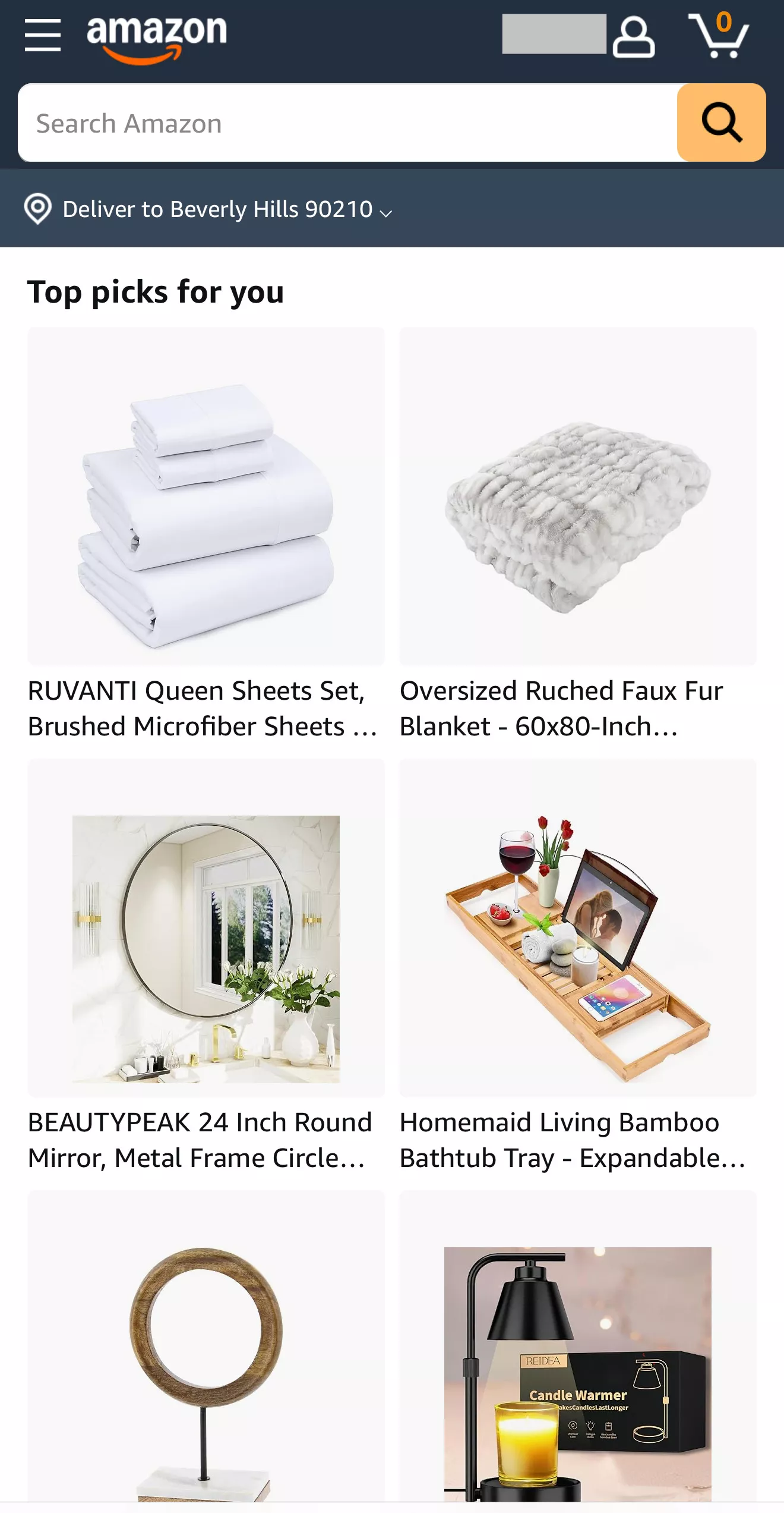
Smart stores don't just personalize product suggestions—they customize the whole experience:
- Homepage shows relevant items
- Email offers match their interests
- Content fits their shopping style
A study reports that stores that personalize their mobile experience see 34% more email signups because the offers feel more relevant to each person.
Use what you know about your visitors (what they've looked at, bought before, or searched for) to show them exactly what they're most likely to want. Keep it simple, keep it relevant, and watch your sales grow.
The Mobile Personalization Implementation System
1. Implement Behavioral Tracking
- Track product views, time spent on pages, and scroll depth
- Monitor search queries and filtered browsing behavior
- Record add-to-cart and purchase history
- Identify peak browsing times and preferred product categories
- Create user segments based on engagement patterns
2. Deploy Dynamic Content Recommendations
- Show "Recently Viewed" products prominently on homepage
- Create "Recommended for You" sections based on browsing history
- Implement "Customers Like You Also Bought" cross-selling
- Add "Complete the Look" bundles for fashion and home products
- Use AI-powered recommendations for complex product catalogs
3. Personalize Email Capture Offers
- Offer product-specific discounts based on browsing behavior
- Create category-focused newsletters for different user segments
- Implement exit-intent popups with personalized messaging
- Add "Get notified when this item goes on sale" options
- Use location-based offers for local store pickup
4. Optimize for Mobile Context
- Prioritize fast-loading personalized content
- Limit recommendations to 3-5 items per section
- Use lazy loading for personalized product grids
- Implement infinite scroll for personalized product feeds
- Test personalization impact on mobile page speeds
Key Insights
- Mobile personalization can increase conversion rates by 288% while simultaneously boosting email signup rates by 34% when implemented strategically.
- The ideal mobile personalization in 2025 focuses on quality over quantity, showing 3-5 highly relevant recommendations rather than overwhelming users with options.
- Focus your personalization efforts on your highest-traffic mobile pages first, as these will deliver the greatest impact on both sales and email capture.
With personalization driving more relevant experiences, let's examine how to ensure your mobile search functionality helps customers find exactly what they're looking for.
Mobile Design Fix #5: Make Search Work Better
Mobile shoppers search your site right away, but most mobile searches fail to show results. When people can't find what they want, they leave your site completely.
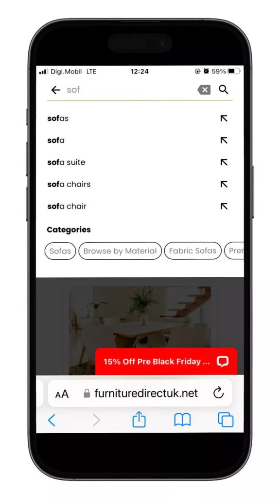
Mobile users:
- Type shorter search terms
- Make more spelling mistakes (tiny keyboards)
- Want instant results
- Expect to see results in under 2 seconds
If your search takes longer than 2 seconds, more people will give up. New research by Google has found that 53% of mobile website visitors will leave if a webpage doesn’t load within three seconds.
When someone searches for something you don't have, ask for their email to notify them when it's back in stock. This simple trick can boost email signups.
Fix Your Mobile Search
- Make it fast (under 2 seconds)
- Handle spelling mistakes
- Show "no results" pages that capture emails
- Use simple, visual results
Good mobile search helps people find what they want quickly. Bad mobile search loses sales and customers. But even failed searches can win you email subscribers if you handle them right.
The Mobile Search Optimization Framework
1. Implement Smart Search Features
- Add autocomplete suggestions that appear after 2-3 characters
- Include typo tolerance and synonym recognition
- Implement visual search using image recognition
- Add voice search capability for hands-free browsing
- Create predictive search based on trending products
2. Optimize Search Results Display
- Show product images in search results, not just text
- Implement infinite scroll for mobile search results
- Add quick filters for price, color, size, and brand
- Display search result count and estimated load time
- Use grid view optimized for mobile screens
3. Handle Search Failures Strategically
- Create "No results found" pages that capture emails
- Offer to notify users when searched items become available
- Suggest similar or alternative products with images
- Add "Request this product" forms that capture contact information
- Implement exit-intent popups specifically for failed searches
4. Track and Optimize Search Performance
- Monitor search query analytics and zero-result rates
- Track conversion rates from search vs. browsing
- Measure time from search to purchase completion
- Identify most common unsuccessful search terms
- Test search bar placement and prominence
Key Insights
- Optimizing mobile search can reduce zero-result rates by up to 68% while creating opportunities to capture emails from users who can't find specific products.
- The ideal mobile search in 2025 returns visual results in under 2 seconds, includes autocomplete suggestions, and converts search failures into email capture opportunities.
- Focus your search optimization efforts on your most common search queries first, as these represent the highest-volume opportunities for both sales and email capture.
Now that your search functionality is optimized for mobile users, let's explore how to create micro-interactions that build emotional connections with shoppers.
Mobile Design Fix #6: Create Micro-Interactions That Build Connection
Micro-interactions are tiny animations that happen when people tap buttons or interact with your site. They make mobile shopping feel more engaging and trustworthy.
When someone taps a button and gets instant visual feedback, their brain releases dopamine (the "feel good" chemical). This makes people like your brand more and stay focused on your site longer.
[video width="688" height="1280" mp4="https://autogrow-s3.s3.amazonaws.com/wp-content/uploads/2025/07/03163915/Mobile-Design-Fix-6-Create-Micro-Interactions-That-Build-Connection.mp4" autoplay="true"][/video]
Stores with good micro-interactions see:
- People spend more time on their site
- More email signups get completed
- Higher purchase confidence
The best micro-interactions are subtle:
- Button changes color when tapped
- Loading animations show progress
- Success checkmarks confirm actions
- Gentle bounces guide attention
Don't use flashy animations that:
- Slow down your site
- Distract from shopping
- Annoy users
Small, purposeful animations make your mobile site feel more polished and responsive. They guide users through buying and signing up while making the whole experience more enjoyable.
The Mobile Micro-Interaction Strategy
Follow this three-step strategy to implement micro-interactions that boost conversions:
1. Identify High-Impact Interaction Points
- Map critical conversion moments (add to cart, email signup, purchase)
- Track where users hesitate or abandon actions
- Identify form fields with high error rates
- Note buttons that receive low click-through rates
- Analyze mobile session recordings for confusion points
2. Design Purposeful Micro-Interactions
- Add subtle button press animations (scale and color changes)
- Create loading animations that show progress, not just spinning wheels
- Implement form validation that appears as users type
- Add "success" animations for completed actions
- Use gentle bounce effects for important call-to-action buttons
3. Focus on Email Capture Enhancements
- Animate email signup forms sliding in from screen edges
- Add checkmark animations when email addresses are validated
- Create progress indicators for multi-step signup processes
- Use subtle pulsing effects to draw attention to signup buttons
- Implement celebratory animations for successful email subscriptions
Key Insights
- Strategic micro-interactions can increase mobile user engagement by 37% while improving email signup completion rates by 19%.
- The most effective mobile micro-interactions in 2025 focus on providing immediate feedback and guiding user attention rather than purely decorative animation.
- Focus your micro-interaction efforts on your conversion and email capture points, as these will deliver the greatest impact on your business metrics.
With micro-interactions enhancing user engagement, let's examine how to ensure your mobile store loads quickly even on slow connections.
Mobile Design Fix #7: Optimize for Speed on Any Connection
If your mobile site takes more than 3 seconds to load, more people will leave immediately. Every extra second of loading time kills more sales. Google's research shows that the probability of bounce increases 32% as page load time goes from 1 second to 3 seconds.
Mobile shoppers expect your site to load instantly, even on slow phone connections. They're browsing while walking, waiting in line, or switching between WiFi and cellular data.
You need to balance fast loading with good-looking content. People still want:
- High-quality product photos
- Smooth animations
- Personalized recommendations
But they won't wait for them.
Load the most important stuff first:
- Product images and prices
- Buy buttons
- Basic navigation
Then load everything else in the background.
Stores that fix their mobile speed see more revenue within 6 months.
Speed beats fancy features every time on mobile. A fast, simple site will outsell a slow, beautiful one. Focus on loading the essentials instantly, then add the extras.
The Mobile Speed Optimization Protocol
1. Implement Critical Resource Prioritization
- Load above-the-fold content first (hero images, primary navigation)
- Defer non-critical JavaScript until after page interaction
- Prioritize add-to-cart and email signup functionality
- Use resource hints to preload critical fonts and images
- Implement service workers for offline functionality
2. Optimize Images for Mobile Performance
- Use next-generation formats (WebP, AVIF) with fallbacks
- Implement responsive images that serve appropriate sizes
- Add lazy loading for all images below the fold
- Compress images without quality loss using AI tools
- Use placeholder images while content loads
3. Minimize JavaScript and CSS
- Remove unused CSS and JavaScript code
- Implement code splitting for large applications
- Use tree shaking to eliminate dead code
- Minify and compress all assets
- Implement browser caching strategies
4. Leverage Content Delivery Networks
- Use CDNs to serve static assets from locations close to users
- Implement edge computing for dynamic content
- Use CDN-based image optimization services
- Set up geographic load balancing
- Monitor CDN performance across different regions
5. Monitor and Optimize Continuously
- Use real user monitoring to track actual load times
- Test performance on various devices and connection speeds
- Monitor Core Web Vitals scores
- Track correlation between speed and conversion rates
- Implement automated performance testing
Key Insights
- Mobile speed optimization can increase conversion rates by 20% per second of improvement while reducing bounce rates by 32%.
- The ideal mobile store in 2025 loads critical content in under 1.5 seconds and provides immediate feedback to user interactions.
- Focus your speed optimization efforts on your highest-traffic mobile pages first, as these will deliver the greatest impact on overall business performance.
With your mobile site now loading quickly, let's explore how to implement email capture strategies specifically designed for mobile users.
Mobile Design Fix #8: Implement Mobile-First Email Capture
Mobile users sign up for emails differently than desktop users. They hate long forms but will give their email for instant value. Mobile-optimized signup forms get way more completions than generic ones.
People browse on mobile during short breaks—waiting in line, on the bus, or during downtime. They want fast, valuable trades:
- Instant discount codes
- Exclusive early access
- Free shipping offers
Skip the generic "newsletter signup" approach.
Mobile screens are small and typing is hard. Start with just an email address, then ask for more info later as people trust you more.
Best Practices
- Offer immediate rewards (discount codes)
- Use big, easy-to-tap buttons
- Keep forms short (email only at first)
- Make the value clear upfront
- Account for slow connections
Stores using mobile-first email capture strategies can double their signup rates compared to desktop-focused approaches.
Mobile users will give you their email, but only if you make it quick, easy, and immediately valuable. Focus on instant gratification over long-term newsletter promises.
The Mobile Email Capture Optimization System
1. Design Mobile-Optimized Signup Forms
- Use single-field forms that only request email addresses initially
- Implement large, touch-friendly input fields and buttons
- Add form validation that works as users type
- Use auto-focus on email fields to reduce taps
- Implement smart keyboard suggestions for email domains
2. Create Mobile-Specific Value Propositions
- Offer instant mobile discounts (10-15% off first order)
- Provide exclusive mobile-only product alerts
- Create mobile shopping guides and style tips
- Offer early access to mobile app features
- Implement location-based offers for nearby stores
3. Optimize Timing and Placement
- Use exit-intent detection optimized for mobile gestures
- Implement scroll-triggered popups at 60-70% page depth
- Add sticky email capture bars at the bottom of mobile screens
- Create time-delayed offers after 30-45 seconds of engagement
- Use page-specific offers based on product categories
4. Implement Progressive Profiling
- Start with email-only capture, then request additional information
- Use post-signup surveys to gather preferences
- Implement birthday and anniversary capture for special offers
- Add social media integration for expanded profiles
- Create preference centers for email frequency and content
Key Insights
- Mobile-first email capture strategies can increase subscription rates by 68% while improving the overall user experience.
- The most effective mobile email capture in 2025 focuses on immediate value exchange and minimal friction.
- Focus your email capture optimization efforts on your highest-traffic mobile pages, as these represent the greatest opportunities for list growth.
With email capture optimized for mobile users, let's examine how to build trust quickly through social proof.
Mobile Design Fix #9: Build Trust with Mobile Social Proof
Mobile shoppers decide to buy within seconds of seeing a product. Most read reviews before purchasing, and products with visible social proof convert much better than those without.
You can't show long review sections like on desktop. Instead, use:
- Star ratings near product titles
- Short, powerful testimonials
- Trust badges in key spots
- Quick-scan social proof elements
Mobile users spot fake reviews instantly. Use real-time social proof:
- "Sarah from Texas just bought this"
- "12 people viewing this item"
- Recent review highlights
- Live purchase notifications
Stores using real-time social proof see mobile sales increase 25% faster, according to studies.
Social proof works for email capture:
- "Join 50,000+ happy customers"
- "1,200 people signed up today"
- Customer testimonials about your emails
Mobile users need quick proof that others trust you. Show real, recent social proof prominently and watch both sales and email signups improve.
Speaking of social proof such as reviews, most stores display them poorly. Here are 9 ways to do it right and increase sales.
The Mobile Social Proof Framework
1. Implement Real-Time Social Proof
- Show recent purchase notifications ("Sarah from California just bought this")
- Display current visitor counts ("23 people viewing this product")
- Add live review feeds with recent customer feedback
- Implement real-time inventory updates ("Only 3 left in stock")
- Show social media mentions and user-generated content
2. Optimize Review Display for Mobile
- Use star ratings prominently in product listings
- Show review count and average rating at the top of product pages
- Implement review highlights that show key benefits
- Add photo reviews that load quickly on mobile
- Create review summaries that capture main points
3. Leverage Trust Badges and Certifications
- Display security badges prominently during checkout
- Show shipping and return policy badges
- Add payment method icons (Visa, PayPal, etc.)
- Implement industry certifications and awards
- Use customer service badges (24/7 support, free returns)
4. Create Social Proof for Email Capture
- Show subscriber counts ("Join 50,000+ happy customers")
- Display testimonials about email content quality
- Add social media follower counts
- Show user-generated content from email subscribers
- Implement social login options for email signup
Key Insights
- Mobile social proof can increase conversion rates by 34% while building the trust necessary for email capture.
- The most effective mobile social proof in 2025 is real-time, authentic, and immediately visible without requiring additional taps.
- Focus your social proof efforts on your product pages and email capture points, as these are where trust matters most for conversions.
Want to turn more mobile visitors into paying customers? These optimization tactics will help.
Want to get all your marketing and funnel work done—without the headaches of hiring a team? Download our free guide: 33 Marketing Projects You Can Delegate to Growbo and discover how to save 100+ hours a month, grow faster, and scale without the overhead.
Conclusion
Wow, we've covered a lot about mobile optimization! If you're running an online store in 2025, you know how crucial your mobile experience has become. Most of your customers are probably scrolling through your products on their phones right now.
I've shared these strategies because they flat-out work. They're practical ways to get more sales and grow your email list without spending a fortune on ads.
Here's what you can start working on this week:
- Fix your button placement so they're easy to tap with thumbs (bottom 75% of screen).
- Make your product pictures better with multiple angles and files under 200KB.
- Simplify your checkout to just a few taps with digital wallet options front and center.
- Show people what they want with personalized recommendations.
- Improve your search with visual results and predictive suggestions.
- Speed up your pages by compressing images and cutting unnecessary scripts.
I get it – looking at this list probably feels overwhelming. Each strategy requires specific skills and time you might not have.
Not sure where to start? Schedule a free consultation with the team. Just click here to book your call.
Here's a shortcut: Try Growbo for just $7 and get a complete marketing team working on your mobile optimization for the next 7 days. We'll handle everything from thumb-friendly designs to checkout streamlining – all the strategies we've covered.
Which mobile optimization strategy would you tackle first? Share your thoughts below!
Keep Growin', Stay Focused,

Image Credits:
1. https://www.nike.com
2. https://www.mansurgavriel.com
3. https://www.bestbuy.com
4. https://www.amazon.com
5. https://www.doofinder.com/en/blog/mobile-search-ux
6. https://www.apple.com
7. https://www.walmart.com/account/signup
8. https://www.glossier.com/


