9 Call to Action Fixes in SaaS Websites

Is your SaaS website getting plenty of visitors but hardly any sign-ups? The problem might be your calls to action on your SaaS website. Those small but mighty buttons asking users to "Start a Trial" or "Book a Demo" have far more impact than most realize.
Here's the truth: Most SaaS companies spend weeks perfecting their headlines and feature descriptions. Yet they give their CTAs just a few minutes of thought. This is a costly oversight.
Think about it. Your CTA is the final bridge between a visitor and a customer. If that bridge is weak, unclear, or in the wrong spot, people simply won't cross it.
The numbers don't lie. According to VWO research, companies that systematically test and improve their CTAs see up to three times more conversions than those who don't. That's the difference between 100 new customers a month and 300 – without spending an extra dollar on ads.
We've helped dozens of SaaS companies fix their CTAs, and we've seen firsthand how small changes lead to big results. In this article, you will discover:
- The customer journey mapping technique that aligns your CTAs with visitor intent
- The "Value-First Formula" that makes your button text irresistibly clickable
- The strategic placement method that puts CTAs exactly where eyes naturally look
Ready to turn those website visitors into paying customers? Let's fix those CTAs today...
If you want to get your marketing work done for your business (or for your clients’), then you HAVE to learn more how you can delegate unlimited marketing projects & tasks without the headaches of hiring. Download this free guide: 33 Examples of Marketing Projects You Can Delegate to Growbo
CTA Fix #1: Map Your CTAs to the SaaS Customer Journey
Calls to action in SaaS websites work best when they align with where your visitors are in their buying journey. You've probably noticed how some SaaS sites seem to know exactly what to offer you at the right moment. This isn't accidental – it's strategic journey mapping.
Authenticity in your conversion elements significantly impacts trial signups. When you match your CTAs to specific stages of the customer journey, you're essentially speaking directly to your visitor's current needs and mindset.
Think about your own experience visiting SaaS websites. You're likely turned off when a site immediately pushes you to "Buy Now" before you understand what they offer. Your visitors feel the same way.
A framework that works well for SaaS companies divides the journey into three main stages: awareness, consideration, and decision. Each stage requires different CTA approaches.
Awareness Stage CTAs
During the awareness stage, your visitors are just discovering they have a problem. They're not ready for a sales pitch or even a free trial. Your CTAs should focus on education and light engagement.
Effective awareness-stage CTAs include:
- "Learn More About [Problem]"
- "Read Our Guide on [Topic]"
- "Watch How [Solution] Works"
- "Subscribe for Industry Updates"
Slack does this particularly well on their homepage. Instead of immediately pushing for signups, they offer educational content about remote work challenges – meeting visitors exactly where they are in their journey.
Consideration Stage CTAs
As visitors move into the consideration stage, they understand their problem and are evaluating potential solutions. Your CTAs should now focus on helping them see your specific value.
Effective consideration-stage CTAs include:
- "See How It Works"
- "Watch a Demo"
- "View Case Studies"
- "Compare Plans"
According to our article on 313 case studies on conversion, matching CTAs to different journey stages can increase engagement by up to 74%. This shows just how important proper journey alignment really is.
Decision Stage CTAs
At the decision stage, visitors are ready to take action. Your CTAs should be direct and create a clear path to becoming a customer.
Effective decision-stage CTAs include:
- "Start Your Free Trial"
- "Get Started Now"
- "Create Your Account"
- "Schedule a Demo Call"
The key to success is placing these different CTAs strategically throughout your website. Your homepage might include all three types, while product pages might focus more on consideration and decision CTAs.
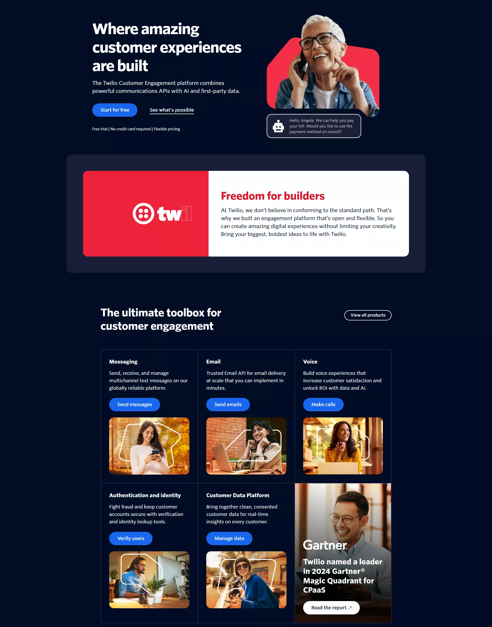
For instance, Twilio's CTAs on the top of its homepage are more informational :
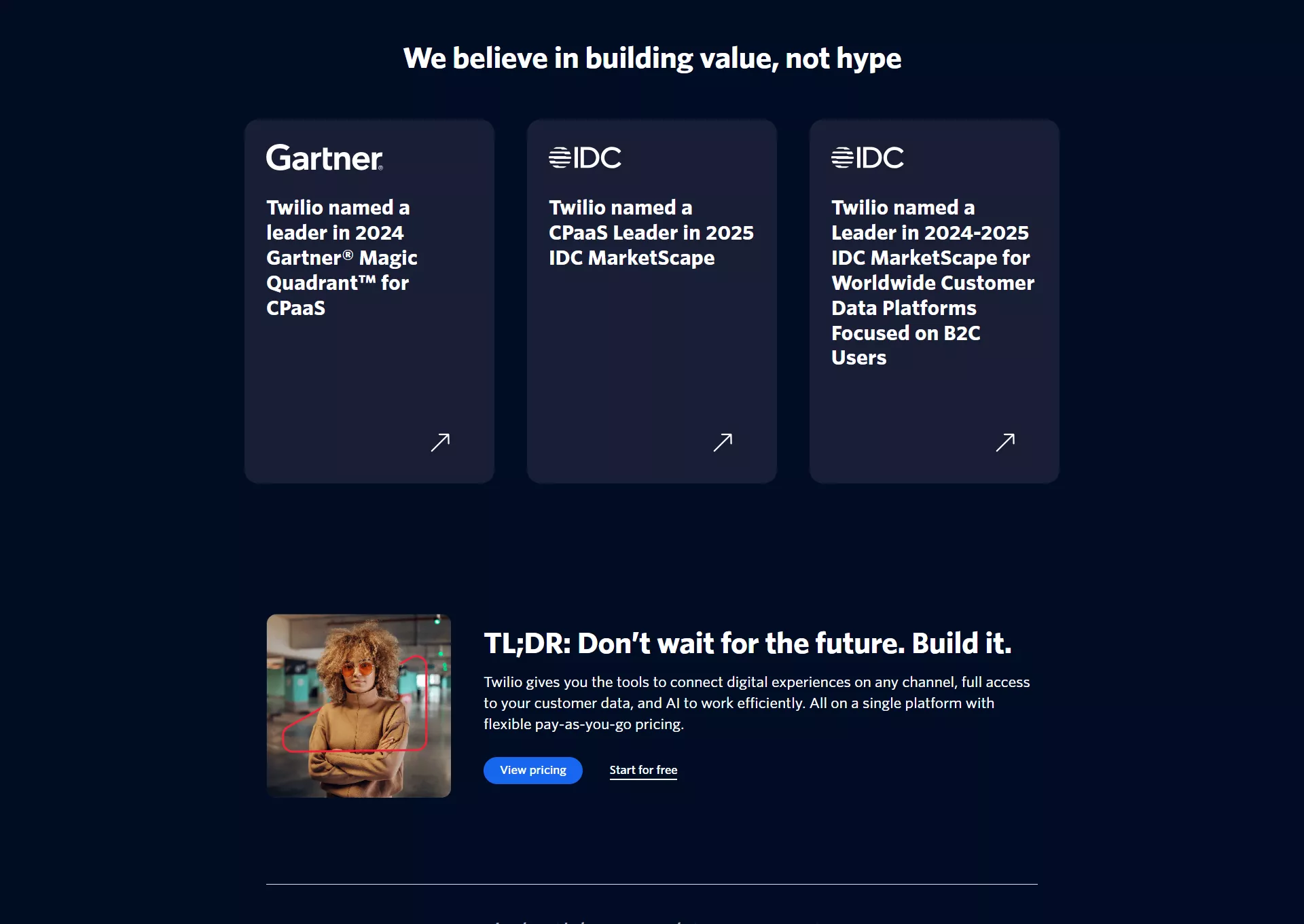
While the CTAs at the footer enocurage readers to see pricing or sign up.
Implementation Steps
To create your own CTA journey map, follow these steps:
First, document your current customer journey from first touch to purchase. Look at your analytics to understand how people actually move through your site, not just how you think they do.
Next, audit your existing CTAs and categorize them by journey stage. You'll likely find gaps where certain stages have weak or missing calls to action.
Then, create new CTAs specifically designed for underserved journey stages. Make sure the language matches what visitors need at that moment.
Finally, implement and test your new journey-aligned CTAs. According to Growbo's 53-Point CRO Checklist, conversion rate optimization requires hands-on testing with results tied directly to your bottom line.
When you align your CTAs with the customer journey, you create a more natural, helpful experience. Your visitors feel understood rather than pushed, which builds trust and ultimately leads to higher conversion rates and more qualified leads.
CTA Fix #2: Craft Compelling CTA Copy That Communicates Value
Call to actions in SaaS websites need copy that instantly communicates value to your visitors. You've likely clicked on buttons that say "Sign Up" hundreds of times, but how often did they actually convince you? Generic CTAs miss a crucial opportunity to address what your visitors really care about.
The words you choose for your CTA buttons directly impact your conversion rates. According to WordStream, simply changing button copy from a generic phrase to a value-focused one can increase clicks by up to 90%. This dramatic difference shows why your CTA copy deserves careful attention.
Think about the last time you signed up for a SaaS product. Was it the "Sign Up" button that convinced you, or was it understanding exactly what you'd get from taking that action?
Value-First Formula for SaaS CTAs
The most effective SaaS CTAs follow what I call the "Value-First Formula" – they lead with the specific benefit users will receive rather than the action they need to take.
Compare these generic CTAs with their value-focused alternatives:
- Generic: "Start Free Trial" → Value-Focused: "Start Saving Time Today"
- Generic: "Schedule Demo" → Value-Focused: "See How [Product] Solves [Problem]"
- Generic: "Learn More" → Value-Focused: "Discover How to Increase Your ROI by 30%"
- Generic: "Sign Up" → Value-Focused: "Create Your First Dashboard in 5 Minutes"
Ahrefs does this particularly well with their homepage CTA that reads "Analyze your website" instead of a generic "Try it free." This immediately communicates what you'll get – an analysis of your website – rather than just telling you to try something.
According to Growbo's Sales Conversion Pack, which includes hundreds of proven copywriting tactics, the most successful CTAs speak directly to the end benefit rather than the feature or action. Your visitors don't want a "free trial" – they want what the free trial will help them achieve.
Personalize CTAs to User Segments
Different visitor segments have different priorities. A marketing director and a CEO might both use your SaaS product, but they care about different outcomes.
For marketing directors, your CTA might focus on efficiency: "Create Reports in Half the Time"
For CEOs, your CTA might emphasize business impact: "See How [Product] Increases Revenue"
This personalization makes your CTAs more relevant and compelling to each specific audience segment. According to HubSpot, personalized CTAs convert 202% better than default versions. This massive improvement shows just how much your visitors value relevance.
Testing Your CTA Copy
The only way to know which CTA copy works best for your specific audience is through testing. Start with these steps:
First, identify your current top-performing and worst-performing CTAs based on click-through rates. This gives you a baseline to improve upon.
Next, create 2-3 value-focused alternatives for each CTA, making sure each one communicates a specific benefit. Be specific about what users will get.
Then, run A/B tests comparing your current CTAs against the new value-focused versions. Growbo's CRO Checklist emphasizes that hands-on testing is essential for optimizing conversions.
Finally, analyze not just click-through rates but also downstream metrics like trial activations or purchases. Sometimes a CTA that gets more clicks doesn't actually lead to more customers.
When you craft CTA copy that clearly communicates value, you help visitors quickly understand what they'll gain by clicking. This clarity builds confidence in their decision and leads to higher-quality conversions from visitors who truly understand your value proposition.
CTA Fix #3: Design CTAs That Command Attention Without Disrupting UX
Call to actions in SaaS websites need to stand out visually while still feeling like a natural part of your page design. You've probably encountered websites where the CTAs either blend in too much (making them easy to miss) or scream for attention in a way that feels pushy and off-putting.
Finding the right balance is crucial. According to Nielsen Norman Group, users typically scan web pages in an F-shaped pattern, which means your CTAs need to be strategically placed and visually distinctive to capture attention during this quick scanning process.
Think about your own browsing habits. When you visit a SaaS website, you're likely making split-second decisions about where to click based largely on visual cues. Your visitors are doing exactly the same thing.
The Contrast Principle
The most effective SaaS CTAs use strategic contrast to stand out from surrounding elements. This doesn't necessarily mean using the brightest, most attention-grabbing color possible.
Instead, focus on creating meaningful contrast that guides the eye naturally. According to ConversionXL, buttons that contrast with the page's color scheme can increase conversion rates by up to 32.5% compared to buttons that blend with the site's palette.
Our article on the "Salty Foot" Formula emphasizes this point clearly: "If you want to get more conversions (opt-ins, sales, etc.), put your offer somewhere where it will be seen. It should stand out." This straightforward advice is backed by conversion data across hundreds of websites.
Effective contrast techniques include:
- Using a button color that complements but stands apart from your main brand colors
- Creating white space around your CTA to isolate it visually
- Adding subtle animation or hover effects that activate when users scan near the button
- Using directional cues like arrows or images of people looking toward your CTA
Size and Proportion Considerations
The size of your CTA buttons matters significantly. Buttons that are too small can be easily missed, while buttons that are too large can feel overwhelming and trigger skepticism.
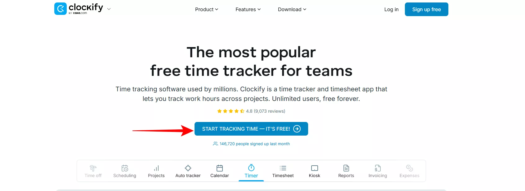
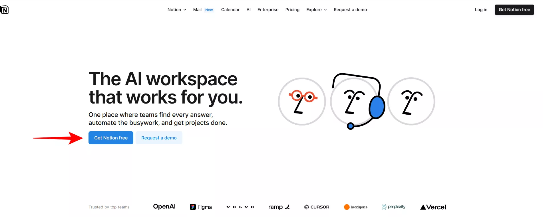
For most SaaS websites, the ideal CTA button size follows what I call the "prominence without dominance" rule – it should be one of the most noticeable elements on the page without overwhelming everything else.
Notion demonstrates this perfectly with CTAs that are approximately 20% larger than surrounding text elements – enough to stand out clearly without dominating the clean, minimalist design of their pages.
When designing your CTA size, consider these guidelines:
- Make primary CTAs 20-30% larger than secondary page elements
- Ensure buttons are large enough for easy clicking on mobile devices (minimum 44x44 pixels per W3C accessibility guidelines)
- Maintain consistent sizing for similar CTAs throughout your site
- Use size hierarchy to indicate primary vs. secondary actions
Real-World Impact
HubSpot provides an excellent case study in CTA design optimization. By redesigning their CTAs with improved contrast, strategic sizing, and better placement, they increased their conversion rates by 21%, according to their UX statistics report.
What made their redesign successful wasn't just making buttons bigger or brighter – it was creating a thoughtful visual hierarchy that guided users naturally toward the next step while maintaining a clean, professional look.
To implement these principles on your own SaaS website, start by conducting a visual audit of your current CTAs. Take screenshots of each page and blur them slightly – the elements that still stand out are likely capturing attention effectively.
Next, identify CTAs that blend in too much or feel disconnected from surrounding content. These are your prime candidates for redesign using the contrast and sizing principles discussed above.
Remember that effective CTA design balances visibility with user experience. Your goal isn't just to make buttons that get clicked – it's to create a visual flow that helps users accomplish their goals while moving them naturally toward conversion points.
CTA Fix #4: Optimize CTA Placement Using Heatmap Intelligence
Call to actions in SaaS websites perform dramatically better when placed where your visitors naturally look and interact. You've probably noticed how some websites seem to have buttons in exactly the right spots, making it effortless to take the next step. This isn't luck – it's data-driven placement optimization.
Understanding where users actually focus their attention is crucial for effective CTA placement. According to Crazy Egg, only 20% of users scroll below the fold on most web pages. This means your most important CTAs need strategic positioning in high-visibility areas.
Think about your own browsing behavior. Where do your eyes naturally go when you first land on a website? Where do you expect to find buttons for taking action? Your visitors have similar patterns and expectations.
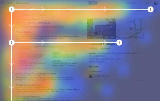
The F-Pattern and Z-Pattern Principles
Research from the Nielsen Norman Group shows that users typically scan web pages in predictable patterns – most commonly F-patterns (for text-heavy pages) and Z-patterns (for more visual layouts).
In the F-pattern, users scan horizontally across the top of the content area, then move down and scan horizontally again (though typically covering less distance), and finally scan vertically down the left side of the page.
For SaaS websites, this means your primary CTAs will typically perform best when placed:
- In the upper right of the navigation (for account creation/login)
- At the end of the first horizontal scan (right side of your hero section)
- At natural stopping points in the F-pattern (after key benefit explanations)
The Z-pattern follows how users scan from top-left to top-right, then diagonally to bottom-left, and finally to bottom-right. This pattern works well for more visual, less text-heavy pages.
Growbo's "Salty Foot" Formula reinforces this concept with the straightforward equation: "traffic + greater visibility for your offer = more conversions." Placing your CTAs where they naturally receive more visibility directly impacts your conversion rates.
Using Heatmap Data for Optimization
Theoretical patterns are a good starting point, but nothing beats actual user data from your specific website. Heatmap tools provide visual representations of where users are actually looking, clicking, and scrolling on your pages.
According to Hotjar, websites that optimize CTA placement based on heatmap data see an average conversion increase of 30%. This significant improvement comes from aligning your CTAs with actual user behavior rather than assumptions.
To implement heatmap intelligence for your SaaS website, follow these steps:
First, install a heatmap tool like Hotjar, Crazy Egg, or FullStory on your key landing pages and conversion paths. Let it collect data for at least 2-3 weeks to ensure you have a representative sample.
Next, analyze the resulting heatmaps to identify hot zones (where users focus most) and cold zones (areas that receive little attention). Look specifically for click patterns and scroll depth.
Then, compare your current CTA placements with these hot zones. Are your CTAs in high-attention areas, or are they hiding in cold zones where few users look?
Finally, reposition your CTAs to align with the hot zones identified in your heatmaps. This might mean moving buttons higher on the page, shifting them from left to right (or vice versa), or adding additional CTAs at key scroll depths.
Common Placement Mistakes to Avoid
Through analyzing hundreds of SaaS websites, I've identified several common CTA placement mistakes that hurt conversion rates:
- Placing primary CTAs below the fold where only 20% of visitors will see them
- Clustering too many CTAs together, creating decision paralysis
- Positioning CTAs before you've established sufficient value to motivate action
- Hiding CTAs in unexpected locations that don't align with user scanning patterns
Monday.com avoids these mistakes with expertly positioned CTAs that align perfectly with user attention patterns. Their primary "Get Started" button appears in the upper right of their hero section – exactly where the eye naturally lands after reading their headline and value proposition.
When you optimize your CTA placement based on actual user behavior data, you create a more intuitive experience that feels natural to visitors. This approach leads to higher engagement rates and more conversions without requiring design changes to the buttons themselves.
CTA Fix #5: Implement Contextual CTAs Within Feature Explanations
Call to actions in SaaS websites convert significantly better when they appear in direct context with the specific features they relate to. You've likely experienced the frustration of reading about an interesting feature on a SaaS site, becoming excited about it, but then having to hunt around the page to figure out how to try or learn more about that particular capability.
Contextual CTAs solve this problem by placing action buttons directly within or immediately after feature explanations. According to Invesp, contextual CTAs can increase conversion rates by up to 121% compared to generic, isolated CTAs. This dramatic improvement happens because you're capturing interest at the exact moment it peaks.
Think about your own decision-making process when evaluating software. When a specific feature catches your attention, that's when you're most motivated to take action related to that feature. Your visitors experience the same psychological trigger points.
The Benefit-Action Connection
The most effective contextual CTAs create a clear connection between a specific benefit and an immediate action. This approach follows what I call the "Benefit-Action Connection" principle – directly linking what users will gain with how they can get it.
Asana demonstrates this perfectly on their product pages. After explaining how their workflow templates save time, they include a contextual CTA that reads "Try templates now" – not a generic "Sign up" button. This direct connection between the benefit (time-saving templates) and the action (trying them) creates a compelling reason to click.
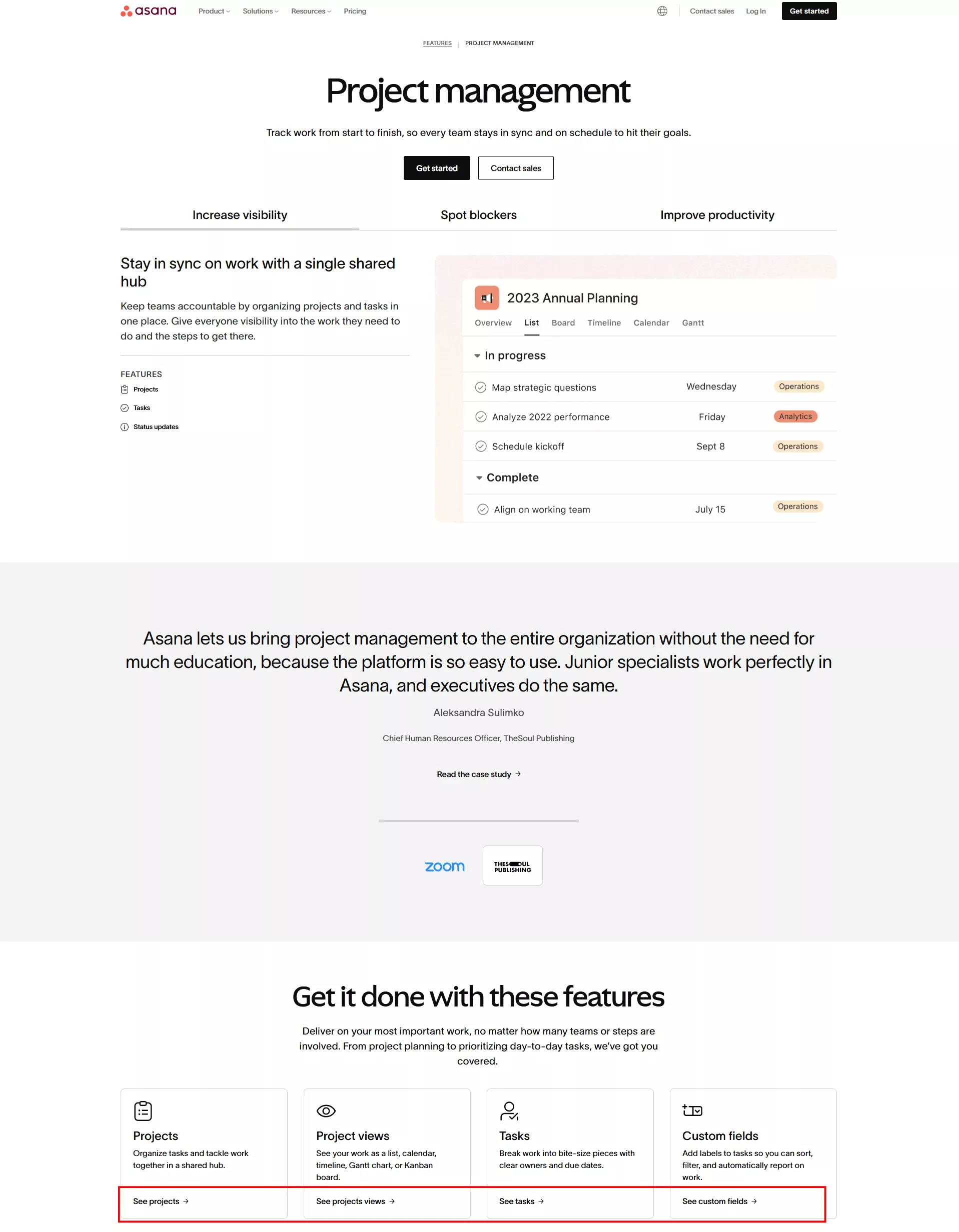
Effective contextual CTAs typically follow this structure:
- Feature explanation that highlights a specific benefit
- Brief transition sentence that bridges to the action
- CTA button with copy that directly relates to the specific feature
- Optional supporting text that reduces friction or addresses objections
Implementation Guide
To implement contextual CTAs effectively on your SaaS website, follow these steps:
First, identify your key feature sections and the primary benefit each one delivers to users. Be specific about the value proposition for each feature.
Next, craft custom CTA copy for each feature section that directly references the benefit or action related to that feature. Avoid generic phrases like "Learn More" or "Sign Up" in favor of specific actions like "Start Organizing Projects" or "Create Your First Dashboard."
Then, position these contextual CTAs immediately after the benefit explanation, when interest is highest. According to HubSpot, CTAs placed directly after relevant content receive 371% more clicks than those placed in standard locations like sidebars or top navigation.
Finally, ensure visual consistency while maintaining feature-specific messaging. Your contextual CTAs should share design elements with your primary CTAs but contain copy that's tailored to each specific feature context.
When you implement contextual CTAs within your feature explanations, you create multiple conversion opportunities that feel helpful rather than pushy. This approach leads to higher engagement with specific features and more qualified conversions from users who clearly understand what they're signing up for.
CTA Fix #6: Leverage Social Proof to Amplify CTA Effectiveness
Calls to action gain significant power when paired with relevant social proof. You've probably noticed how much more confident you feel clicking a button when you see that others have already taken that step and found success. This psychological principle can dramatically boost your conversion rates.
Social proof reduces perceived risk and builds trust at the critical moment of decision. According to BigCommerce, adding social proof elements near CTAs can increase conversion rates by up to 34%. This substantial lift occurs because you're addressing the natural hesitation that happens right before someone clicks.
Think about your own decision-making process when signing up for a new SaaS tool. Don't you feel more comfortable taking action when you see that others like you have already done so successfully? Your visitors experience that same reassurance when you strategically pair social proof with your CTAs.
Strategic Social Proof Pairings
The most effective approach pairs specific types of social proof with corresponding CTAs based on what objections might arise at that decision point. This creates what I call "objection-specific social proof" – evidence that directly addresses the main concern a user might have about taking the requested action.
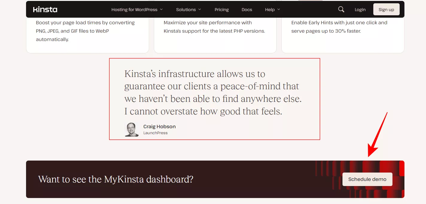
For example, if your CTA is asking visitors to start a free trial, the nearby social proof should address concerns about ease of setup or time investment. A testimonial like "I was up and running in less than 5 minutes" directly overcomes the objection that the trial might be complicated or time-consuming.
In this example, the testimonial talks about Kinsta's infrastructure and the CTA is to show the dashboard through a demo:
Effective social proof pairings include:
- For "Start Free Trial" CTAs: User testimonials about quick setup and immediate value
- For "Schedule Demo" CTAs: Testimonials about how helpful and non-pushy the demo experience was
- For "View Pricing" CTAs: Customer quotes about ROI and value for money
- For "Create Account" CTAs: User numbers or logos of well-known companies using your product
Implementation Techniques
To implement social proof + CTA pairings effectively on your SaaS website, follow these steps:
First, identify the primary objection or concern users might have for each major CTA on your site. What might make them hesitate to click?
Next, select or gather social proof elements that specifically address those objections. According to Nielsen, 83% of consumers trust recommendations from peers over traditional advertising, so authentic testimonials are particularly powerful.
Then, position these social proof elements in close proximity to your CTAs – ideally just above or to the side of the button. The visual connection between the proof and the action is crucial.
Finally, test different combinations of social proof types (testimonials, user counts, logos, case study snippets) to see which creates the strongest lift for each specific CTA.
Real-World Impact
ConvertKit demonstrates this strategy effectively on their homepage. Next to their "Start Your Free Trial" CTA, they display a brief testimonial from a successful creator who mentions how quickly they saw results, along with their subscriber growth numbers. This directly addresses the common objection that email marketing tools might not deliver real results.
A mini case study from ConversionXL showed that adding customer testimonials next to a signup CTA increased conversions by 34%. What made this particularly effective was that the testimonials specifically mentioned how easy the signup process was – directly addressing the friction point associated with that CTA.
When you strategically pair social proof with your CTAs, you create a powerful combination that addresses objections at exactly the right moment. This approach leads to higher conversion rates and increased user confidence in taking the actions you're requesting.
CTA Fix #7: Create Ethical Urgency That Respects the SaaS Buying Process
CTAs can benefit from urgency elements, but only when implemented ethically and appropriately for the B2B context. You've likely encountered websites using fake countdown timers or manufactured scarcity that felt manipulative and damaged your trust. This approach backfires in the SaaS space, where relationships are built on trust and credibility.
Instead, effective SaaS CTAs use what I call "authentic urgency" – creating genuine reasons for timely action that respect the considered nature of software purchasing decisions. According to Forrester, B2B buyers are 57% through their decision-making process before engaging with a sales representative, making trust-building crucial throughout the self-service evaluation process.
Think about your own reaction to artificial urgency tactics. Don't they make you more skeptical rather than more likely to convert? Your visitors – especially in the B2B SaaS space – have the same negative reaction to manipulative tactics.
Ethical Urgency Techniques for SaaS
The most effective urgency approaches for SaaS CTAs are based on genuine value and actual limitations, not artificial constraints. These approaches create motivation without manipulation.
Authentic urgency techniques include:
- Limited-time promotional pricing (with transparent regular pricing shown)
- Early adopter benefits that genuinely won't be available later
- Limited spots for high-touch onboarding or implementation support
- Upcoming price increases with clear advance notice
- Access to beta features for a limited number of new customers
Slack demonstrates this well with their approach to new feature rollouts. When introducing new capabilities, they often offer early access to users who take specific actions, creating genuine urgency without manipulation.
According to HubSpot, using authentic urgency techniques can increase conversion rates by up to 27% compared to CTAs without urgency elements. This significant improvement comes without the trust damage caused by manipulative tactics.
Implementation Guidelines
To implement ethical urgency for your SaaS CTAs, follow these guidelines:
First, identify genuinely limited resources or time-sensitive opportunities in your business. These might include implementation team availability, promotional pricing periods, or beta program spots.
Next, communicate these limitations transparently, explaining why the limitation exists rather than just stating that something is "limited." For example: "Early adopter pricing available for the first 100 customers while we gather feedback and refine the product."
Then, use subtle visual cues rather than aggressive attention-grabbing elements. According to Baymard Institute, subtle visual emphasis creates urgency without triggering skepticism. Think gentle highlighting rather than flashing countdown timers.
Finally, always provide a non-urgent alternative path for those who aren't ready to take immediate action. This respects the considered nature of SaaS purchasing decisions.
Balancing Urgency with Respect
The key to effective urgency in SaaS CTAs is finding the balance between motivation and respect for the buyer's process. According to Growbo's research on sales funnels, authenticity matters significantly in conversion – manipulative tactics might increase clicks but damage long-term trust and retention.
HubSpot provides an excellent example of balanced urgency. When they offer limited-time promotional pricing, they clearly explain the value at both price points and provide transparent information about when the price will change. This creates urgency without manipulation.
When you implement ethical urgency techniques that respect the SaaS buying process, you create motivation without manipulation. This approach leads to higher-quality conversions from prospects who trust your brand and understand the genuine value of taking timely action.
CTA Fix #8: Optimize CTAs for the Mobile SaaS Experience
Call to actions in SaaS websites must be specially optimized for mobile users, who now make up a significant portion of B2B traffic. You've probably experienced the frustration of trying to navigate a SaaS website on your phone only to find tiny, hard-to-tap buttons or CTAs that disappear when the page reflows on mobile. These poor experiences directly impact your conversion rates.
Mobile optimization for CTAs goes beyond just making buttons "work" on smaller screens – it requires rethinking placement, size, and even messaging for touch-based interaction. According to Statista, mobile devices now account for approximately 54.8% of global website traffic. Even in B2B SaaS, where desktop still dominates for in-depth evaluation, mobile optimization is crucial for initial discovery and research phases.
Think about your own mobile browsing habits. How quickly do you abandon websites that are difficult to use on your phone? Your visitors have the same low tolerance for poor mobile experiences.
Touch-Friendly Design Principles
The most effective mobile CTAs follow touch-friendly design principles that accommodate the unique constraints and interaction patterns of mobile devices.
Key mobile CTA design principles include:
- Size: Buttons should be at least 44×44 pixels (ideally 48×48) to create a comfortable touch target
- Spacing: Maintain at least 8px of space between clickable elements to prevent accidental taps
- Placement: Position primary CTAs within easy thumb reach (typically the center or bottom of the screen)
- Contrast: Use even stronger visual contrast on mobile to ensure buttons stand out on smaller screens and variable lighting conditions
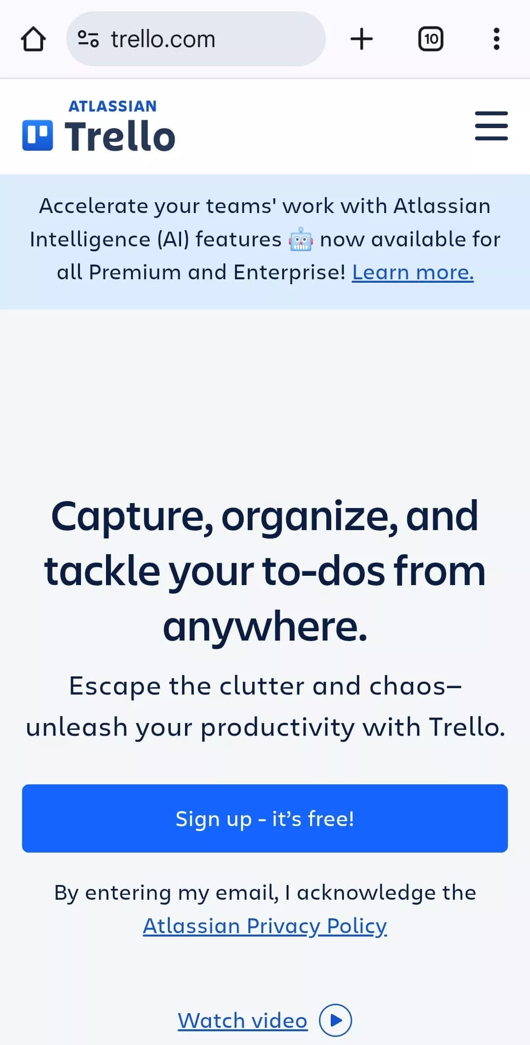
Trello excels at mobile CTA design with large, clearly tappable buttons positioned in the center of the screen where thumbs naturally rest. Their mobile CTAs maintain the same messaging as desktop but with optimized placement and sizing for touch interaction.
According to Google, 53% of mobile site visits are abandoned if pages take longer than 3 seconds to load. This makes lightweight, fast-loading CTAs particularly important for mobile users. Heavy animations or complex button designs that slow down mobile performance should be simplified.
Mobile-Specific CTA Considerations
Beyond basic touch-friendly design, effective mobile CTAs often require unique considerations that differ from desktop experiences:
First, consider vertical prioritization more carefully on mobile. With limited vertical screen space, the order of your CTAs becomes even more critical. Primary actions should appear before users need to scroll, while secondary actions can appear further down.
Next, simplify CTA copy for mobile contexts. Shorter, more direct button text often works better on smaller screens where space is at a premium. "Start Free" might work better than "Start Your Free 30-Day Trial" on mobile.
Then, consider mobile-specific CTA options like click-to-call buttons for complex products where prospects might prefer to speak with someone rather than complete a form on their phone. According to DialogTech, 70% of mobile searchers have used click-to-call buttons to connect with businesses directly from search results.
Finally, ensure your CTAs lead to mobile-optimized experiences. There's nothing more frustrating than tapping a compelling CTA only to land on a page that's not mobile-friendly. The entire post-click experience must be optimized for mobile users.
Testing Methodology for Mobile CTAs
To optimize your mobile CTAs effectively, implement this testing methodology:
First, conduct a mobile-specific CTA audit using actual devices (not just browser emulators). Document tap areas, visual prominence, and any usability issues across different screen sizes.
Next, develop A/B tests specifically for mobile users, testing variables like button size, placement, and copy independently from your desktop tests. According to Marketing Sherpa, mobile-specific testing can identify conversion opportunities that multi-device tests miss.
Then, analyze mobile conversion paths separately from desktop in your analytics. Look for drop-off points that might indicate mobile-specific usability issues with your CTAs.
When you optimize your CTAs specifically for mobile users, you create a more seamless experience that accommodates on-the-go research and evaluation. This approach leads to higher mobile engagement and ensures you're not losing valuable conversions from the growing segment of mobile B2B researchers.
CTA Fix #9: Personalize CTAs Based on User Behavior and Segments
Call to actions in SaaS websites perform dramatically better when personalized to specific user behaviors and segments. You've likely noticed how some websites seem to know exactly what to offer you based on your previous interactions or characteristics. This isn't coincidence – it's strategic personalization.
Personalized CTAs go beyond generic one-size-fits-all buttons to deliver targeted calls to action based on what you know about each visitor. According to HubSpot, personalized CTAs convert 202% better than default versions. This dramatic improvement occurs because you're aligning your ask with each visitor's specific context and needs.
Think about your own experience receiving personalized recommendations. Don't they feel more relevant and compelling than generic offers? Your visitors experience that same increased relevance when you personalize your CTAs.
Behavior-Based Personalization
The most powerful form of CTA personalization is based on observed user behavior – what pages they've visited, what content they've consumed, and what actions they've already taken on your site.
Effective behavior-based personalization includes:
- Page-based CTAs that reflect the specific content being viewed
- Return visitor CTAs that acknowledge previous interactions
- Engagement-level CTAs that match user investment (casual browsers vs. deep researchers)
- Funnel-stage CTAs that align with where users are in their decision process
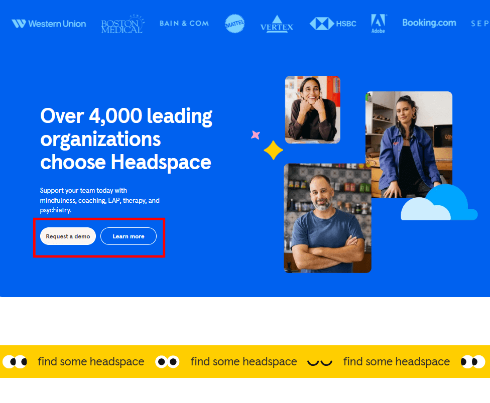
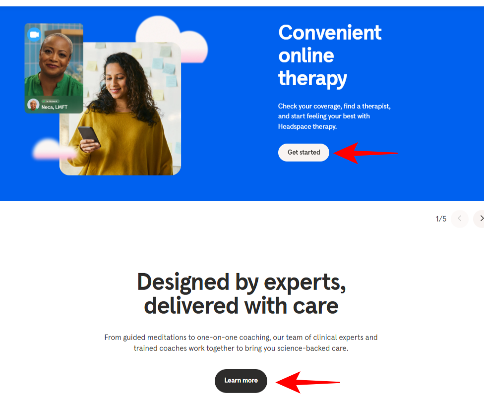
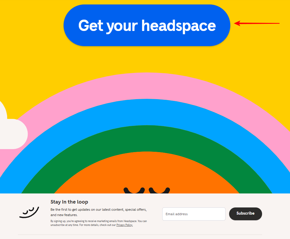
Headspace demonstrates this brilliantly with their behavior-based CTAs. Visitors who are introduced to the platform will learn more about the service and as they know more about Headspace, the final CTA is to checkout.
According to data, 77% of consumers have chosen, recommended, or paid more for brands that provide personalized experiences. This preference extends to B2B SaaS, where decision-makers increasingly expect consumer-grade personalization.
Segment-Based Personalization
Beyond individual behavior, effective CTA personalization also considers broader user segments based on firmographics, traffic source, industry, or role.
For example:
- Industry-specific CTAs that reference challenges unique to each vertical
- Role-based CTAs that address the primary concerns of different decision-makers
- Company-size CTAs that reflect the scale-appropriate benefits of your solution
- Traffic-source CTAs that maintain message consistency from ads or referral links
According to Forrester, 71% of B2B buyers expect the same level of personalization as B2C customers. This expectation makes segment-based CTA personalization increasingly important for SaaS companies.
Implementation Guide
To implement personalized CTAs on your SaaS website, follow these steps:
First, identify your key user segments and behavioral patterns. Use your analytics and CRM data to understand different visitor groups and their typical interaction patterns.
Next, develop personalized CTA variations for each major segment and behavior pattern. Focus on adjusting the value proposition and offer to match each group's primary concerns and interests.
Then, implement using the appropriate technology. Depending on your tech stack, this might involve your CMS's personalization features, a dedicated personalization platform like Dynamic Yield or Optimizely, or custom development using your own user data.
Finally, measure the impact of personalization not just on click-through rates but on downstream metrics like trial activations, conversion to paid, and customer lifetime value. According to McKinsey, companies that excel at personalization generate 40% more revenue from those activities than average players.
When you personalize your CTAs based on user behavior and segments, you create more relevant, compelling conversion opportunities. This approach leads to higher engagement rates, better-qualified leads, and improved conversion metrics across your entire funnel.
If you want to get your marketing work done for your business (or for your clients’), then you HAVE to learn more how you can delegate unlimited marketing projects & tasks without the headaches of hiring. Download this free guide: 33 Examples of Marketing Projects You Can Delegate to Growbo
Conclusion
You've just discovered 9 proven ways to improve your SaaS website's call-to-action buttons. These aren't just random tips – they're practical strategies that can help you turn more visitors into paying customers.
Small, strategic changes to your CTAs can lead to big improvements in your conversion rates without redesigning your entire website.
Here are the key takeaways you can implement right away:
- 1. Match your CTAs to where visitors are in their journey – awareness, consideration, or decision stage.
- 2. Replace generic button text with specific value statements that tell users exactly what they'll get.
- 3. Use visual contrast to make CTAs stand out without disrupting your overall design.
- 4. Place CTAs where users actually look, based on heatmap data rather than guesswork.
- 5. Add relevant social proof near CTAs to build confidence at the moment of decision.
Feeling overwhelmed by these CTA optimization strategies? I get it – implementing these tactics takes time and expertise you might not have in-house.
Here's a better approach: Schedule a quick call with our Growbo team. We'll show you exactly how our on-demand marketing specialists can implement these exact CTA strategies for you – writing the compelling copy, designing the buttons, and setting up the tests.
Which of these CTA strategies are you most excited to try? Drop a comment below.
Keep Growin', Stay Focused,

Image Credits:
1 - https://www.twilio.com/en-us
2 - https://clockify.me/
3 - https://medium.com/uxd-critical-software/understanding-the-f-shaped-and-z-shaped-reading-patterns-for-optimal-usability-in-complex-systems-e96668839abd
4 - https://www.notion.com/
5 - https://uxplanet.org/z-shaped-pattern-for-reading-web-content-ce1135f92f1c
6 - https://asana.com/features/project-management
7 - https://kinsta.com/
8 - https://kit.com/
9 - https://trello.com