9 Coaching Website Navigation Tips That Actually Work
Ever tried to use a website and felt completely lost? It happens to everyone. Coaching website navigation is one of the biggest reasons visitors either stay and become clients—or leave without a trace. When your menu is hard to use or your main offer is buried, even the most interested people can slip away before they ever get to know you.
Your website should help clients find what they need, trust you, and take action—without any confusion. This article will show you easy ways to do just that, no tech skills required.
Keep reading to discover:
- The navigation shift that puts your best offer right where it gets noticed
- A menu naming trick that guides visitors straight to what they want
- How a tiny homepage change can spark instant trust
- An overlooked mobile move that keeps clients exploring
- The feedback loop that turns visitor struggles into your next big win
Let’s explore how you can make your coaching website navigation work for you and your clients...
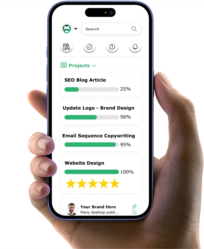
If you want to get your marketing work done for your business (or for your clients’), then you HAVE to learn more how you can delegate unlimited marketing projects & tasks without the headaches of hiring. Download this free guide: 33 Examples of Marketing Projects You Can Delegate to Growbo
Navigation Tip #1: Plan Your Website with Your Clients in Mind
Coaching website navigation is most effective when you design every step around your clients' actual needs. Many coaches make the mistake of building their site based on what they want to say, not what their clients need to find. According to the The Good, customer-centric approach creates a satisfying customer experience that becomes the key to crafting winning digital experiences that will, in turn, create loyal customers.

Client-Focused Website Mapping Process
- List your main client types and their goals. Write down 2-3 specific client profiles. For each, note what they're looking for when they land on your homepage. For example, a business coach might have one profile for startup founders who want quick strategy sessions, and another for established owners looking for long-term support.
- Sketch a simple sitemap showing logical pathways. Map out the journey from your homepage to your most valuable pages (like About, Services, Book a Call). Use a whiteboard, sticky notes, or a free tool like Miro. Ensure each step answers a client question or solves a need.
- Get real feedback from target clients. Ask two or three people who fit your ideal client profile to review your draft sitemap. Listen for confusion or missing steps.
- Revise your navigation based on feedback. Make changes to your menu structure and page order so that every click leads logically to the next step a client would want to take.
Industry Expert Perspective
Experienced coaches know that a "client-first" navigation approach leads to more inquiries and fewer bounces. Instead of guessing what clients want, they ask, test, and refine. This process is what separates effective coaching websites from those that just look nice.
Common Mistake to Avoid
- Designing navigation based solely on your own preferences or copying competitors without client input.
Quick Implementation Guide
- Time required: 1-2 days for mapping and feedback.
- Resources needed: Pen and paper or a free mapping tool, 2-3 client contacts for review.
Measurement Tips
- Track which pages visitors exit from most often. High exits from key pages may signal navigation problems.
- Success benchmark: Aim for at least a 15% increase in time-on-site after updating your navigation.
KEY INSIGHTS
- Client-driven navigation increases engagement and trust.
- Simple mapping and real feedback are more effective than guesswork.
- Small changes based on client needs can boost lead generation quickly.
Ready to make your menu names clear and helpful? The next section shows you exactly how to do that for higher engagement.
Navigation Tip #2: Use Clear and Helpful Menu Names
Coaching website navigation must start with clear, helpful menu names to guide visitors where they want to go. Many coaches use creative or vague terms, but research shows that simple, direct language boosts user engagement and reduces confusion. According to Gold Pebble, clear navigation and a user-friendly layout contribute to lower bounce rates. When visitors can quickly understand how to navigate your website and find relevant content, they are more likely to stay and explore further.

Menu Naming: Do This / Not That Comparison
- Use direct words like 'About', 'Services', 'Book a Call'
- Use creative terms like 'Journey', 'Transformations', 'Connect'
- Group similar pages under clear headings
- Scatter related pages across the menu
- Test menu names with real users
- Guess what users understand
Case Example
A leadership coach switched from 'The Journey' to 'Coaching Services' in the menu. Within a month, clicks to the services page increased by 18%.
Common Mistake to Avoid
- Choosing menu names based on personal preference or branding over clarity.
Quick Implementation Guide
- Time required: 1-2 hours to revise menu names and test with 2-3 users.
- Resources needed: Website access, feedback from actual or potential clients.
Measurement Tips
- Monitor which menu items are clicked most and track bounce rates from your main pages.
- Success benchmark: Aim for a 10-20% increase in clicks to key pages after updating menu names.
KEY INSIGHTS
- Clear menu names help visitors find what they need faster.
- User testing reveals confusing terms you may overlook.
- Small changes in wording can drive measurable engagement improvements.
Want to ensure your most important actions stand out on your site? The next section covers exactly how to do that for maximum impact.
Navigation Tip #3: Make Important Things Stand Out
Coaching website navigation should spotlight your most important offers or calls-to-action. If visitors can't quickly spot your main services or booking buttons, they're more likely to leave. Industry best practices recommend using visual hierarchy to direct attention, and a strong call-to-action (CTA), and high-quality visuals can all drive higher engagement and conversions, as reported by Saras Analytics.

Action Highlighting Step-by-Step
- Identify your top-priority action. Decide if it's 'Book a Call', 'Download a Guide', or another key step.
- Design your navigation so this action stands out. Use a contrasting color or button style in your menu for this action.
- Limit main menu items. Keep it to 5-7 items so your main action isn't buried.
- Test with a heatmap tool. Check if users are noticing and clicking your highlighted action.
Industry Expert Perspective
Top coaches prioritize their main call-to-action in both desktop and mobile menus, making it impossible to miss. This drives more bookings and downloads without overwhelming the visitor.
Common Mistake to Avoid
- Having too many competing menu items or hiding your main action in a dropdown.
Quick Implementation Guide
- Time required: 1-2 hours to redesign and test navigation highlights.
- Resources needed: Website editor, basic design skills, access to a free heatmap tool.
Measurement Tips
- Track clicks on your main action before and after changes.
- Success benchmark: Look for at least a 15% increase in action clicks within two weeks.
KEY INSIGHTS
- Highlighting your top action can quickly boost conversions.
- Visual hierarchy matters more than clever design.
- Testing with real users is the fastest way to spot what works.
Next, discover how to put your main coaching offers front and center for even better results.
Navigation Tip #4: Put Your Main Coaching Offers in the Spotlight for More Leads
Coaching website navigation works best when your main programs or services are featured prominently. Many coaches hide their best offers in dropdowns or secondary pages, missing out on leads. Instead, place your top offer directly in the main menu or at the top of your homepage. This makes it easy for visitors to find and act on your most valuable service.

KEY INSIGHTS
- One client saw a 15% boost in conversions by reorganizing their mobile menu to emphasize top-level navigation links that directed users to key pages rather than less relevant ones like "Home" or "About Us", according to The Good.
Case Example
A wellness coach added her flagship program to the top menu as 'Premium Coaching'. Within six weeks, program inquiries doubled.
Implementation Steps
- Decide which offer brings the most value to your business and clients.
- Add this offer as a dedicated menu item or homepage button.
- Use a short, clear label like 'VIP Coaching' or 'Group Program'.
Measurement Tips
- Track sign-ups or inquiries from the new menu position.
- Success benchmark: Seek a 10%+ increase in leads from the featured offer within one month.
Common Mistake to Avoid
- Hiding your main offer under generic menu items or deep in your site structure.
In the following section, you'll learn how to build trust with visitors right from your navigation menu.
Navigation Tip #5: Show Trust Signals Where People Can See Them
Coaching website navigation isn't just about moving between pages, it's about building trust from the first click. Placing reviews, credentials, or client logos near your main menu or top of the homepage reassures visitors that you're credible. According to a statistical study, websites that successfully integrate trust signals can see conversion rates soar by as much as 20%.

Implementation Tips
- Add a 'Testimonials' or 'As Seen In' link to your main menu.
- Display badges, certifications, or client logos above the fold on your homepage.
- Rotate recent reviews or success stories in a menu dropdown or sidebar.
Common Mistake to Avoid
- Hiding trust signals on a separate page that few visitors see.
Measurement Tips
- Monitor average session duration and inquiry rates after adding visible trust signals.
- Success benchmark: Look for a 10-20% increase in contact form submissions within a month.
KEY INSIGHTS
- Visible trust signals make visitors feel safe and confident in your services.
- Integrating reviews or logos into your main navigation increases the chance of conversion.
Curious how to make your website just as effective for mobile users? The next section explains how to optimize your navigation for every device.
Navigation Tip #6: Make Sure Your Site Works Well on Phones
Coaching website navigation needs to be just as effective on mobile devices as it is on desktop. More than 60% of users now visit sites from their phones, so if your navigation is hard to use on a small screen, you could be losing potential clients. A mobile-friendly menu helps visitors find what they need quickly, which leads to more inquiries and longer site visits.

Mobile Optimization Steps
- Test your site on multiple devices. Use your own phone and ask friends or clients to check your site on theirs. Look for any menu items that are hard to tap or hidden off-screen.
- Simplify your menu for mobile. Limit the top menu to 4-5 items. Use large, easy-to-tap buttons for key actions like 'Book a Call' or 'Contact.'
- Check loading speed and readability. Make sure text is clear and buttons don’t overlap.
Common Mistake to Avoid
- Forgetting to regularly test your site after updates, which can break mobile navigation.
Measurement Tips
- Compare mobile vs. desktop inquiry rates using Google Analytics.
- Success benchmark: Aim for at least 50% of your leads to come from mobile users.
KEY INSIGHTS
- Test navigation is critical for reaching busy coaching clients who browse on the go.
- Simple, visible menu items and fast loading times directly increase conversions.
Next, let's look at how to tailor your navigation for the unique needs of different coaching clients.
Navigation Tip #7: Personalize for Different Types of Clients
Coaching website navigation should reflect the different goals and backgrounds of your clients. Coaches often serve several types of clients—each with unique needs. Personalizing navigation helps each visitor feel like your site was built just for them, which increases trust and engagement. Read more about personalization marketing in this article.

Personalization Implementation Steps
- Identify your main client segments. For example, if you coach both executives and entrepreneurs, list their specific needs and goals.
- Create dedicated pages or sections for each segment. Use menu labels like 'For Executives' or 'For Startups' so visitors can self-select right from the homepage.
- Show relevant offers or resources based on user choice. Use simple website tools to display different lead magnets, testimonials, or program details for each group.
Case Example
A life coach added separate menu tabs for 'Career Coaching' and 'Personal Growth.' Visitors spent 25% more time on the site and downloaded more resources.
Common Mistake to Avoid
- Showing the same generic content to all visitors, which can make your site feel impersonal.
Measurement Tips
- Track which personalized pages get the most clicks and downloads.
- Success benchmark: Look for at least a 20% increase in engagement on personalized sections.
KEY INSIGHTS
- Personalized navigation makes clients feel seen and understood.
- Segmented menus and targeted offers drive higher engagement and more leads.
Now that your navigation is tailored for different clients, it's time to make it easy for all visitors to take action with simple lead capture buttons.
Navigation Tip #8: Add Simple Lead Capture Buttons in Your Menu to Boost Conversion
Coaching website navigation should encourage visitors to take the next step, whether that's booking a call or downloading a free guide. Adding clear, simple lead capture buttons directly in your main menu can double your inquiries, especially for new visitors who may not scroll far.

Lead Capture Button Steps
- Choose your primary lead action. Decide if you want people to 'Book a Free Call,' 'Download a Guide,' or 'Join a Newsletter.'
- Add a prominent button to your main menu. Use a color that stands out from the rest of your navigation, but still matches your brand.
- Test button placement and wording. Try different positions and calls-to-action, then monitor which gets the most clicks.
Industry Expert Perspective
Top marketing coaches recommend using only one or two lead capture buttons in the menu to avoid overwhelming visitors. This focused approach makes it easier for people to take action without feeling pressured.
Common Mistake to Avoid
- Adding too many buttons or using vague calls-to-action like 'Click Here.'
Measurement Tips
- Track click-through rates and completed actions from menu buttons.
- Success benchmark: Look for a 25% increase in lead capture form submissions within a month of adding the button.
KEY INSIGHTS
- Clear, focused lead capture buttons increase conversion rates without cluttering your navigation.
- Testing button wording and placement is key for maximizing results.
With these strategies in place, your coaching website navigation will be primed for more leads and better client engagement. The final section will show you how to keep improving over time.
Navigation Tip #9: Keep Testing and Improving Your Navigation
Coaching website navigation isn't a one-time project. The most successful coaches regularly review and update their navigation based on real user behavior and feedback. This ongoing process ensures your site stays easy to use and keeps converting visitors into leads as your business evolves.
Continuous Optimization Steps
- Collect feedback from real users every quarter. Ask clients or prospects to complete simple tasks on your site, like booking a call or finding a resource. Note where they hesitate or get lost.
- Review analytics monthly. Use tools like Google Analytics and Hotjar to track which pages have high exit rates or low engagement. Identify bottlenecks in your navigation flow.
- Make small, targeted changes. Update menu names, move key offers, or simplify pathways based on your findings. Test each change and monitor results for 2-4 weeks.
Common Mistake to Avoid
- Making too many changes at once, which can confuse returning visitors and skew your data.
Measurement Tips
- Set specific goals for each change, like reducing bounce rate on a key page by 10% or increasing clicks to your lead magnet by 15%.
- Success benchmark: Achieve measurable improvements in at least one key metric after each optimization round.
KEY INSIGHTS
- Regular testing and small tweaks prevent your navigation from becoming outdated.
- Data-driven changes are more effective than guessing what works.
Key insights from this section include the importance of ongoing user feedback, analytics-driven updates, and incremental improvements to keep your site high-performing.
Key Takeaways: Your Coaching Website Navigation Checklist
- Design navigation around your clients' real needs, not just your own preferences.
- Use clear menu names, highlight your main action, and make trust signals visible.
- Optimize for mobile, personalize for different clients, and add simple lead capture buttons.
- Commit to regular testing and improvement for ongoing results.
Implementing these strategies will help you attract more leads, build trust, and make your site easier to use for every visitor. (Learn more navigation tactics in this article that focuses on agency websites).
If you want to get your marketing work done for your business (or for your clients’), then you HAVE to learn more how you can delegate unlimited marketing projects & tasks without the headaches of hiring. Download this free guide: 33 Examples of Marketing Projects You Can Delegate to Growbo
CONCLUSION
Ever feel like your coaching website could do more to welcome your clients? Clear, friendly navigation is the key to making every visitor feel at home and confident to reach out. Even small tweaks—like simple menu names or a standout button—can help your business grow.
- Build your navigation around what your clients need most—not just what you want to share.
- Use clear menu names and highlight your main offer with an easy-to-find button.
- Show trust signals and your best offers where everyone can see them, especially on mobile devices.
You don’t have to handle all these updates alone. Imagine having a friendly team on your side, ready to fix your coaching website navigation and take care of every marketing detail—no hiring, no stress. See how easy it can be to get marketing off your plate. Got a question or want to share your own story? Leave a comment below—let’s help each other succeed!
Want to talk through your website or marketing goals with a real person? Schedule a free call with our team and see how Growbo can help you reach your next milestone.
Keep Growin', Stay Focused,
![]()
Image Credits:
1. https://www.ccd-grow.de/en/leistungen/life-coaching-2/
2. https://www.drshefali.com/
3. https://www.alyssanobriga.com/
4. https://christinehassler.com/
5. https://coachingtocomealive.com/transformational-coaching-services/client-testimonials/
6. https://theshiftnetwork.com/
7. https://www.jodymichael.com/
8. https://shereenhoban.com/