Improve Your Course Checkout in 9 Simple Steps

You spend countless hours perfecting your online course, valuable content, engaging lessons, and actionable insights—only to watch potential costumers disappear at the final step: the checkout. Frustrating, isn’t it? You're not alone. Many course creators struggle with cart abandonment, and often, it's not the product that's the problem it's the checkout experience.
The truth is, a confusing or clunky checkout can quietly kill conversions. All that effort you put into attracting and nurturing leads can fall flat in seconds if the buying process isn’t seamless. But the good news? A smooth, strategic checkout isn’t just about tech—it’s about creating trust and momentum.
In this article, you’ll uncover practical ways to turn your checkout from a roadblock into a conversion booster. You’ll learn:
How to simplify the user journey so customers stay engaged and don’t drop off.
Techniques to streamline your checkout page and remove unnecessary friction.
Smart strategies to guide buyers with calls-to-action that lead to more sales.
The key factors that reduce cart abandonment and increase completion rates.
Creative ways to personalize the checkout experience and make each buyer feel seen.
Many course creators focus exclusively on developing great content but overlook the critical final step, the checkout process. This oversight can cost you significant revenue and student satisfaction. By implementing the strategies in this article, you'll remove the friction that's currently preventing interested prospects from becoming clients.
Let’s dive in and transform your checkout process into a powerful driver of sales and satisfaction…
If you want to get your marketing work done for your business (or for your clients’), then you HAVE to learn more how you can delegate unlimited marketing projects & tasks without the headaches of hiring. Download this free guide: 33 Examples of Marketing Projects You Can Delegate to Growbo
Course Checkout Page Step #1: Simplifying The User Journey
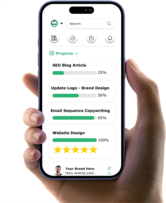
Simplifying the user journey is a fundamental step in enhancing your online course checkout process. When potential customers encounter a complicated checkout, their likelihood of completing a purchase diminishes significantly. According to Heights Platform, businesses that optimized their checkout process saw an average increase of 35% in conversions. You may be surprised to learn that a poorly optimized mobile checkout process can lead to high abandonment rates, as users often abandon their carts if they encounter difficulties on their devices.
To create a mobile-friendly checkout experience, start by ensuring that your website is responsive. This means that it should automatically adjust to fit the screen size of any device. A responsive design not only improves usability but also enhances the overall aesthetic of your course site. Additionally, consider simplifying navigation on mobile devices. Users should be able to easily access the checkout page without unnecessary clicks or distractions. This streamlined approach can help keep potential customers engaged and reduce the likelihood of them abandoning their purchase.
Key insights from this section include:
- Streamlining the checkout process is essential for increasing conversions.
- Minimizing required fields can reduce friction and improve user experience.
- Clear instructions and progress indicators enhance user confidence during checkout.
Course Checkout Page Step #2: Optimizing for Mobile Devices
In today's digital landscape, optimizing for mobile devices is essential for any online course provider. As more users access courses through their smartphones and tablets, ensuring a seamless mobile experience can significantly impact your conversion rates. According to Heights Platform, around 70% of online shopping carts are being abandoned by users, and one of the reasons for this is a poor checkout experience. You may be surprised to learn that a poorly optimized mobile checkout process can lead to high abandonment rates, as users often abandon their carts if they encounter difficulties on their devices.

To create a mobile-friendly checkout experience, start by ensuring that your website is responsive. This means that it should automatically adjust to fit the screen size of any device. A responsive design not only improves usability but also enhances the overall aesthetic of your course site. Additionally, consider simplifying navigation on mobile devices. Users should be able to easily access the checkout page without unnecessary clicks or distractions. This streamlined approach can help keep potential customers engaged and reduce the likelihood of them abandoning their purchase.
Another key aspect of mobile optimization is the speed of your checkout process. Mobile users often expect quick loading times, and any delay can lead to frustration. Therefore, optimizing images, minimizing redirects, and utilizing efficient coding practices can greatly enhance the speed of your mobile checkout.
Key insights from this section include:
- Mobile optimization is essential for increasing conversion rates in online courses.
- A responsive design improves usability and accessibility for mobile users.
- Speeding up the mobile checkout process can significantly reduce abandonment rates.
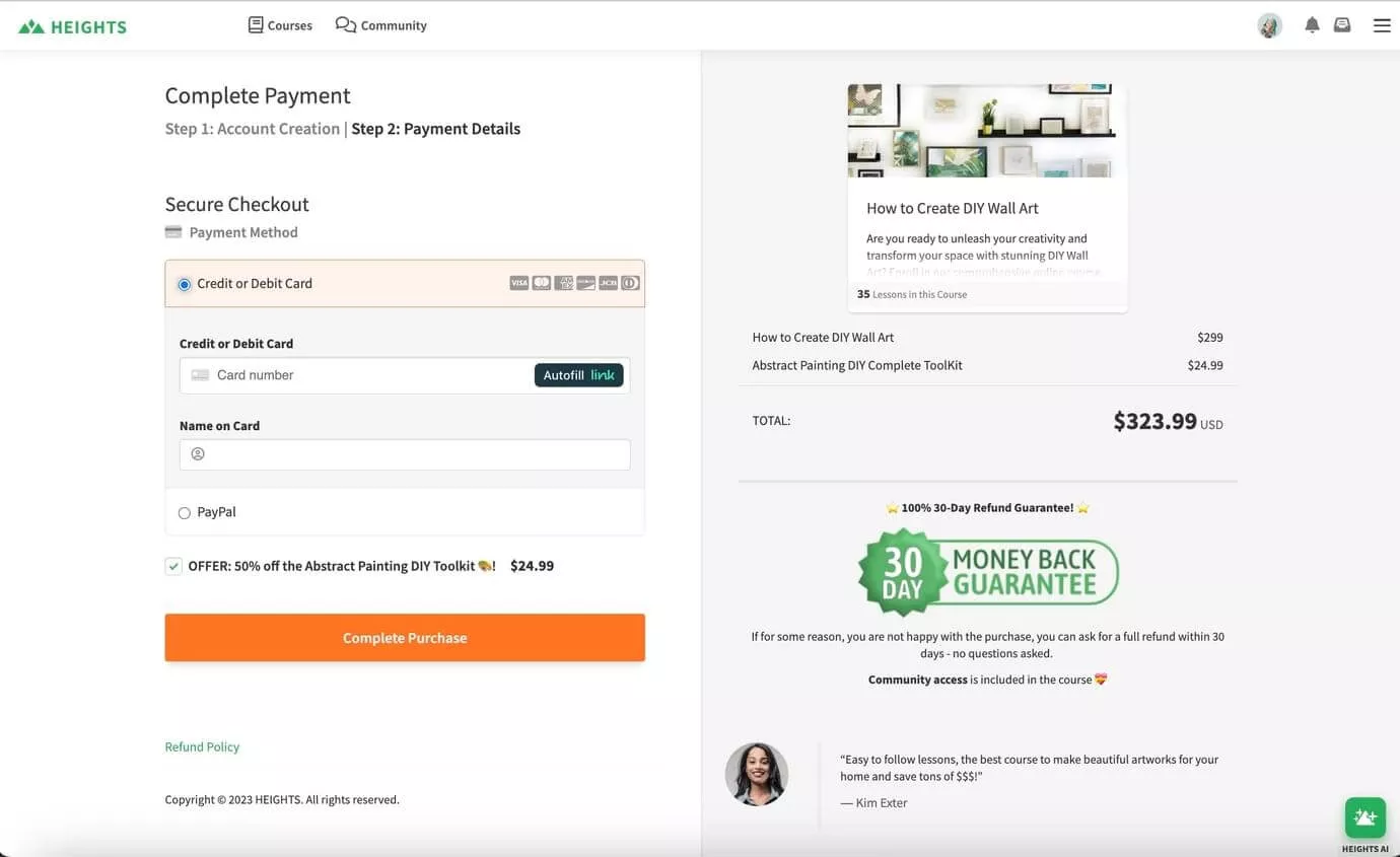
Course Checkout Page Step #3: Offering Multiple Payment Options
When it comes to online courses, offering multiple payment options is crucial for accommodating a diverse range of customers. You might be surprised to learn that not providing preferred payment methods can lead to cart abandonment. A study from Pipelinep It Tech shows that about 13% of shoppers abandon their carts because a store doesn't offer enough payment methods. This means that by expanding your payment options, you can significantly increase your conversion rates.
Consider incorporating popular payment methods such as credit cards, PayPal, and even newer options like digital wallets or buy now, pay later services. Each customer has unique preferences, and allowing them to choose how they pay can enhance their overall experience. For instance, some users may prefer the security of PayPal, while others might opt for the convenience of a credit card. By accommodating these preferences, you not only make the checkout process smoother but also build trust with your customers.

Additionally, it’s essential to ensure that your payment process is secure and user-friendly. Customers are increasingly concerned about the safety of their financial information, and providing a secure environment can alleviate these concerns. Implementing SSL certificates and displaying security badges can reassure users that their data is protected. Remember, a positive checkout experience is key to retaining customers and encouraging repeat business.
Key insights from this section include:
- Offering multiple payment options can reduce cart abandonment rates.
- Diverse payment methods cater to different customer preferences.
- Ensuring a secure payment process builds trust and enhances user experience.
Course Checkout Page Step #4: Creating a Clear Call to Action
Creating a clear call to action (CTA) is essential for guiding potential customers through the checkout process. A well-designed CTA can significantly influence conversion rates and ensure that users complete their purchases. Research from HubSpot shows that personalized CTAs convert 202% better than basic ones. This highlights the importance of not only having a CTA but also making it effective and compelling.
To craft an effective CTA, start by using clear and actionable language. Phrases like "Complete Your Purchase" or "Enroll Now" provide users with a clear understanding of what action they need to take next. Additionally, consider using contrasting colors for your CTA buttons to make them stand out on the page. This visual distinction can draw users' attention and encourage them to click.
It's also important to place your CTAs strategically throughout the checkout process. For instance, having a prominent CTA at the top of the checkout page, as well as at the bottom, can guide users seamlessly through their journey. You should also ensure that CTAs are easy to find and not buried within other content. Remember, the goal is to make the checkout process as straightforward as possible, and a clear CTA is a crucial element in achieving that.

Key insights from this section include:
- A clear call to action can significantly influence conversion rates.
- Using actionable language and contrasting colors enhances CTA effectiveness.
- Strategic placement of CTAs throughout the checkout process improves user experience.
Course Checkout Page Step #5: Implementing Exit-Intent Popups
Implementing exit-intent popups can be a powerful strategy for retaining potential customers who are about to leave your checkout page. According to SemRush, approximately 68% of online shopping carts are abandoned, with distractions during the checkout process being a major reason. By utilizing exit-intent popups, you can capture the attention of these users right before they leave, offering them a compelling reason to stay and complete their purchase.
Exit-intent popups work by detecting user behavior, such as mouse movements that indicate they are about to navigate away from the page. When this behavior is detected, a popup can appear, providing an incentive to stay. This could be a discount offer, free shipping, or even a reminder of the benefits of your course. For example, a simple message like "Wait! Here’s 10% off your purchase if you complete it now!" can be effective in encouraging users to reconsider.

However, it's essential to ensure that your exit-intent popups are not intrusive or overwhelming. They should be designed to enhance the user experience rather than disrupt it. Consider using a clean design with a clear message and a straightforward call to action. Additionally, you should provide an easy way for users to close the popup if they are not interested. Remember, the goal is to engage users without creating frustration, which can lead to further abandonment.
Key insights from this section include:
- Exit-intent popups can help retain customers who are about to abandon their carts.
- Offering incentives through popups can encourage users to complete their purchases.
- Popups should be designed to enhance the user experience, not disrupt it.
Course Checkout Page Step #6: Using Progress Indicators
Using progress indicators during the checkout process is a crucial strategy for enhancing user experience and increasing conversion rates. You might be surprised to learn that many users abandon their purchases simply because they feel uncertain about how long the checkout process will take. Research from Semrush shows that 25% of people who abandon carts because of overly complex navigation. By clearly showing users how far along they are in the process, you help them feel more in control of their experience.
Progress indicators can take various forms, such as a simple percentage bar or a step-by-step guide showing users where they are in the checkout process. For instance, a bar that fills up as users complete each step visually reinforces their progress. You might consider adding messages like "You're almost there! Just one more step to go!" to encourage users to complete their purchase.
Additionally, it's important to make sure that the progress indicators are visually appealing and easy to understand. A cluttered or confusing design can have the opposite effect, leading to frustration and abandonment. By focusing on simplicity and clarity, you can enhance the overall checkout experience for your users. Remember, the goal is to make the process as smooth and reassuring as possible, guiding users toward a successful purchase.

Key insights from this section include:
- Progress indicators help reduce anxiety and improve user confidence during checkout.
- Visual cues like percentage bars motivate users to complete their purchases.
- Clear and appealing designs enhance the overall checkout experience.
Course Checkout Page Step #7: Personalizing the Checkout Experience
Personalizing the checkout experience can significantly enhance user satisfaction and increase conversion rates for your online courses. You might be surprised to learn that tailored experiences can lead to higher engagement levels, as customers appreciate when businesses recognize their individual preferences. According to research from LinkedIn, personalized checkout experiences can boost conversion rates by up to 30%, highlighting the value of customization in the checkout process.
To create a personalized experience, start by addressing users by their names in the checkout process. Simple touches, such as greeting returning customers with a message like "Welcome back, [Name]!" can make a significant difference in how valued they feel. Additionally, consider using data from previous interactions to suggest relevant courses or upsell opportunities based on their interests. For example, if a user has previously shown interest in graphic design courses, you might recommend related offerings during checkout.

Moreover, providing options for users to save their preferences or payment information for future purchases can enhance convenience and streamline the process. This not only simplifies their experience but also encourages repeat business, as customers are more likely to return if they know their preferences are remembered. Remember, the more you can tailor the experience to meet individual needs, the more likely users are to complete their purchases.
Key insights from this section include:
- Personalization can significantly enhance user satisfaction and increase conversion rates.
- Addressing users by name and suggesting relevant courses can improve engagement.
- Allowing users to save preferences streamlines future purchases and encourages repeat business.
Course Checkout page step #8: A/B Testing for Continuous Improvement
A/B testing is a method that lets you compare two versions of a webpage to see which one performs better in terms of conversion rates. According to a case study on Slideshare implemented A/B tests across various pages, including the checkout process, resulting in an increase in conversion rate from 3.54% to 4.26%. This shows how important it is to refine your checkout experience based on what your users prefer.
To get started with A/B testing, think about specific elements of your checkout process you want to improve. This could be anything from the color of your CTA buttons to the layout of your checkout page. Once you identify these elements, create two versions: one for control and one for the variant. Direct traffic to both versions to analyze user interactions and find out which design leads to more conversions.
Make sure your A/B tests are statistically significant. This means you need enough data to make reliable conclusions. And remember, patience is key; it might take some time to see meaningful results. The goal of A/B testing is to learn more about your customers and how they interact with your checkout process, allowing you to make informed decisions that enhance their experience.
You can use tools that can help you test your checkout page


Key insights from this section include:
- A/B testing can significantly improve conversion rates by optimizing specific elements of your checkout process.
- Identifying key elements to test and ensuring statistical significance is crucial for reliable results.
- Patience is essential, as meaningful insights may take time to surface.
Course Checkout Page Step #9: Incorporating Customer Support Options
Incorporating customer support options during the checkout process is vital for addressing user concerns and improving satisfaction. Research from Shopify shows that 41% of customers feel live chat is the best way to communicate with a business. Customers often have questions or need assistance while completing their purchases. Providing them with easy access to help can make a huge difference.

Think about offering multiple support channels, such as live chat, email, and phone support. Live chat is particularly effective because it allows customers to get immediate answers without leaving the checkout page. Also, having a comprehensive FAQ section can help address common concerns and guide users through the process.
Ensure your customer support team is well-trained to handle inquiries related to the checkout process. Prompt and helpful responses can enhance the overall user experience and build trust with your customers. Remember, the goal is to make the checkout process as smooth as possible, and having accessible support options is a key part of that experience.
Key insights from this section include:
- Accessible customer support can significantly reduce cart abandonment rates.
- Offering multiple support channels, such as live chat and email, enhances user experience.
- Well-trained support teams can address user concerns effectively, building trust and satisfaction.
If you want to get your marketing work done for your business (or for your clients’), then you HAVE to learn more how you can delegate unlimited marketing projects & tasks without the headaches of hiring. Download this free guide: 33 Examples of Marketing Projects You Can Delegate to Growbo
Conclusion
In summary, optimizing your course checkout process is absolutely essential for converting interested prospects into paying students. By implementing strategic improvements to your user journey and checkout experience, you can significantly reduce cart abandonment and boost your course sales. Here are nine key takeaways to enhance your checkout process:
- Streamline the user journey to keep customers engaged and minimize dropouts.
- Simplify the checkout so it feels quick, intuitive, and effortless.
- Position clear calls to action that guide users effectively through each step.
- Implement abandonment reduction strategies to recover potential lost sales.
- Personalize the checkout experience to make each customer feel valued.
- Ensure mobile optimization for the growing number of smartphone users.
- Offer multiple payment options to accommodate different preferences.
- Provide accessible support at critical decision points.
- Regularly test and refine your checkout flow based on user behavior.
Feeling overwhelmed by the technical aspects of optimizing your course checkout? That's where Growbo comes in! Our marketing specialists can transform your checkout process to maximize conversions and client satisfaction. No more losing potential students at the final hurdle—we handle everything from user experience design to abandonment recovery strategies.
Our team delivers:
- Professional checkout flow optimization
- Strategic placement of conversion elements
- Mobile-responsive design implementation
- Abandonment recovery systems
- Ongoing performance analysis and improvements
Skip the stress of hiring freelancers or managing everything yourself, let Growbo streamline your marketing and boost your course sales. Schedule a call now. And if you found this article helpful, drop a comment below. We’d love to hear your thoughts and questions!
Keep Growin', Stay Focused,

Image Credits:
1 - https://www.heightsplatform.com/blog/how-to-optimize-your-online-course-checkout-page-for-better-conversions
2 - https://checkout.edx.org/en/checkout/?sku=6482B69&sku=5181396&bundle=0ce916b6-ca09-4bc9-9d7f-6db0b2d9af97
3 - https://www.pluralsight.com/buy?requestId=73dd1441-c9c1-40ae-a891-8512222d3fd0&priceOptionId=2824d8ab-dd36-45d6-a9ab-cb8a84d71557&legacyTrackingId=CORE-Y-TECH-TEST&time=1745949277031&productOptionId=20af10e9-0097-4544-84e6-bf483f877c85&productOptionId=20af10e9-0097-4544-84e6-bf483f877c85&planId=Individual+plan&quantity=1
4 - https://www.omnisend.com/blog/exit-intent-popup-examples-small-online-businesses/
5 - https://www.thegreatcourses.com/checkout
6 - https://checkoutpage.com/help/articles/how-to-make-test-payments
7 - https://www.stacksocial.com/checkout