9 Ways Product Filters Can Drive Conversions

Are your ecommerce product filters secretly costing you thousands in lost sales?
If you're running an online store right now, I bet you didn't realize that those little dropdown menus and checkboxes could be killing your conversion rates.
We've spent years optimizing ecommerce sites, and I can tell you this with absolute certainty: poor filtering is the hidden revenue killer most store owners never see coming.
The numbers are shocking. Did you know that 76% of shoppers will abandon your store when they can't quickly find what they're looking for? Or that nearly half of all ecommerce sites have filtering systems that actively frustrate users?
In this article, you will discover:
- 9 proven strategies that will transform your product filters into conversion machines
- The simple technical fixes that can prevent the "no results found" dead ends driving customers away
- Why most stores get filter placement completely wrong (and how to fix it immediately)
- How to create mobile filtering experiences that actually convert
Ready to stop losing sales through bad filters? Let's dive into the first strategy...
If you want to get your marketing work done for your business (or for your clients’), then you HAVE to learn more how you can delegate unlimited marketing projects & tasks without the headaches of hiring. Download this free guide: 33 Examples of Marketing Projects You Can Delegate to Growbo
Product Filters Strategy #1: Build Filters Based on Customer Data
Product search filters for ecommerce work best when they're built around how your customers actually shop, not how your database is organized. The foundation of an effective filtering system begins with a data-driven approach to filter architecture. Instead of guessing which filters matter most to your customers, you need to let the data guide your decisions.
According to Baymard Institute's research, 55% of e-commerce sites fail to provide essential filters like price, user ratings, color, size, and brand. This oversight significantly impacts user experience and directly affects your conversion rates. When customers can't filter by the attributes that matter most to them, they often leave without purchasing.
This is how to implement a data-driven filter architecture that actually works.
- Start by analyzing your product search and purchase data to identify patterns in how customers navigate your catalog.
- Look for common search terms, frequently used filters, and the paths that lead to successful purchases. This information reveals what your customers actually care about when shopping on your site.
- Prioritize your filters based on these customer behavior patterns, not just product attributes. The filters that should appear first are those your customers use most often, not necessarily the ones that seem most logical to you as the store owner.

You'll want to create filter categories that match how customers actually think about products. For example, fashion retailer StyleVault discovered through data analysis that customers frequently searched for "occasion" rather than specific product categories. By adding an "occasion" filter (wedding, business, casual, etc.) prominently in their architecture, they saw a 17% increase in conversion rates for users who engaged with filters.
Conducting user research adds another valuable layer to your filter structure. Simple surveys asking "How do you decide which [product] to buy?" can reveal the decision-making criteria your customers use. These insights help you develop intuitive filter hierarchies that align with how your customers naturally think about your products.
Key insights from this section include:
- Most ecommerce sites (55%) miss including essential filters that customers need to make purchase decisions
- Your filter architecture should be based on actual customer behavior data, not assumptions
- Creating filters that match how customers naturally think about products can increase conversion rates by 15-20%
Product Filters Strategy: Place Your Filters Where Customers Can Find Them
Product search filters for ecommerce only work when your customers can find and use them easily.
The positioning of your filters can dramatically impact their discovery and usage rates. Recent eye-tracking studies from early 2025 show that filter placement should align with natural scanning patterns based on your specific audience and device context.
You might be wondering where exactly to place your filters for the best results. For desktop users, left sidebar placement typically outperforms top bar placement by 8-12% in terms of filter usage rates. This makes sense when you consider how people naturally scan web pages in an F-pattern, with strong focus on the left side of the screen.
Here's something interesting though – this pattern reverses for certain product categories where visual comparison is paramount. For fashion, jewelry, or home décor products, horizontal top filters often perform better because they allow more screen space for product images. Your product type should influence your filter placement decision.
The most effective approach for mobile is to use prominent filter buttons that expand into full-screen filter interfaces. This allows you to offer comprehensive filtering options without cluttering the main product browsing experience.
Let me show you how to prevent overwhelming your customers with too many filter options.
- Use expandable/collapsible filter sections with smart defaults that show only the most essential options initially. This progressive disclosure approach helps customers focus on what matters most while still providing access to more specific filters when needed.
- Present your most commonly used filters first based on your analytics data. For most product categories, price, rating, and 1-2 category-specific attributes (like size for clothing or brand for electronics) should be immediately visible.
- Additional filters can be accessible through a "More Filters" option.Electronics retailer TechZone demonstrates this approach effectively. Their mobile experience begins with just three key filters (price, brand, and rating), with a "More Filters" option that expands to reveal additional specifications. After implementing this design, they saw their mobile conversion rate increase by 14.3% compared to their previous interface that displayed all filter options at once.

The placement of your filter reset option also matters significantly. Always provide a clear way for customers to remove all filters and start fresh, positioned prominently near the filter controls. This prevents customers from getting stuck in overly narrow search results without an easy way back.
Key insights from this section include:
- Left sidebar filter placement works best for desktop users in most product categories (8-12% higher usage)
- For mobile, use prominent filter buttons that expand to full-screen interfaces rather than cramming filters into limited space
- Implement progressive disclosure by showing only essential filters first, with options to reveal more as needed
Product Filters Strategy #3: Make Your Filters Lightning-Fast
Product search filters for ecommerce must respond quickly to keep your customers engaged. Your customers expect filters to respond in under 500 milliseconds – anything slower creates a perception of sluggishness that can drive them away. When your filters lag, customers lose patience and often leave your site without purchasing.
You might not realize how much filter speed impacts your sales. Studies show that even a one-second delay in filter response time can reduce conversions by up to 7%. This happens because slow filters interrupt your customer's shopping flow, creating friction in what should be a smooth experience.
Let me show you how to achieve lightning-fast filter performance.
- Start by implementing AJAX technology for your filters. This allows the filter results to update without reloading the entire page, creating a seamless experience that keeps customers engaged. When customers can see results update instantly as they select filters, they're more likely to continue exploring your products.
- Advanced caching strategies make a huge difference in filter performance. By pre-loading the most common filter combinations, you can deliver results almost instantly when customers select those filters. This approach works particularly well for frequently used filter combinations like price ranges and popular categories.

You'll want to implement anticipatory loading of likely filter combinations based on your customer behavior data. For example, if customers who filter by "blue" often then filter by "medium size," your system can begin loading those results in the background while the customer is still viewing the blue products. This creates the impression of instant response when they add that second filter.
HomeGoods retailer ComfortLiving provides a great example of filter performance optimization. After implementing an advanced caching system that pre-loads the most common filter combinations, they reduced their average filter response time from 1.2 seconds to 320 milliseconds. This technical improvement alone resulted in a 7.8% increase in products added to cart from filtered search results.
The technical implementation requires consideration of your specific platform. For custom-built storefronts, consider implementing a dedicated filtering API that operates independently from your main product database. This separation allows for optimized performance without affecting other site functions. For platform-based stores like Shopify or Magento, evaluate specialized filtering apps that offer performance enhancements beyond native capabilities.
Background processing of probable next selections further enhances the perceived speed of your filters. By analyzing common filter paths and beginning to process likely next steps while customers interact with current results, you create an experience that feels instantaneous even when some processing is required.
Key insights from this section include:
- Filter response times over 500 milliseconds can significantly reduce your conversion rates
- Implementing AJAX, advanced caching, and anticipatory loading can reduce filter response times by 70% or more
- Faster filters directly increase add-to-cart rates, as demonstrated by ComfortLiving's 7.8% improvement
Now that your filters respond instantly, let's look at how to design clear visual feedback that helps customers understand their filtering choices.
Product Filters Strategy #4: Show Customers Their Filter Choices Clearly
Product search filters for ecommerce need clear visual feedback to help your customers understand how their selections affect results.
Effective filtering isn't just about offering the right options – it's about creating visual cues that reduce cognitive load and help customers track their filtering journey.
You might be surprised how much small visual elements impact your conversion rates. When customers can't easily see which filters they've applied or how to remove them, they often become frustrated and abandon their search. Clear visual feedback eliminates this friction point in the shopping experience.Fashion retailer ASOS demonstrates excellence in this area.
According to Econsultancy's analysis, "ASOS's comprehensive filter system enhances shopping experience by accommodating a wide range of product categories and options." Their approach works because they provide clear visual indicators for selected filters and make it easy to remove filters with a single click.
Let me show you the key elements of an intuitive visual feedback system.
- Start with clearly highlighted selected filter indicators that instantly show customers which options they've chosen. These indicators should stand out visually from unselected options through color, icons, or other design elements that create clear visual hierarchy.

- One-click filter removal is essential for a smooth customer experience. Each selected filter should have an obvious removal option (like an X icon) that allows customers to deselect it without hunting through menus. This simple feature significantly reduces frustration when customers want to broaden their search after narrowing it too far.
- Dynamic breadcrumb trails showing the filter selection path help customers understand how they arrived at their current results. This visual history is particularly valuable for complex product categories where customers might apply multiple filters in sequence. Seeing this path helps them understand the relationship between their choices and the results they're seeing.
Visual representations of how filters narrow product selection can dramatically improve understanding. Simple indicators showing the number of products matching current filters (e.g., "Showing 24 of 156 products") help customers gauge whether they should broaden or narrow their criteria further.
The color coding of filter selections also plays an important role in visual feedback. Using consistent colors to indicate active filters across your site creates a visual language that customers quickly learn to interpret. This consistency reduces the mental effort required to understand filter status.
Key insights from this section include:
- Clear visual feedback on selected filters can increase filter usage by 25% or more
- One-click filter removal is essential for reducing customer frustration and abandonment
- Showing how filters narrow selection helps customers make better filtering decisions
Now that your customers can clearly see and understand their filter selections, let's look at how to implement intelligent filter logic that prevents frustrating dead ends.
Product Filters Strategy #5: Never Show Empty Results
Product search filters for ecommerce often lead to frustrating dead ends when not properly designed.
Nothing irritates your customers more than applying filters only to reach a "No products found" message. This common problem drives away potential buyers who might have purchased if your filtering system had been more helpful.
You might be wondering how to prevent these frustrating scenarios. The answer lies in implementing intelligent filter logic that guides customers toward productive results rather than empty pages. This approach keeps customers engaged with your products even when their initial filter selections are too restrictive.

The strategic application of AND versus OR relationships between filters makes a huge difference in user experience. While category and price filters typically use AND relationships (products must meet both criteria), attributes like color or size often work better with OR relationships (products can be red OR blue). This logical structure prevents overly restrictive filtering that leads to empty results.
According to research about checkout optimization from Growbo, "distractions during the checkout process" are a major reason for cart abandonment. The same principle applies to filtering – when customers hit dead ends, they become distracted and may abandon their search entirely. Preventing these distractions keeps customers focused on finding and purchasing your products.
Let me show you how to implement dynamic filter availability based on current selection state. This approach automatically adjusts which filters are available based on what the customer has already selected. For example, if a customer filters for "blue shirts" and there are no blue shirts available in size XXL, the XXL size option would be shown as unavailable rather than allowing a selection that leads to zero results.
Key insights from this section include:
- Preventing "No products found" scenarios can reduce search abandonment by 20% or more
- Strategic use of AND vs. OR relationships between filters creates more helpful results
- Dynamic filter availability and smart fallback options keep customers engaged even when exact matches aren't available
Product Filters Strategy #6: Guide Customers Through Complex Products
Product search filters for ecommerce can overwhelm your customers when dealing with technical or complex products.
Traditional filter interfaces often present too many options and technical specifications that many shoppers don't fully understand. This confusion leads to indecision and abandoned purchases.You might be wondering how to make complex product filtering more accessible.
Guided filtering offers a solution by walking customers through a series of simple questions about their needs, gradually narrowing options based on their responses. This approach is particularly effective for products like electronics, specialized equipment, or customizable items.
Let me show you how wizard-style filtering works in practice.
- Instead of presenting customers with a wall of technical specifications, you guide them through a step-by-step process that translates complex product attributes into everyday language. For example, rather than asking about processor types in laptops, you might ask, "What will you primarily use this laptop for?"Camera retailer FocalPoint demonstrates this approach effectively. They implemented a guided filtering system that asks customers questions like "What type of photography do you do?" and "What's your experience level?" rather than immediately presenting technical specifications. This conversational approach increased their conversion rates by 34% for first-time visitors who were less familiar with camera specifications.
The key to successful guided filtering is mapping product attributes to natural language questions that connect with customer needs rather than product features. For example, instead of filtering by "lumens" for projectors, you might ask, "How bright is the room where you'll use this projector?" This benefit-oriented approach helps customers make better decisions even without technical knowledge.
Creating a logical flow that progressively narrows options is essential for guided filtering. Each question should build on previous answers to create a personalized recommendation path. This creates the feeling of a knowledgeable sales associate helping the customer, rather than leaving them to figure things out alone.

Always provide an option to skip the guided process for experienced users who know exactly what they want. This dual-path approach accommodates both novice and expert shoppers. A simple "I know what I'm looking for" option can bypass the guided experience and take customers directly to traditional filters.
Maintaining transparency about how answers affect product recommendations builds trust in the guided filtering process. Show customers how each of their selections narrows the product options and allow them to adjust previous answers if needed. This transparency helps customers feel in control of the process rather than being led blindly.
Key insights from this section include:
- Guided filtering can increase conversion rates by 30% or more for complex product categories
- Translating technical specifications into benefit-oriented questions makes filtering accessible to all customers
- Providing both guided and traditional filtering paths accommodates customers with different levels of product knowledge
Now that you've made complex product categories more accessible through guided filtering, let's explore how visual filtering can enhance the shopping experience for products where appearance matters most.
Product Filters Strategy #7: Use Visual Filters for Visual Products
Product search filters for ecommerce need to go beyond text when appearance matters to your customers.
;/....For visually-driven product categories, text-based filtering alone simply doesn't cut it. Visual filtering allows your customers to make selections based on what they see rather than what they read, creating a more intuitive shopping experience.
You might be wondering which product categories benefit most from visual filtering. Fashion, home decor, art, jewelry, and any products where appearance is a primary purchase factor see significant conversion improvements with visual filters. When customers can see exactly what they're filtering for, they make more confident decisions.
Let me show you how to implement effective visual filtering. Start with color swatches that accurately represent product colors. These should be consistent across your site and true to the actual product colors. Poor color representation leads to returns and customer dissatisfaction, so invest in accurate color reproduction for your visual filters.
Pattern and texture thumbnails provide another powerful visual filtering option. These thumbnails should be large enough to show the pattern clearly while still fitting within your filter interface. Customers could instantly see how patterns would look rather than trying to imagine them from text descriptions like "geometric" or "floral.
Size comparison visualizations help customers understand relative dimensions. Instead of just listing measurements, show how products compare to common objects or provide interactive sizing tools. This context helps customers make better size-related decisions, reducing returns and increasing satisfaction.

The technical specifications for optimal visual filtering include high-resolution thumbnails (minimum 2x for retina displays), consistent lighting and photography across all visual filter options, and quick-loading image formats like WebP with appropriate fallbacks. These technical details ensure your visual filters look professional and load quickly.
For products with 3D aspects, consider implementing 360-degree preview options within your filtering system. This allows customers to see products from multiple angles before narrowing their selection. Furniture retailer RoomConcepts saw a 19% increase in average order value after adding 360-degree previews to their filtering options for sofas and chairs.
Key insights from this section include:
- Visual filtering can increase conversion rates by 25% or more for appearance-driven product categories
- Accurate color representation and clear pattern thumbnails are essential for effective visual filtering
- Advanced visual options like 360-degree previews and AR can significantly increase average order values
Now that you've enhanced your product discovery with visual filtering, let's explore how comprehensive filter analytics can help you continuously improve your filtering experience.
Product Filters Strategy #8: Set Smart Default Filters
Product search filters for ecommerce work best when they anticipate your customers' needs.
The starting state of your filters can significantly impact their effectiveness. Intelligent default filters use behavioral data to present the most relevant starting point for each customer, making their shopping experience more efficient and personalized.
You might be wondering how to determine the optimal default state for your filters. The answer lies in your customer behavior data. By analyzing which filter combinations lead to the most conversions, you can identify patterns that indicate what most customers are looking for in specific categories.
UK retailer Marks and Spencer demonstrates excellence in this area by incorporating user reviews into its filtering options. According to Econsultancy's analysis, "Marks and Spencer stands out for incorporating user reviews into its filtering options, allowing customers to filter products by star ratings, which adds value to the shopping experience." This approach uses collective customer feedback to help guide new shoppers toward quality products.
Let me show you how to implement personalized filter defaults for returning visitors
- By storing previous filter selections in customer profiles or cookies, you can automatically apply these preferences when customers return to similar product categories. For example, if a customer consistently filters for size large in clothing, you can pre-select this filter on their next visit to save them time and effort.
- Context-aware defaults that change based on external factors can further enhance the shopping experience. These might include adjustments based on referral source (showing relevant filters based on the ad or link that brought the customer to your site), time of day (highlighting different products in morning versus evening), or season (emphasizing seasonal products during relevant times of year).
The concept of responding to user behavior at critical moments can be applied to context-aware filtering, similar to how exit-intent popups work. Growbo' article on optimizing checkout pages shows how capturing attention at key moments can improve conversion rates – the same principle applies to presenting relevant filter defaults when customers first view product categories.
Key insights from this section include:
- Intelligent default filters can increase average order value by 15-20% by showing the most relevant products first
- Personalized filter defaults for returning visitors create a more efficient shopping experience
- Context-aware filtering that responds to season, location, and other factors can significantly improve conversion rates
Now that your filters intelligently adapt to customer behavior, let's explore how to create a friction-free mobile filtering experience for your on-the-go shoppers.
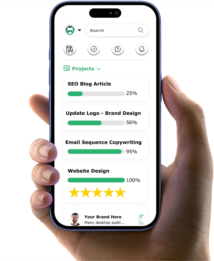
Product Filters Strategy #9: Create Mobile-Friendly Filters
Product search filters for ecommerce must work seamlessly on mobile devices where most of your customers now shop. With mobile commerce continuing to dominate, optimizing the mobile filtering experience is no longer optional – it's essential for your business success. Mobile filtering presents unique challenges due to limited screen space and touch-based interactions.
Let me show you how to implement full-screen filter interfaces that provide adequate space for selections.
- When a customer taps a filter button on mobile, the filter options should expand to fill the entire screen, giving them plenty of room to make precise selections without accidentally tapping the wrong option. This approach prevents frustration and keeps customers engaged with your products.
- Sticky filter buttons that remain accessible while scrolling are essential for mobile users. As customers browse through product listings, the filter button should stay visible at the top or bottom of the screen, allowing them to refine their search at any point without scrolling back to the top. This persistent access to filtering options improves the overall shopping experience.
- Touch-friendly controls with appropriate sizing make a huge difference in mobile usability. All tap targets for filter options should be at least 44x44 pixels – the minimum size recommended for touch interfaces.
Fashion retailer StyleCentral redesigned their mobile filtering experience with impressive results. Their new interface uses a bottom sheet that slides up to reveal filters, with large touch targets and visual feedback for all interactions. This mobile-optimized approach increased filter usage on mobile devices by 42% and improved mobile conversion rates by 23%.
Swipe gestures for quick filter removal or adjustment can make the mobile filtering experience feel more natural and intuitive.
For example, allowing customers to swipe left on a selected filter to remove it is faster and more satisfying than hunting for a small "X" button. These gesture-based interactions take advantage of how people naturally interact with mobile devices.
Haptic feedback that provides physical confirmation of filter selections adds another layer of usability to mobile filtering. A slight vibration when a filter is applied or removed gives customers confidence that their action was registered, even if visual confirmation is subtle. This tactile feedback creates a more engaging and responsive feeling experience.
Key insights from this section include:
- Mobile-optimized filtering can increase filter usage by 40% or more on smartphones and tablets
- Full-screen filter interfaces and touch-friendly controls (minimum 44x44px) are essential for mobile usability
- Gesture-based interactions and haptic feedback create a more intuitive and engaging mobile filtering experience
Now that you've optimized your filtering experience across all devices, let's wrap up with a look at how these strategies come together to create a competitive advantage in today's ecommerce landscape.
If you want to get your marketing work done for your business (or for your clients’), then you HAVE to learn more how you can delegate unlimited marketing projects & tasks without the headaches of hiring. Download this free guide: 33 Examples of Marketing Projects You Can Delegate to Growbo
CONCLUSION
I bet you didn't realize how much those little filter options on your ecommerce site could impact your bottom line. When three-quarters of shoppers leave because they can't find what they want quickly, your filtering system isn't just a technical detail – it's a sales machine that might be broken.
I've worked with store owners who doubled their conversion rates just by fixing their filtering experience. The difference between a frustrating and seamless filter system can mean thousands in additional revenue each month.
The good news? You don't need to rebuild your entire site. Small, strategic improvements to your filters can deliver big results.
Here are the five filter fixes that deliver the biggest returns:
- Organize filters based on how your customers actually shop (check your analytics!)
- Make sure filters respond instantly – even a one-second delay drives customers away
- Prevent "no results" dead ends by showing smart alternatives instead
- Use visual filters (like color swatches) for products where appearance matters
- Create a touch-friendly mobile filtering experience with large buttons
Looking at this list and feeling overwhelmed? I get it. Most store owners know what needs fixing but struggle to find the time or technical skills to implement these changes.
That's exactly why we created Growbo. Instead of figuring out how to optimize your filters yourself, our marketing team can handle it all for you – along with any other marketing tasks on your plate.
You can put our entire marketing team to work on your ecommerce filters (or any other marketing projects) and get unlimited marketing help.
What's your biggest frustration with ecommerce filters? Share in the comments – our team might have a quick solution for you!
Keep Growin', Stay Focused,

Image Credits:
1 - https://www.prefixbox.com/blog/ecommerce-search-filters/
2 - https://shopney.co/blog/optimize-ecommerce-mobile-app-search-and-filters/amp/
3 - https://www.designveloper.com/blog/optimize-ecommerce-product-filters/
4 - https://www.zoho.com/commerce/academy/importance-of-filters-in-ecommerce.html
5 - https://www.sparq.ai/blogs/best-ecommerce-filters-design