11 Proven Tricks to Boost Your SaaS Features Page Conversions

A SaaS features page can either help someone quickly see the value in your product or leave them scratching their head. We’ve all seen those feature lists packed with jargon and tiny details. It’s easy to get lost and even easier to click away.
I once spoke with a founder who thought listing every single feature would impress people. But her users just wanted to know, how does this help me do my job better? That’s what really matters.
Most visitors don’t want to read a lot of tech-speak. They want a page that’s simple, clear, and easy to scan. When your SaaS features page answers real questions and highlights true benefits, people feel understood. They trust you and are more likely to give your product a try.
This guide is packed with quick wins and practical ideas you can use right away. Here’s what you’ll discover:
- A messaging trick that makes your page feel more personal
- Where to add a short line that puts visitors at ease
- The visual cue that helps your best features stand out
- How to use a customer’s words to build trust at just the right moment
- Why organizing your features the right way helps everyone find what they need fast
Let’s get started and see how your features page can make a real difference...
If you want to get your marketing work done for your business (or for your clients’), then you HAVE to learn more how you can delegate unlimited marketing projects & tasks without the headaches of hiring. Download this free guide: 33 Examples of Marketing Projects You Can Delegate to Growbo
Proven Trick #1: Show the Benefit, Not Just the Feature
SaaS features pages often list technical capabilities, but showing the benefit, not just the feature, is what helps your customers quickly see why your product matters. Focusing on outcomes lets prospects connect your solution to real-world needs. This is especially important for SaaS buyers, who compare similar-sounding lists from multiple vendors.
Many SaaS companies still fall into the trap of technical jargon, leaving users to figure out the benefits on their own. This leads to confusion and lost conversions. Instead, translate every feature into a tangible benefit that solves a specific pain point or goal.
How to Turn Features Into Benefits: A Practical Guide
- List every feature your product offers. For example: "Automated data backup" (from a SaaS like Backblaze).
- For each, ask: "Why does this matter to my user?" The answer might be: "So they never worry about losing their work."
- Rewrite the feature as a benefit-focused statement: "Your data is always safe, so you can focus on growing your business."
Common Mistake to Avoid:
Don’t just reword the feature. Make sure the benefit clearly connects to a user outcome. For example, "Real-time notifications" is a feature; "Get instant updates so you never miss a critical task in ClickUp" is a benefit that solves a real problem.
KEY INSIGHTS
- Translate features into user-focused benefits to boost clarity and conversions.
- Ask "why does this matter?" for every feature to uncover true value for your audience.
- Test your benefit statements with real users to ensure they are clear and compelling.
Up next, see how adding short, SaaS-specific microcopy can answer objections and keep users moving forward on your features page.
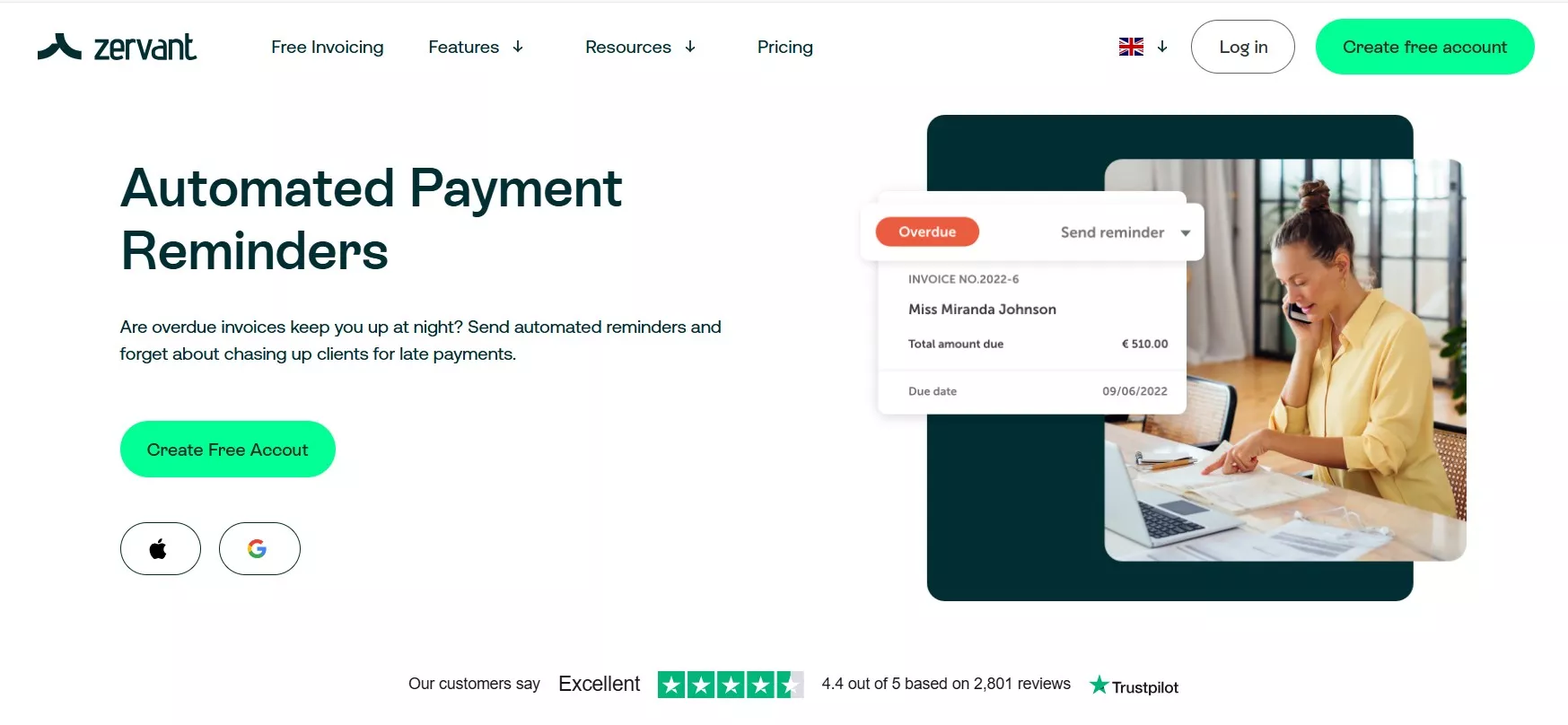
Proven Trick #2: Add Short, Helpful Microcopy for User Confidence
SaaS features pages rely on short, helpful microcopy to guide users and address their concerns at critical moments. Microcopy includes those small bits of text you see around buttons, forms, and navigation elements. When crafted well, it reduces hesitation and increases user confidence as they move through your page.
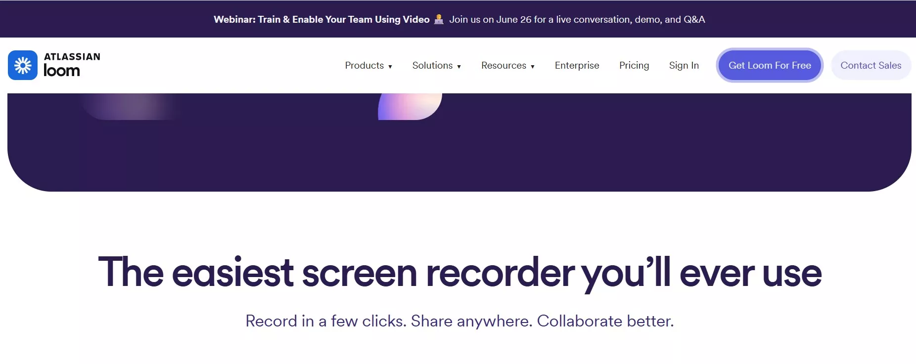
Many SaaS companies overlook the impact of microcopy, but studies reveal that that direct language can enhance click-through rates by up to 40%. By placing microcopy where users might have doubts, you can proactively answer questions and keep them moving forward. For example, adding "No credit card required" near your signup button (as seen on Loom's signup page) removes a common barrier. Read more about micropy on your SaaS page in this article.
Where to Place Microcopy for Maximum Impact
- Sign-up forms: Clarify what’s needed and what will happen next. Example: "Start your 14-day free trial instantly" (from Notion).
- CTA buttons: Set expectations, such as "Get started in 60 seconds" (from Zapier).
- Tooltips: Explain technical terms or features in plain language, e.g., "Unlimited boards means you can organize every project" (from Trello).
Common Mistake to Avoid:
Don’t overload users with too much text. Microcopy should be brief, relevant, and placed only where it adds value.
KEY INSIGHTS
- Use microcopy to address objections and clarify actions at decision points.
- Keep microcopy concise and user-focused for best results.
- Test placements and wording to see what increases conversions.
Next, discover how strategic use of SaaS-specific images and icons can make your features page easier to scan and understand.
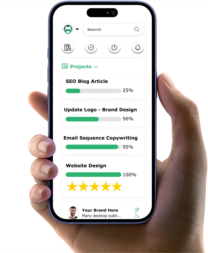
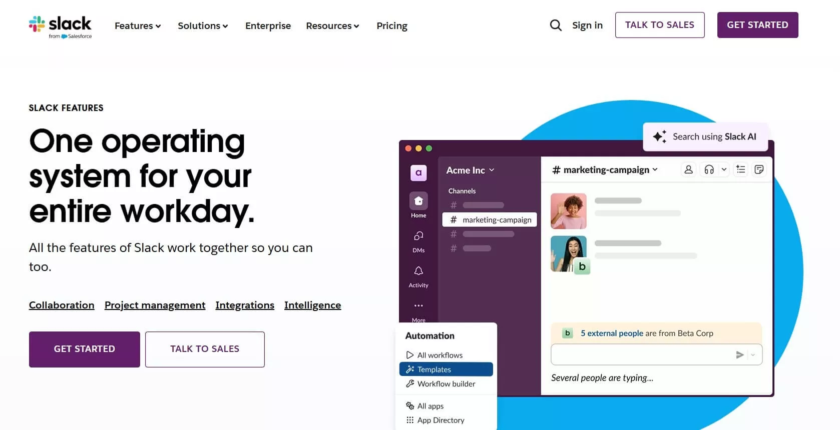
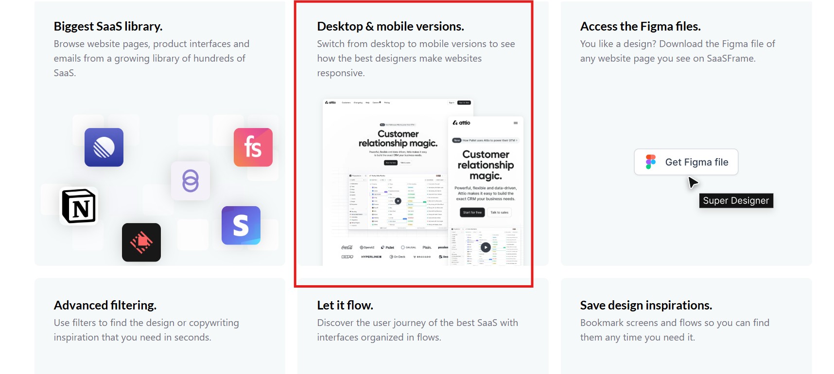
Proven Trick #3: Use Images or Icons to Show Features Clearly
SaaS features pages benefit from strong visual cues. Using images or icons to represent each feature makes your content more scannable and memorable. Visuals help users quickly identify the value of each feature, especially for those who skim rather than read every word.
![]()
HubSpot reports that people remember approximately 80% of what they see, compared to only 20% of what they read. Users are more likely to remember your product’s benefits if you pair them with relevant icons or images. For example, Miro uses whiteboard and sticky note icons to make collaboration features instantly recognizable. Consistency in icon style and placement also creates a polished, professional impression.
Quick Visual Implementation Guide
- List your core features that need visual support.
- Choose or design icons that clearly represent each feature (e.g., a "Kanban board" icon for project management in ClickUp).
- Place icons directly beside feature headings for easy scanning.
Common Mistake to Avoid:
Avoid using generic or unrelated stock images. Every visual should reinforce the feature it represents.
KEY INSIGHTS
- Pair every key feature with a clear, relevant icon or image.
- Maintain visual consistency for a professional look.
- Test different visuals to see which aid user understanding most.
Section 4 will show you how customer quotes near features can build credibility and trust with your audience.
Proven Trick #4: Include Short Customer Quotes Near Features for Trust
SaaS features pages that highlight customer quotes next to features build instant credibility. Real user feedback helps prospects see the practical value of each feature and reassures them that others have found success with your product. This is particularly effective in crowded markets where trust is a deciding factor.
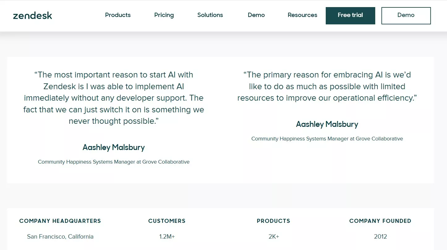
Statistics show that 93% of consumers say that online reviews influenced their purchase decisions.
Place short, specific quotes that directly relate to the feature in question. For example, next to "Automated reporting" in Databox: "This dashboard gives me all my KPIs in one place—no more spreadsheets." This approach makes the benefits tangible and relatable.
How to Gather and Place Effective Quotes
- Survey your most satisfied customers for feedback on specific features.
- Extract concise, outcome-focused quotes.
- Pair each quote with the relevant feature on your page.
Common Mistake to Avoid:
Don’t use generic praise. Make sure each quote is authentic and tied to a real feature outcome.
KEY INSIGHTS
- Feature-specific quotes build trust and credibility.
- Short, authentic testimonials are more effective than long, general endorsements.
- Regularly update quotes as you receive new feedback.
The next section explains how to organize your features for maximum clarity and user engagement.
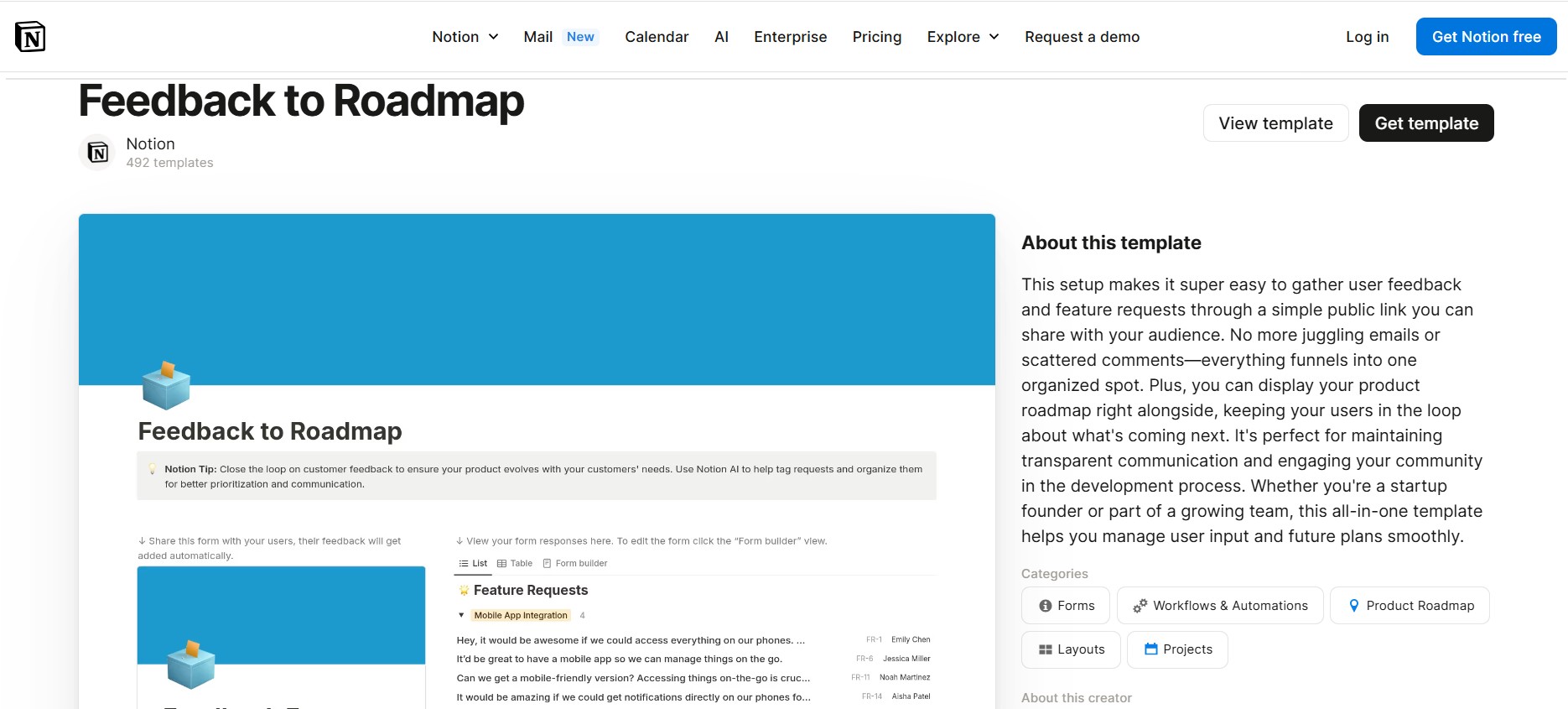
Proven Trick #5: Make Features Easy to Find and Read with Smart Organization
SaaS features pages need to be organized for clarity and speed. Users should be able to scan and find what matters to them in seconds. Logical grouping, clear headings, and strategic use of whitespace all contribute to a positive experience. When features are hard to find, users quickly lose interest and leave.
Successful SaaS products like Asana group features by use case, user type, or workflow. This mirrors how your audience thinks about your product and makes information more accessible. Use bullet points or grids to improve readability and highlight the most important details.
Feature Organization Checklist
- Group features by audience, value, or workflow.
- Use bold headings and bullet points for scannability.
- Leave enough whitespace to separate sections visually.
Common Mistake to Avoid:
Don’t crowd too many features together. Overloading users with information leads to confusion and missed opportunities.
KEY INSIGHTS
- Organize features in a way that matches how users think and search.
- Use clear headings and bullet points for easy navigation.
- Review your layout regularly to ensure clarity as your product evolves.
Section 6 will cover how to personalize your features page for different audiences to increase relevance and conversions.
Proven Trick #6: Personalize for Different Audiences to Maximize Relevance
SaaS features pages that personalize content for different audiences help each visitor see how your product fits their unique needs. Personalization goes beyond simple segmentation; it means adapting your messaging, visuals, and feature highlights to match the roles, industries, or use cases of your users. This approach is especially important in SaaS, where buyers range from solo founders to large enterprise teams.
A website personalization statistic reveals that a significant 74% of customers express frustration when website content lacks personalization. By allowing users to filter features by persona or use case, you increase engagement and conversion rates. Use tabs, toggles, or segmented lists so visitors can instantly find what matters most to them. This also gives you valuable data on which features resonate with each segment.
Audience Personalization Flow
- Identify your primary audience segments (e.g., freelancers, agencies, enterprise teams).
- Map features to each segment’s top needs.
- Create toggles or tabs that let users select their audience type and see relevant features.
Common Mistake to Avoid:
Don’t show the same generic list to everyone. Overlooking personalization leads to lower engagement and missed sales opportunities.
KEY INSIGHTS
- Personalize features by audience for higher relevance and conversions.
- Use toggles or tabs to let users self-select their segment.
- Track engagement by segment to refine your messaging.
The next section explores how to highlight what makes your SaaS unique, ensuring your offering stands out in a crowded market.
Proven Trick #7: Highlight What Makes You Unique with Clear Differentiators
SaaS features pages that clearly highlight what makes your product unique help buyers understand why they should choose you over competitors. In a market crowded with similar solutions, your unique selling proposition (USP) must be front and center. This could be a proprietary technology, a pricing advantage, or an unmatched support policy.
Buyers often compare multiple SaaS options before making a decision. A well-placed comparison table or a bold badge calling out your USP can make the difference. For example, if you’re the only provider with unlimited storage at your price point, display this prominently. Use side-by-side tables to show exactly how you stack up against key competitors.
Do This/Not That
- Do This: Showcase unique features with a bold badge (e.g., "Only SaaS with AI-driven workflow automation" for Process Street)/Not That: Bury your differentiators at the bottom
- Do This: Use side-by-side comparison tables/Not That: Rely on vague claims like "best in class"
Common Mistake to Avoid:
Don’t hide your best features. Make your differentiators impossible to miss.
KEY INSIGHTS
- Make your USP highly visible on your features page.
- Use comparison tables to clarify your advantages.
- Focus on specific, provable points of difference.
Section 8 will show you how to use a friendly, simple tone to make your SaaS approachable and easy to understand.
Proven Trick #8: Write in a Friendly, Simple Tone for Higher Engagement
SaaS features pages that use a friendly, simple tone make your product feel accessible and easy to use. Technical jargon or stiff language can intimidate new users and reduce trust. Instead, write as if you’re explaining features to a friend—clear, concise, and focused on real-world outcomes.
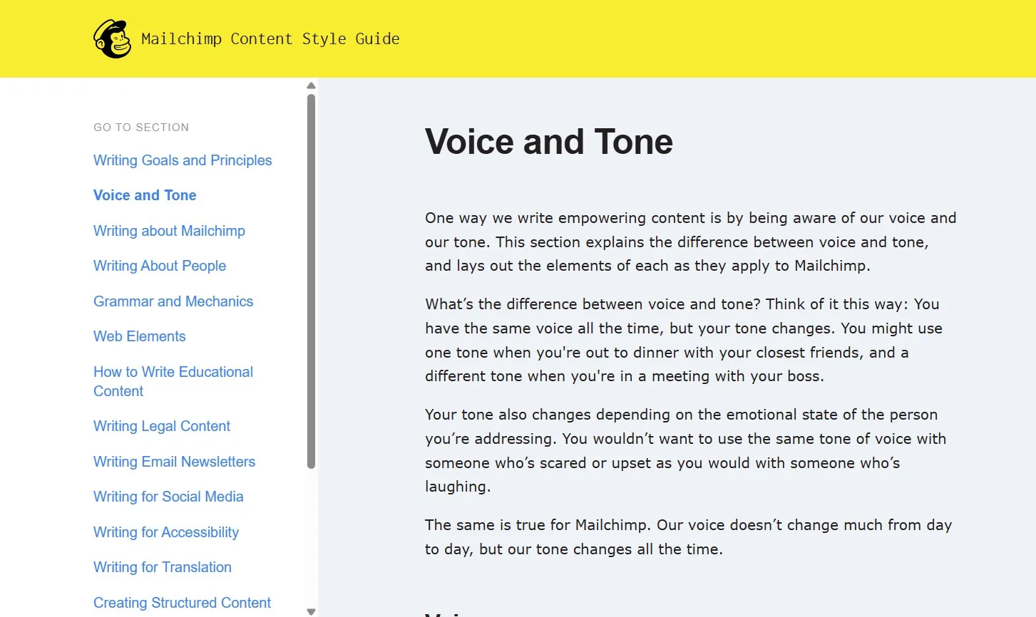
Industry leaders like HubSpot recommend reviewing your copy out loud or sharing it with non-technical colleagues to check for clarity. If your message sounds confusing, rewrite it using everyday language. This not only improves comprehension but also increases the likelihood that users will act on your calls-to-action.
Friendly Tone Checklist
- Use short sentences and simple words.
- Focus on how features help users, not just what they do.
- Ask a non-technical friend to review for clarity.
Common Mistake to Avoid:
Don’t assume your audience understands technical terms. Always prioritize clarity over cleverness.
KEY INSIGHTS
- Use approachable language to make your SaaS more inviting.
- Test your copy with real users for clarity and impact.
- Update your features page regularly as your product evolves.
Next, you’ll learn how to let users try features with simple demos to boost confidence and drive more signups.
Proven Trick #9: Let Users Try Features with Simple Demos for Immediate Buy-In
SaaS features pages that let users try features with simple demos help prospects experience your product’s value right away. Interactive demos or short videos give users a risk-free way to see how your solution fits their needs. This is crucial for SaaS buyers who want hands-on proof before committing.
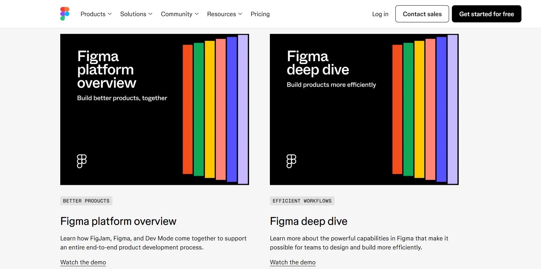
Companies see a 20% increase in sales after implementing interactive content, like interactive demos, according to Content Marketing Institute. Prioritize your highest-impact features for demo content. Keep demos short, focused, and easy to access. Use clear “See it in action” buttons next to each feature, as seen on Airtable's feature pages, so users don’t have to search for proof of value.
Demo Implementation Process
- Choose the top 2-3 features that drive purchase decisions.
- Create short demo videos or interactive previews for each (e.g., a 90-second walkthrough of "Automated Workflows" in Process Street).
- Embed "See it in action" buttons near every relevant feature.
Common Mistake to Avoid:
Don’t overwhelm users with long or complex demos. Focus on clarity and quick wins.
KEY INSIGHTS
- Use short, focused demos to build confidence and reduce friction.
- Highlight demos for your most valuable features.
- Monitor demo engagement to refine your content strategy.
Section 10 explains why optimizing for mobile users is essential for SaaS growth.
Proven Trick #10: Make Sure It Looks Good on Phones for Maximum Reach
SaaS features pages that look good on phones reach more users and convert better. With over 60% of SaaS buyers browsing on mobile devices, mobile optimization is no longer optional. Responsive design ensures every feature is easy to read and interact with, no matter the screen size.
Test your features page on multiple devices and browsers. Use larger fonts, touch-friendly buttons, and vertical stacking for content. In January 2025, mobile devices excluding tablets, accounted for over 62 percent of web page views worldwide, as reported by Statista. A seamless mobile experience keeps users engaged and reduces bounce rates.
Speaking of optimization, we've also put together a helpful guide that walks you through the most common SaaS landing page fixes that actually work.
Mobile Optimization Checklist
- Test all features, visuals, and CTAs on various devices.
- Use large, easy-to-tap buttons and clear fonts.
- Stack content vertically for smaller screens.
Common Mistake to Avoid:
Don’t ignore mobile users or assume your desktop layout will work everywhere.
KEY INSIGHTS
- Prioritize mobile-friendly layouts for all features and CTAs.
- Regularly test and update your page for device compatibility.
- Track mobile engagement metrics to spot improvement areas.
The final section covers how ongoing user feedback can keep your features page effective and up to date.
Proven Trick #11: Keep Improving Based on User Feedback for Lasting Results
SaaS features pages that evolve with user feedback stay relevant and effective as your product and audience change. Collect feedback through surveys, analytics, and direct user comments. Use this data to update unclear copy, add new features, and refine your layout.
Continuous improvement is what separates high-performing SaaS brands from the rest. Set a schedule to review feedback monthly or quarterly. Measure the impact of changes by tracking metrics like time on page, conversion rate, and feature engagement. This approach ensures your features page always reflects what users care about most.
User Feedback Improvement Guide
- Collect feedback using surveys and analytics tools.
- Prioritize updates based on user pain points and suggestions.
- Review performance metrics after every change.
Common Mistake to Avoid:
Don’t treat your features page as a one-time project. Regularly refine it for ongoing results.
KEY INSIGHTS
- Use real user feedback to guide ongoing improvements.
- Measure the impact of updates with clear, relevant metrics.
- Schedule regular reviews to keep your page current and effective.
What feedback would you want to see implemented on your features page? Share your ideas or questions below to help shape the next round of improvements.
If you want to get your marketing work done for your business (or for your clients’), then you HAVE to learn more how you can delegate unlimited marketing projects & tasks without the headaches of hiring. Download this free guide: 33 Examples of Marketing Projects You Can Delegate to Growbo
Conclusion
Want your SaaS features page to work harder for you? Start by putting your users first—not just listing features, but showing how your product makes their lives easier. Simple words, clear benefits, and real customer stories make your page more inviting and trustworthy.
Small touches—like bold visuals and easy-to-scan sections—help people find what matters fast. And when you update your page based on real feedback, it shows your customers you care about their experience. Don’t forget mobile users: a friendly, responsive page is key today.
KEY INSIGHTS
- Turn every feature into a clear benefit that solves a real problem for your users.
- Build trust with customer quotes and a design that’s easy to read and friendly.
- Keep improving your page by listening to feedback and making updates that help your users.
Ready to make your marketing easier? With Growbo, you get a full team to help you put these ideas into action—no hiring, no hassle. Get unlimited support and see how much lighter your to-do list can feel.
Got tips or questions? Drop a comment below—I’d love to hear your thoughts!
If you want to talk through your marketing goals or see how Growbo can help your business, we’d love to chat. Book a free call with our team and get expert advice tailored just for you.
Keep Growin', Stay Focused,

Image Credits:
1. https://www.zervant.com/en/payment-reminders/
2. https://www.loom.com/
3. https://clickatell.com/
4. https://www.zendesk.com/customer/grove/
5. https://slack.com/features
6. https://www.salesforce.com/ap/?ir=1
7. https://cleanshot.com/
8. https://styleguide.mailchimp.com/voice-and-tone/
9. https://www.figma.com/demo/
10. https://www.saasframe.io/categories/features-page
11. https://www.notion.com/templates/feedback-to-roadmap