Fix Your Service Pages: 9 Design Best Practices

Are your service pages turning visitors into clients, or sending them straight to your competitors?
Service page design best practices have become essential for businesses looking to win more customers. Having helped thousands of clients, I've seen what works (we took a new service offering from zero to seven figures in just 18 months).
Your service pages are where potential clients decide whether to hire you or move on.
Did you know that visitors form opinions about your website in just 0.05 seconds? This means your service page design creates immediate judgments about your business before anyone reads a single word.
The stakes are high. Poorly designed service pages drive away nearly 7 out of 10 potential clients before they even contact you. Is this happening on your website right now?
When your service pages look outdated or confusing, potential clients question whether you can deliver quality work. But here's the good news – businesses with well-designed service pages see conversion rates 5x higher than their competitors.
In this article, you'll discover 13 essential service page design best practices that work for consultants, agencies, and service providers of all sizes. You'll learn:
- The headline formula that captures attention in less than a second
- How to structure content that creates emotional connection with potential clients
- The strategic placement technique for testimonials that turns skeptics into buyers
- The visual approach that helps clients understand complex services at a glance
- The objection-handling system that removes roadblocks to conversion
Let's dive into what makes service pages convert...
If you want to get your marketing work done for your business (or for your clients’), then you HAVE to learn more how you can delegate unlimited marketing projects & tasks without the headaches of hiring. Download this free guide: 33 Examples of Marketing Projects You Can Delegate to Growbo
Design Best Practice #1. Craft A Value-Focused Headline
Service page design best practices start with your headline - it's the first thing visitors see and determines whether they'll keep reading. Your headline needs to clearly communicate the value you provide, not just describe your service. This approach has proven to increase engagement and conversion rates significantly.
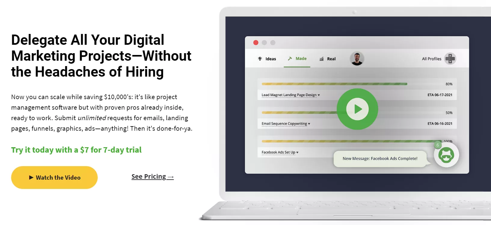
You can learn from Growbo's headline structure: "Delegate All Your Digital Marketing Projects — Without the Headaches of Hiring" which concisely communicates both convenience (delegate) and pain relief (without headaches) as primary value propositions. This headline works because it immediately tells visitors what they'll get and how it benefits them, rather than using generic phrases like "Marketing Services."
Research from Nielsen Norman Group shows headlines with specific value propositions receive 124% more engagement than generic alternatives. This means your headline should focus on outcomes rather than services - tell visitors what they'll gain, not just what you do.
Recent eye-tracking studies from 2024 reveal that users spend 80% of their attention on headlines containing numbers, solutions, or time-saving promises. This means including specific numbers or time-related benefits can dramatically increase how much attention your headline receives.
When crafting your headline, ask yourself: "What's the main problem my service solves for clients?" Then structure your headline to highlight that solution. For example, instead of "Professional Web Design Services," try "Websites That Generate Leads While You Sleep."
According to Unbounce's Conversion Benchmark Report, transforming generic headlines into value-focused ones has increased conversion rates by 45%+ across multiple industries. The most effective headlines focus on a specific outcome that matters to your ideal client.
Key Insights
- Focus your headline on the specific value your service provides, not just what the service is
- Include numbers, time-related benefits, or specific solutions to increase engagement
- Test different headline variations to find what resonates most with your target audience
Now that you know how to craft headlines that grab attention and communicate value, let's look at how to develop a compelling problem-solution narrative that keeps visitors engaged.
Design Best Practice #2. Develop A Problem-Solution Narrative
Service page design best practices must include a compelling problem-solution narrative that connects with your visitors emotionally. Your potential clients aren't just looking for services - they're looking for solutions to specific problems they're facing right now.
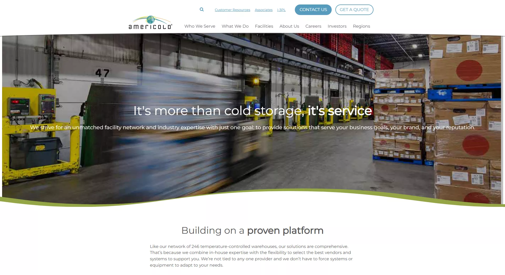
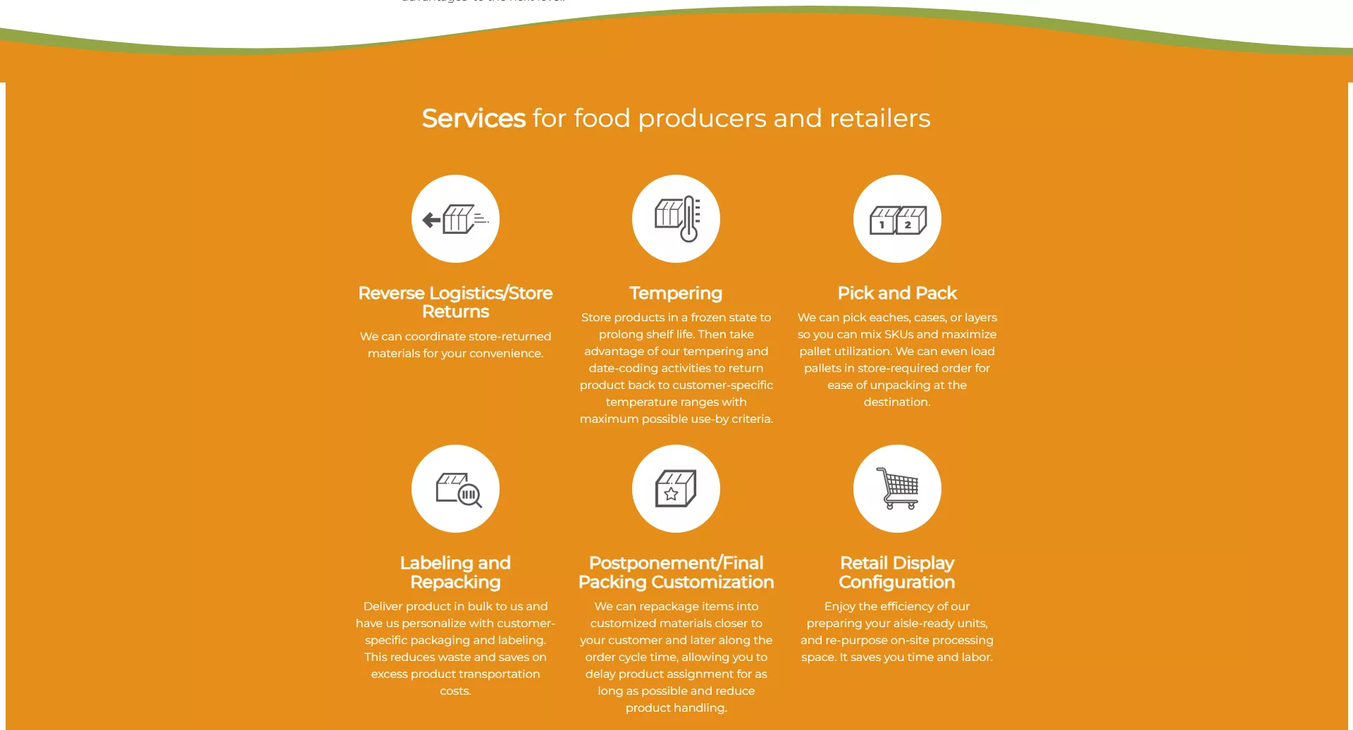
You can see this approach in action on Americold's service page where they position their service as the solution to specific pain points: "It's more than cold storage, it's service" and "solutions that serve your business goals, your brand, and your reputation." Notice how they first identify the problems (limited storage capabilities, brand reputation risks) and then present their comprehensive service network as the clear solution.
This narrative structure works because it follows how people naturally make decisions. According to the Story Brand framework, problem-solution narratives increase retention by 63% compared to feature-focused content. When you acknowledge your visitors' challenges before presenting your solution, they feel understood.
Americold takes this approach further by highlighting specific pain points throughout their service descriptions. For example, with their Multi-Vendor Consolidation service, they identify the problem: "Drive out costs and improve fill rates and on-shelf availability" then immediately follow with their solution: "With on-demand fulfillment, you can place and receive consolidated orders from multiple suppliers within 72 hours from order to delivery." They repeat this pattern across services.
Harvard Business Review's consumer psychology study found that pages addressing emotional pain points before logical benefits see 37% higher engagement. This means you should focus first on how your clients feel about their problems before explaining the logical benefits of your solution.
One effective framework for structuring your problem-solution narrative is the PAS method: Problem-Agitation-Solution. Start by identifying a problem your client faces, then agitate that problem by explaining its consequences, and finally present your service as the solution.
For example:
- Problem: "Managing your digital marketing takes too much time away from running your business."
- Agitation: "Every hour spent struggling with ads or website updates is an hour not spent on growth strategies or serving your customers."
- Solution: "Our done-for-you marketing service handles everything while you focus on what you do best."
This narrative structure creates an emotional connection with your visitors by showing that you understand their challenges. When clients feel understood, they're much more likely to trust that your solution will work for them.
Key Insights
- Start by acknowledging your client's specific problems before presenting your solution
- Use the PAS (Problem-Agitation-Solution) framework to structure your narrative
- Focus on emotional pain points first, then logical benefits
Now that you know how to create a compelling problem-solution narrative, let's explore how to showcase your service benefits in a way that resonates with potential clients.
Design Best Practice #3. Showcase Specific Service Benefits
Service page design best practices require you to clearly showcase the specific benefits of your services, not just list features. Your potential clients want to know exactly how your service will improve their business or solve their problems.
Take a look at how Bamboo Health showcases their benefits on their homepage: "Drive Better Outcomes, Ensure Smooth Transitions of Care, Ease Provider Burdens" followed by specific outcome metrics like "250% increase in post-discharge visit completions" and "$681,000 received by reducing length of stay." This benefit categorization helps visitors quickly understand the scope of impact without overwhelming them with technical details.
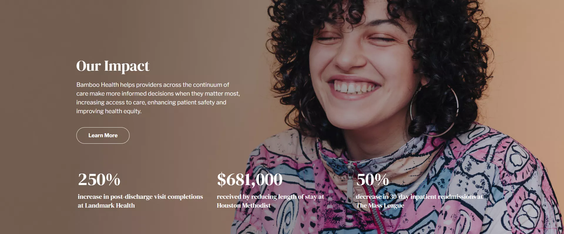
What makes Bamboo Health's approach particularly effective is how they lead with emotional and business benefits before listing functional benefits. They start with "Real-Time Care Intelligence in Pivotal Moments" - addressing the core emotional need for timely, actionable information in critical healthcare situations - before diving into the specific seven solutions they provide. The quantified results and success stories further reinforce these benefits with concrete proof points.
Research from CXL Institute shows benefit-focused content outperforms feature-focused content by 72% in engagement metrics. This means describing how your service helps clients is much more effective than simply listing what your service includes.
For example, instead of saying "We provide SEO services," you could say "Get found by more customers searching for exactly what you offer." The first describes a feature, while the second describes a benefit that matters to your client.
The latest consumer behavior research indicates benefits that address time savings, stress reduction, and business growth resonate most strongly with B2B buyers. These are universal pain points for business owners, so highlighting how your service addresses these specific needs will make your offering more appealing.
One effective technique for transforming features into benefits is the "So What?" method. For each feature you want to highlight, ask yourself "So what? Why does this matter to my client?" For example:
- Feature: "24/7 customer support"
- So what? "This means you never have to wait for help when you need it most."
- Benefit: "Get immediate help any time of day or night, so your business never misses a beat."
When organizing your benefits on your service page, group them into logical categories that align with your clients' priorities. This makes it easier for visitors to quickly find the benefits that matter most to them.
Key Insights
- Focus on benefits (what clients gain) rather than features (what your service includes)
- Lead with emotional and business benefits before functional benefits
- Use the "So What?" technique to transform features into compelling benefits
Now that you know how to showcase your service benefits effectively, let's explore how to build credibility through strategic social proof.
Design Best Practice #4. Implement Strategic Social Proof
Service page design best practices must include strategic social proof to build trust with potential clients. Your visitors need reassurance that your services deliver results, and nothing builds confidence like seeing others have succeeded with your help.
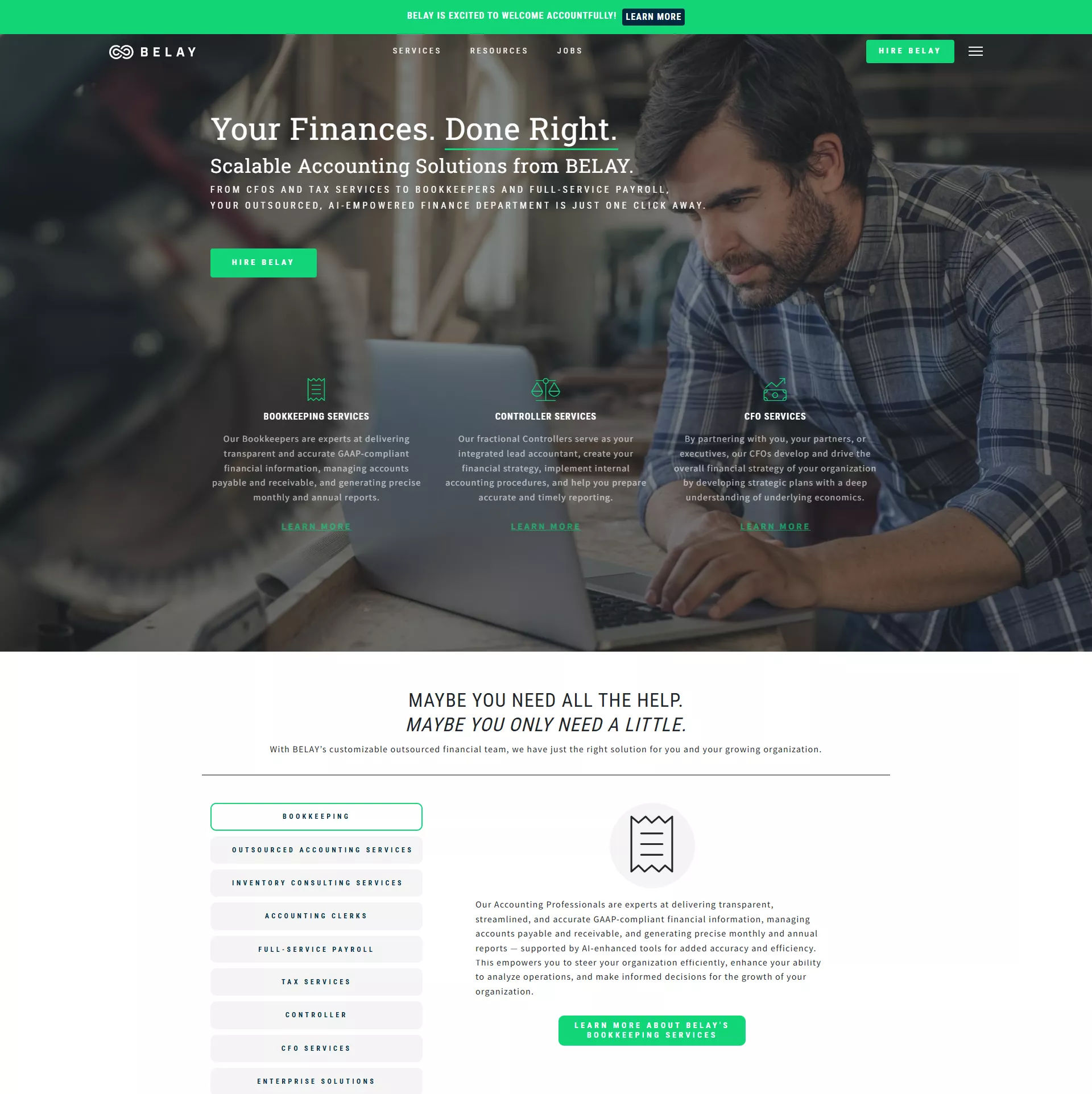
BELAY subtly showcases its deep industry experience without being overtly self-promotional. Consider how they weave expertise into their messaging: “With a team of professional bookkeepers and CPAs, we offer a bundled, back-office solution to keep your finances in order so you can focus on growing your business.” The emphasis isn’t on how long they’ve been doing it, but on how seamlessly they integrate into a client’s workflow — highlighting competence without the hard sell.
Client testimonials are one of the most persuasive forms of social proof. Take this insight from its client:
“We started with bookkeeping because we couldn’t afford to hire in-house. What we got was so much more. Our BELAY bookkeeper gave us back our time, took payroll off our plate, and made sense of our finances in a way that actually helps us grow. We’re more organized, more confident, and way less stressed.”
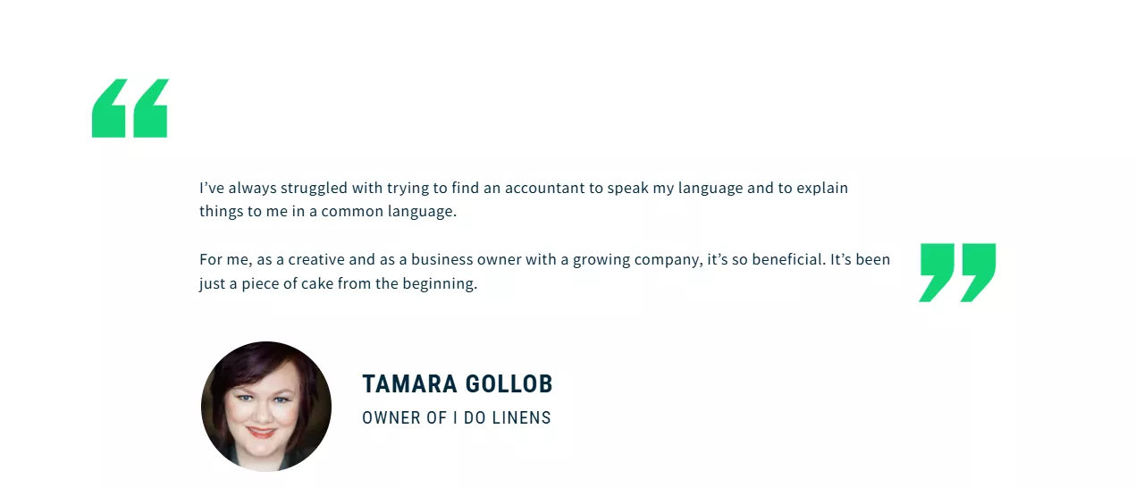
Notice how this testimonial emphasizes clear outcomes — regained time, clarity, and growth — rather than vague praise. It highlights how it delivers tangible value through both expertise and empathy.
Research from TrustPilot shows service pages with strategic testimonials see 62% higher conversion rates than those without. Your potential clients are looking for evidence that you can solve their specific problems.
The placement of your social proof matters just as much as its content. Recent eye-tracking studies reveal testimonials with specific metrics receive 40% more attention than general praise. Place your strongest testimonials near key decision points on your page, such as next to your pricing or call-to-action buttons. Read more about types of social proof in our article here.
Video testimonials are particularly effective for service businesses. According to Wyzowl, including video testimonials can increase conversion rates by up to 86%. Even a simple 30-second testimonial from a satisfied client can significantly boost your credibility.
When selecting testimonials for your service page, prioritize those that address common objections or concerns. For example, if potential clients often worry about how quickly they'll see results, include a testimonial that specifically mentions the timeline for seeing positive outcomes.
The most effective social proof combines specific results with emotional benefits. While metrics like "increased revenue by 45%" are impressive, pairing them with emotional outcomes like "allowed me to take my first vacation in three years" creates a more compelling story.
Key Insights
- Include testimonials that focus on specific outcomes and results
- Place your strongest social proof near key decision points on your page
- Consider adding video testimonials for maximum impact
Now that you know how to build credibility through strategic social proof, let's explore how visual demonstrations can make your services more tangible and appealing.
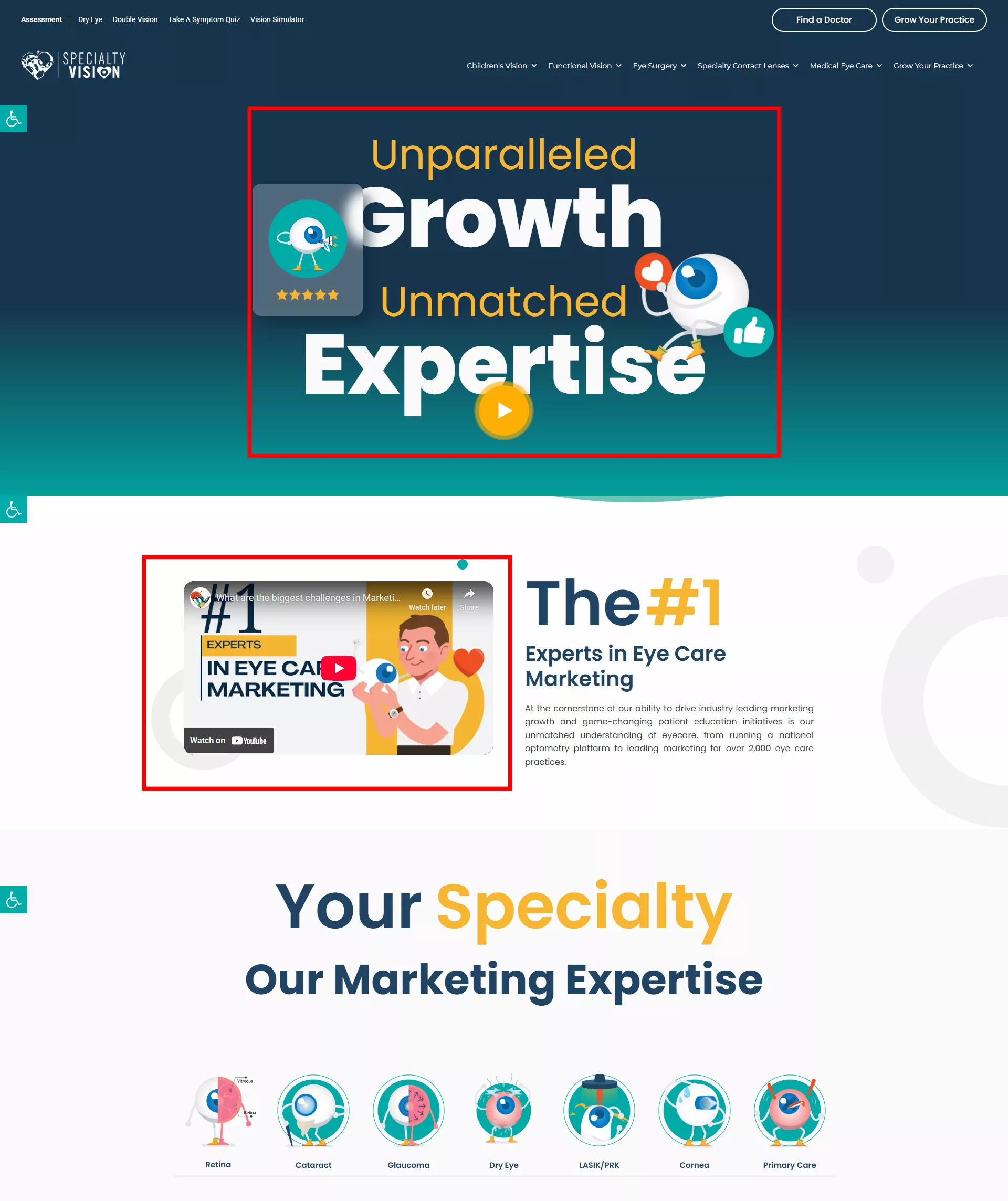
Design Best Practice #5. Create Visual Service Demonstrations
Service page design best practices must include visual demonstrations that help potential clients understand your offerings. Your services are often intangible, making them difficult to grasp without visual aids that show the process or results.
Specialty Vision seamlessly transforms eye care marketing from complex challenges to powerful, measurable results. The video approach clearly illustrates how they turn fragmented marketing efforts into focused, high-impact strategies that drive patient engagement and practice growth—without the need for lengthy explanations.
Visual processing happens 60,000x faster than text processing, according to research from MIT. This means your visitors will understand your service offering much more quickly through visuals than through text alone. When potential clients can easily grasp what you offer, they're more likely to convert.
The most effective service pages include a mix of visual elements. Process videos are particularly powerful for explaining complex services. According to Hubspot, videos under 60 seconds have the highest completion rates, making them ideal for service demonstrations.
Recent user experience data shows interactive demonstrations increase understanding by 74% compared to static images. Consider adding interactive elements like sliders, hover effects, or clickable diagrams to help visitors engage with your service explanation.
Before-and-after examples are especially effective for service businesses. They provide concrete evidence of your impact and help potential clients envision similar results for themselves. For design services, website makeovers, or consulting work, these comparisons can be particularly compelling.
Annotated screenshots are another powerful visual tool. By highlighting key features or benefits with callouts, you can guide visitors' attention to the most important aspects of your service. This technique helps break down complex offerings into digestible pieces.
The most effective visual demonstrations connect directly to specific client pain points or goals. Rather than generic visuals, create demonstrations that show how your service solves the exact problems your ideal clients face.
Key Insights
- Use before-and-after visuals to demonstrate the transformation your service provides
- Keep videos short (under 60 seconds) to ensure viewers watch them completely
- Add annotations or callouts to highlight key benefits in your visual demonstrations
Now that you know how to create compelling visual demonstrations, let's explore how to design clear service packages that make it easy for clients to choose the right option.
Design Best Practice #6. Design Clear Service Packages/Tiers
Service page design best practices require clear, well-structured service packages that help potential clients quickly find the right option. Your pricing and package structure can either simplify the decision process or create confusion that leads to abandonment.
Growbo demonstrates this principle with their approach: "4 unique packages to choose from" - showing the importance of clearly defined options rather than a one-size-fits-all approach. This gives visitors the ability to select the service level that best matches their needs and budget.
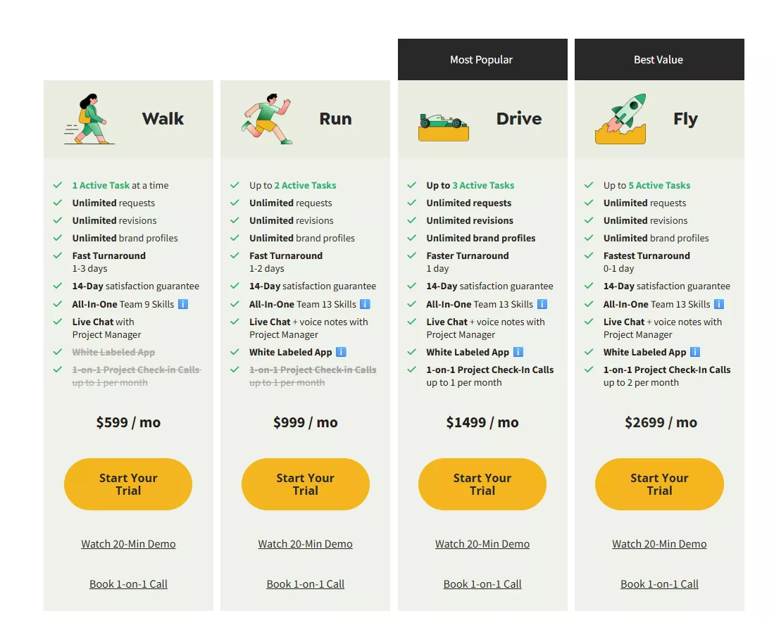
Research from Fast Spring shows the optimal number of service tiers is 3-4, with Growbo's 4 packages aligning perfectly with this finding. Too few options can make clients feel forced into choices that don't fit their needs, while too many can create decision paralysis.
Notice how Growbo emphasizes flexibility with "month-to-month plans" to reduce purchase friction. This addresses a common objection about long-term commitments and makes the initial purchase decision feel less risky for potential clients.
When designing your service packages, use comparison tables to highlight the differences between options. According to ConversionXL, effective comparison tables have increased conversion by 25%+ across various service industries. Make sure to highlight the features that matter most to your clients.
Including a "most popular" or "recommended" option helps guide undecided visitors. Behavioral economics research shows this approach works because it provides a social proof shortcut - people tend to trust what others have chosen. This option typically accounts for 60-70% of sales.
The most effective service packages clearly communicate the value at each tier while making it obvious which clients are the best fit for each option. Don't make visitors guess which package is right for them - tell them directly.
Key Insights
- Offer 3-4 service tiers to provide options without overwhelming potential clients
- Design packages around specific client types or needs rather than arbitrary service levels
- Use comparison tables and highlight a "most popular" option to guide decision-making
Now that you know how to create clear service packages, let's look at how to optimize your call-to-action elements to drive conversions.
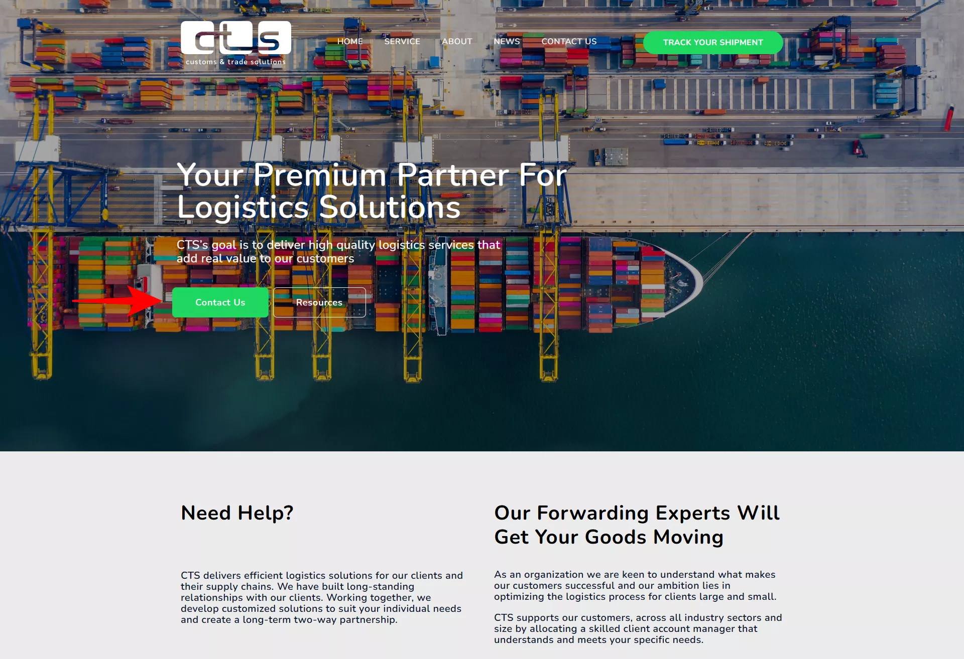
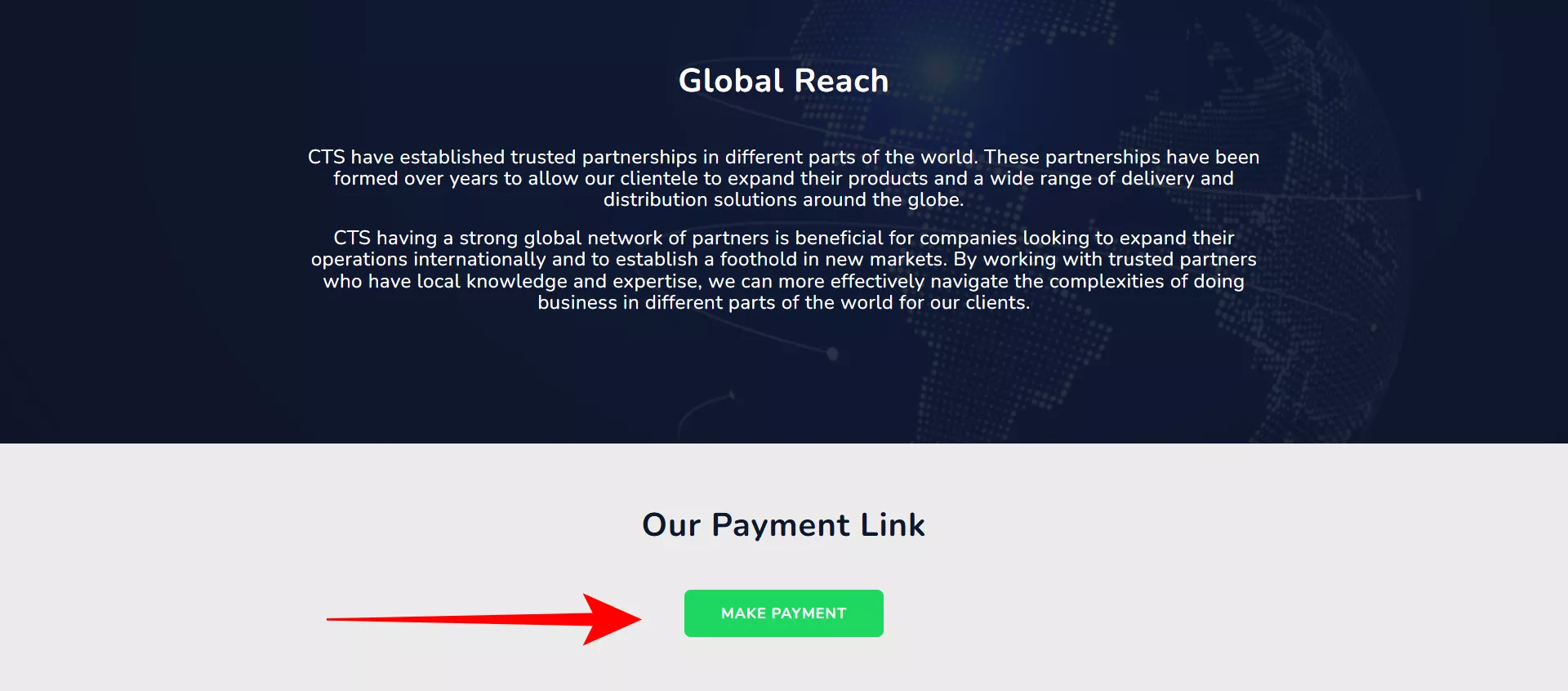
Design Best Practice #7. Optimize Call-to-Action Elements
Service page design best practices require strategic call-to-action (CTA) elements that guide visitors toward conversion. Your CTAs are the bridges between interest and action - they need to be clear, compelling, and strategically placed.
Custom and Trade Solution demonstrates this principle with purpose-specific CTAs like "Make a payment" which shows how CTAs should be tailored to specific user intents rather than using generic "contact us" buttons. This targeted approach helps visitors immediately understand the next step in the process.
Research from Button Optimizer shows action-oriented CTAs outperform passive alternatives by 90% in click-through rates. This means using verbs like "Get," "Start," or "Schedule" rather than generic phrases like "Learn More" or "Click Here." Your CTAs should tell visitors exactly what action they're taking.
The color and contrast of your CTAs matter significantly. According to color psychology research, high-contrast CTAs with complementary colors increase clicks by 32.5%. Your CTA buttons should stand out visually from the rest of your page without clashing with your brand colors.
Placement is just as important as design. Heat map studies show above-the-fold CTAs receive 84% more attention than those below. However, you should still include CTAs throughout your page, especially after key benefit sections and near testimonials.
Creating a sense of urgency can boost CTA effectiveness without being manipulative. According to Invesp, CTAs that create legitimate urgency increase conversions by 27%. This might include limited-time offers or highlighting how quickly clients can see results.
For complex services, consider using multi-step CTAs that break the conversion process into smaller commitments. Unbounce found this approach increased conversion by 43% for complex services. Instead of jumping straight to "Book a Consultation," you might start with "See Available Times."
The most effective CTAs align with the visitor's stage in the decision process. Early in the page, offer low-commitment options like "See How It Works," while later sections can include higher-commitment CTAs like "Get Started Today."
Key Insights
- Use action-oriented verbs in your CTA text that clearly describe the next step
- Ensure your CTAs stand out visually with high-contrast colors
- Place CTAs strategically throughout your page, especially after key benefit sections
Now that you know how to optimize your call-to-action elements, let's explore how to build trust through strategic trust indicators.
Design Best Practice #8. Incorporate Trust-Building Elements
Service page design best practices must include trust-building elements that reassure potential clients about your credibility. Your visitors need to feel confident in your ability to deliver before they'll consider hiring you.
Most service providers build trust through client testimonials that emphasize stress reduction and business growth. Research from the Baymard Institute shows trust indicators increase conversions by up to 42% on service pages. This significant impact makes trust elements one of the highest-ROI improvements you can make to your service pages.
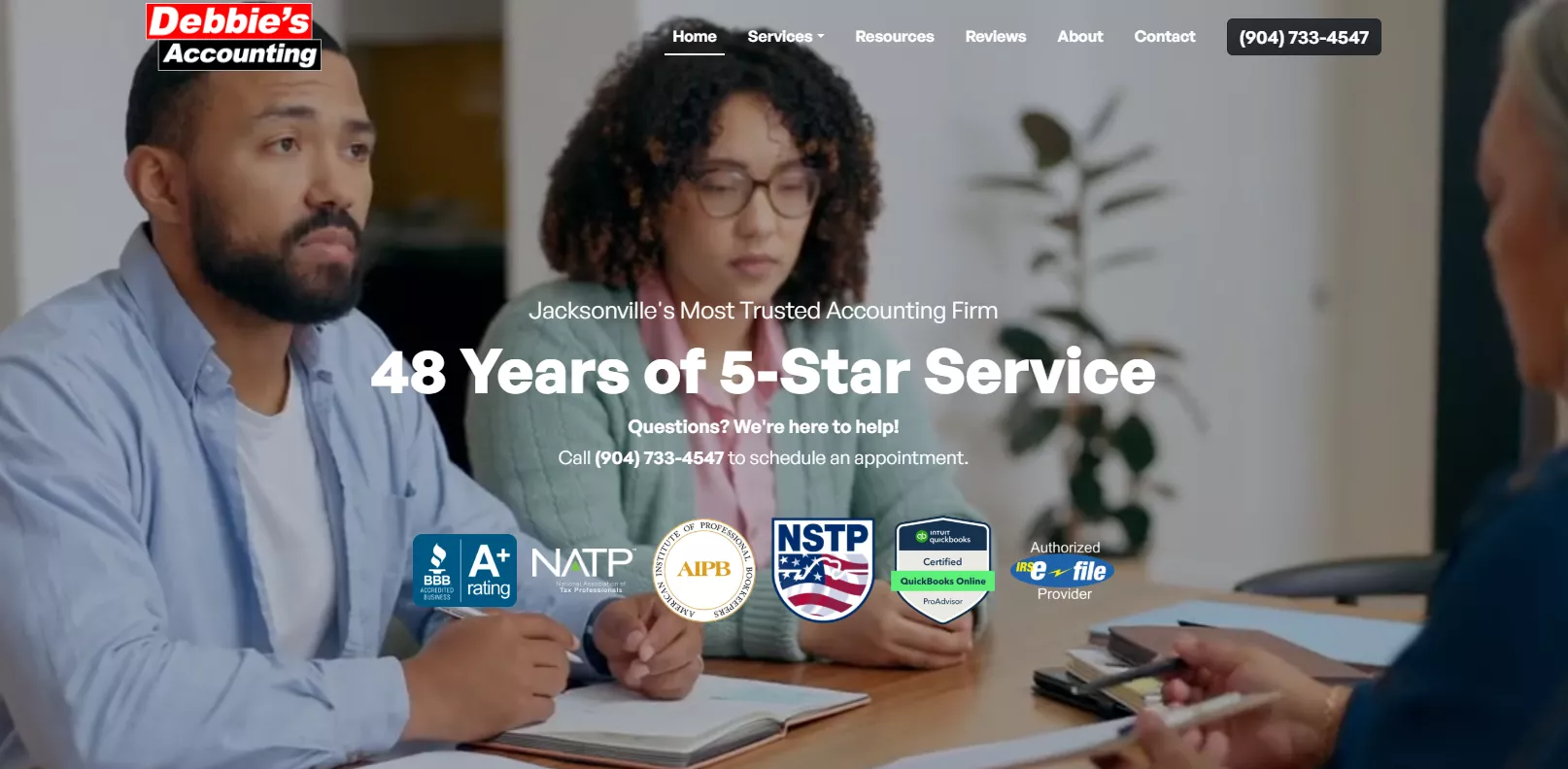
Growbo subtly incorporates experience metrics into their content: "48 Years of 5-Star Service" as well as accreditations to build credibility. This approach works because it establishes expertise in a matter-of-fact way rather than making grand claims.
In our article on trust seals on websites, we indicated that security badges, client logos, and industry certifications are the most impactful trust elements. If you have recognizable clients or industry certifications, displaying them prominently can significantly boost your credibility.
Privacy compliance indicators have become increasingly important. According to CXL, GDPR/privacy compliance indicators increase form submissions by 28%. Simple statements about data protection near your contact forms can help alleviate privacy concerns.
Trust-building micro-copy - small text near key decision points - can address subtle concerns without taking up much space. Copyhackers found this approach increased conversions by 19%. For example, adding "No credit card required" near a free consultation button or "Cancel anytime" near a subscription offer.
The most effective trust elements address specific concerns your potential clients have about working with service providers in your industry. Identify common objections or worries, then add trust elements that directly address those concerns.
Key Insights
- Display relevant certifications, client logos, and security badges prominently
- Include subtle experience metrics that establish expertise without boasting
- Add trust-building micro-copy near forms and CTAs to address specific concerns
Now that you know how to build trust through strategic elements, let's explore how to address common objections that might prevent potential clients from converting.
Design Best Practice #9. Address Common Objections Preemptively
Service page design best practices include addressing potential objections before they become roadblocks to conversion. Your visitors have concerns about hiring your service, and addressing these concerns directly can significantly increase your conversion rates.
Leading Edge addresses the objection of accessibility by positioning their service as an alternative to "needing gym access or expensive equipment." This approach acknowledges the barrier while framing their home-based training with portable equipment as a convenient solution.
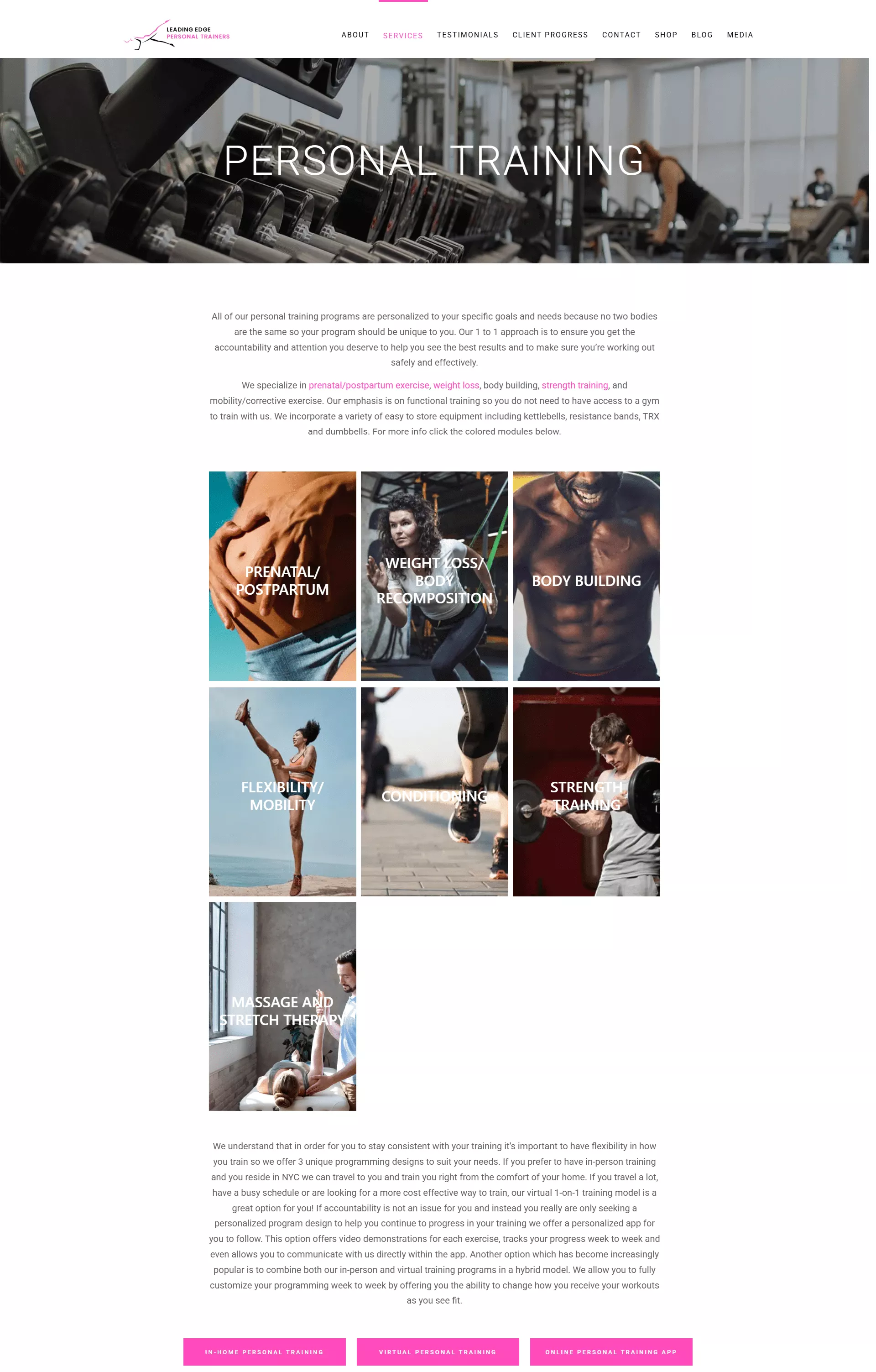
It also addresses the objection of scheduling inflexibility by offering "in-person, virtual, and app-based programs that you can fully customize week to week." This approach acknowledges busy lifestyles while framing their hybrid model as a flexible alternative to rigid gym schedules.
Research from Invesp shows addressing the top 3 objections on service pages increases conversions by 36%. This means identifying and directly responding to the most common concerns your potential clients have about your service.
FAQ sections are one of the most effective ways to address common objections. According to Hotjar case studies, well-designed FAQ sections increased time-on-page by 54%. This extended engagement gives you more opportunity to convince potential clients of your value.
Industry-specific objections are particularly important to address. Research shows addressing these specific concerns increases trust by 47%. For example, if you offer marketing services, addressing concerns about measuring ROI or campaign timelines is essential.
The most effective objection handling anticipates concerns rather than waiting for them to be raised. Review your client communications, sales calls, and competitor reviews to identify the most common objections, then address them proactively on your service page.
Key Insights
- Identify and address the top 3-5 objections potential clients have about your service
- Use FAQ sections to handle common questions and concerns
- Place objection-handling content strategically throughout your page based on the buyer journey
Now that you know how to address common objections, let's explore how persuasive copywriting techniques can make your service page more compelling.
If you want to get your marketing work done for your business (or for your clients’), then you HAVE to learn more how you can delegate unlimited marketing projects & tasks without the headaches of hiring. Download this free guide: 33 Examples of Marketing Projects You Can Delegate to Growbo
CONCLUSION
You've just discovered the most effective service page design practices for 2025. These aren't just random tips – they're proven strategies that can help your pages convert more visitors into paying clients.
The best service pages aren't just pretty – they're strategic. They speak directly to your ideal clients' needs, build trust through social proof, and guide visitors toward taking action.
Here are the key actions you can take right now to improve your service pages:
- Replace generic headlines with specific value propositions that address your clients' biggest challenges
- Organize your content using the Problem-Agitation-Solution framework to create emotional connection
- Showcase benefits rather than features by answering "what's in it for the client?"
- Add strategic testimonials that highlight specific results near key decision points
- Create visual demonstrations that help visitors understand your service quickly
Looking at that list, you might be thinking, "This sounds great, but who has time to implement all this?"
That's where we come in. You can try Growbo's complete marketing team. Our team of marketing pros can implement these exact service page best practices for you while you focus on what you do best – running your business.
Schedule your call today to get started.
What element of your current service pages do you think needs the most improvement? Share in the comments below!
Keep Growin', Stay Focused,

Image Credits:
1 - https://growbo.com
2 - https://www.americold.com/what-we-do/supply-chain-solutions/services/
3 - https://bamboohealth.com/category-care-coordination/
4 - http://belaysolutions.com/services/accounting
5 - https://specialty.vision/specialty-marketing-for-ophthalmology/
6 - https://growbo.com/pricing
7 - https://www.ctsaus.com.au/
8 - https://www.debbiesaccountingservice.com/
9 - https://leadingedgeny.com/personal-training/