9 YC Startup Homepages Reviewed (29+ Tactics / Mistakes Found...)

Your homepage is the most important page on your website, and it happens to be a landing page too of course because conversions are the goal… but…
According to WordStream, the average landing page conversion rate is a measly 2.35%. So, if your page isn’t converting, you’re not alone… but you can also do so much better!
As a kid, I sometimes faked being sick to skip school. I remember sitting in the doctor's waiting room, flipping through those glossy magazines. Ads everywhere, but half the time, I couldn’t tell what they were selling. Perfume? Quantum teleportation?
Fast forward to today, and many landing pages give me the same vibe—”What are you selling? What is the problem and reason people should buy?”
Recently, I took a deep dive into the homepages of nine Y Combinator (YC) startups. What I found was a mixed bag of clever tactics and unfortunate missteps. In this article, I'll walk you through the good, the bad, and the ugly of these startup homepages, highlighting 29+ tactics and mistakes that can make or break a website's effectiveness.
Here are some of the mistakes (and winning tactics) you’ll learn about in today’s video and article:
- The jargon trap: if you do this you are pushing customers away
- The consistency key: unlock brand loyalty with this simple trick
- If you are overloading features, instead of converting every click, you might be turning away customers (and you probably didn't even know it)
- Minimalist messaging: when it can spark an action or leave your audience confused
- Silent killer of conversion: the missing call-to-action
Let’s get started…
Want to
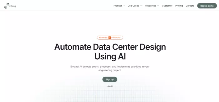
1. The AI-Powered Data Center Designer
Our first startup is developing an AI solution for data center design and engineering reviews. While their idea sounds promising, their homepage left me scratching my head.
Tactics
- Leveraging AI as a key selling point. The homepage prominently mentions AI, positioning it as a key feature of their solution.
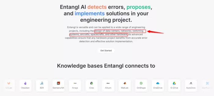
- Multiple industries are addressed, including data centers and avionics, suggesting a versatile product.
Mistakes
- Inconsistent terminology created confusion. Multiple industries are addressed, including data centers and avionics, suggesting a versatile product.
- Lack of specificity in their value proposition
- Overreliance on AI as a buzzword without explaining its practical benefits. There's no clear explanation of how their AI solution works or why it's better than traditional methods.
The takeaway? While it's great to highlight innovative technology, it's crucial to explain how it solves specific problems for your target audience. Don't assume your visitors understand industry jargon or the inherent value of AI – spell it out for them.
2. EXA Laboratories: Reconfigurable Chips for AI
EXA Laboratories took a different approach with their homepage, opting for simplicity and directness.
Tactics
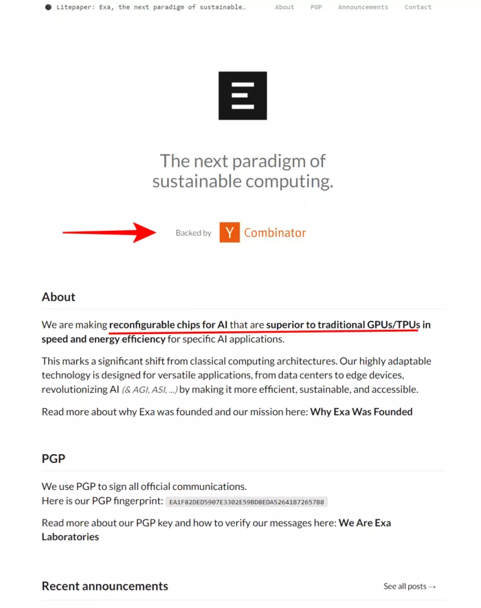
- Clear social proof. "Backed by Y Combinator" is prominently displayed, leveraging the accelerator's reputation.
- Specific problem statement. The homepage clearly states they're making "reconfigurable chips for AI model training and execution."
- Industry-focused approach. It targets a specific niche (AI hardware) rather than a broad market.
Mistakes
- Lack of detailed explanation. While clear to industry insiders, it might not provide enough context for general audiences or potential investors unfamiliar with the specific technology.
- There's no clear call-to-action or information on how to engage with the company.
- Absence of specific use cases. Not providing examples of how their technology could be applied or who their target customers are.
EXA's homepage works well for industry insiders but might leave others wanting more information. Remember, your homepage should cater to various audience levels, from curious beginners to seasoned experts.
3. Kopra Bio: Cancer Immunotherapy Innovators
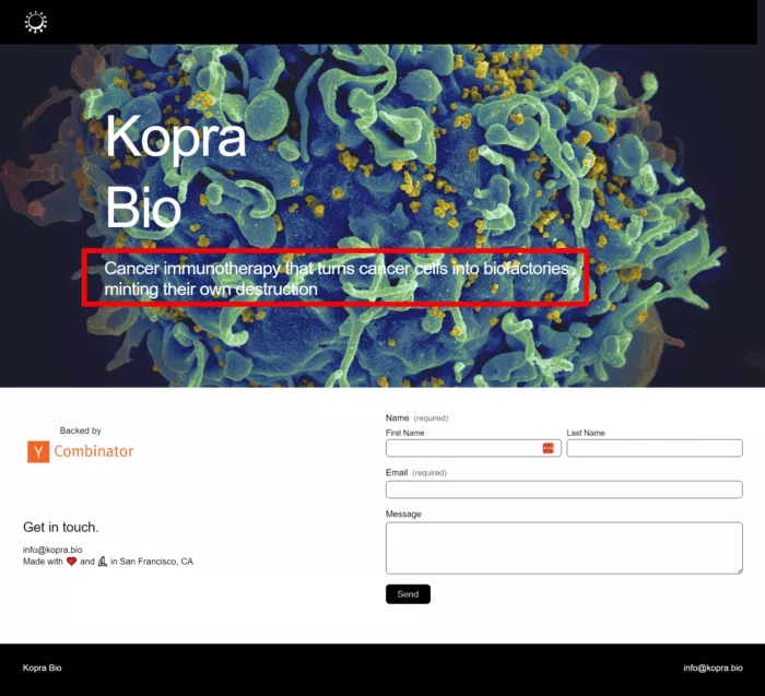
Kopra Bio's homepage showcases both the power and pitfalls of trying to be too clever with your messaging.
Tactics
- Unique value proposition. It is attempting to convey their novel approach to cancer treatment in a single headline.
- Use of scientific terminology to establish credibility / demonstrate expertise in their field.
- Memorable phrasing. Trying to create a memorable description with phrases like "biofactories" and "minting their own destruction".
Mistakes
- Overly complex headline. The main headline, "Cancer immunotherapy that turns cancer cells into biofactories minting their own destruction," is complex and difficult to parse quickly.
- Overuse of jargon and metaphors. There's no simpler explanation or breakdown of what their technology actually does.
- Prioritizing cleverness over clarity
The lesson? While it's tempting to craft a witty, memorable tagline, never sacrifice clarity for cleverness. Your primary goal should be to communicate your value proposition in a way that's easy to understand, even for those outside your immediate field.
4. LedgerUp AI: AI-Powered Bookkeeping
Ledger Up AI's homepage is a classic case of trying to do too much at once.

Tactics
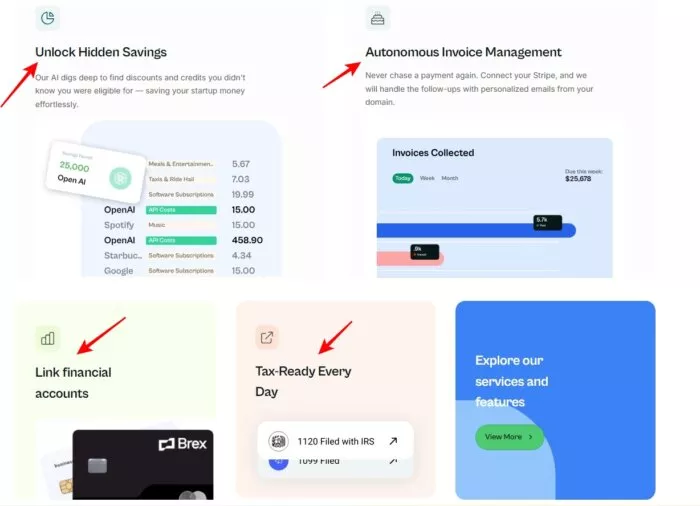
- Visual representation of the product. The page shows images of a dashboard, giving visitors a visual idea of the product.
- Targeting pain points. Mentioning tax readiness and investor readiness.
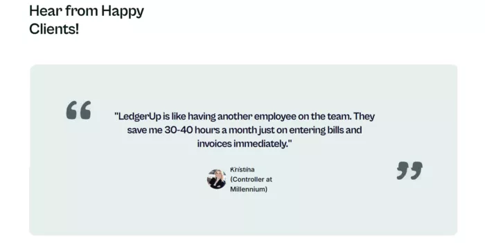
- Use of social proof. Including testimonials or user experiences.
- Time-saving emphasis. Claiming to save users significant time (34 hours a month).
Mistakes
- The page lists numerous features like autonomous invoice management and hidden savings detection without clearly explaining how they work together.
- User experience: Testimonials change too quickly for users to read, potentially frustrating visitors.
5. OrgOrg: Team Productivity Suite
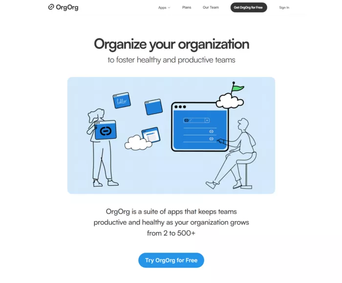
The "org" homepage takes a minimalist approach but falls short in clearly communicating its value.
Tactics
- Catchy, simple name. Using a simple, memorable name "org".
- Growth-focused messaging: Mentioning scalability from 2 to 500+ team members.
- Suite of apps approach: Positioning the product as a comprehensive solution.
Mistakes:
- Ambiguous use of "healthy": Failing to define what "healthy" means in the context of team productivity. It creates confusion about whether it's about physical health, mental ealth, or team
- Lack of clear problem statement. It is not clearly articulating the pain points or problems their product solves.
- Generic messaging that doesn't differentiate from competitors. Using broad, non-specific language that doesn't distinguish the product from competitors.
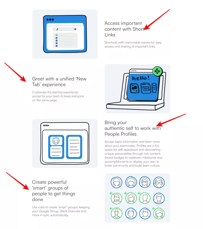
Remember, while simplicity can be powerful, it shouldn't come at the cost of clarity. Make sure your homepage clearly articulates the problem you're solving and how you're different from the competition.
6. Oway.io: Rideshare for Freight
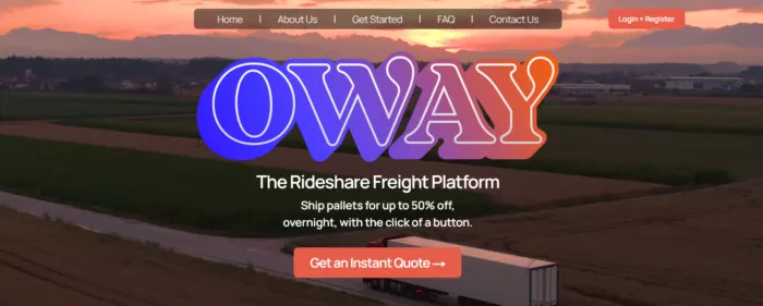
Oway.io's homepage stands out as one of the stronger examples in our review.
Tactics
- The value proposition is clear: "Ship pallets for up to 50% off overnight with click of a button."
- Relatable concept (using "ride share" analogy for freight shipping)
- A simple three-step process (get a quote, match with driver, overnight delivery) is outlined.
Mistakes
- Potentially confusing name: "oway.io" might not be immediately memorable or relevant
- he background video, while dynamic, might distract from the main message.
- Different calls-to-action are used throughout the page, which could confuse visitors.
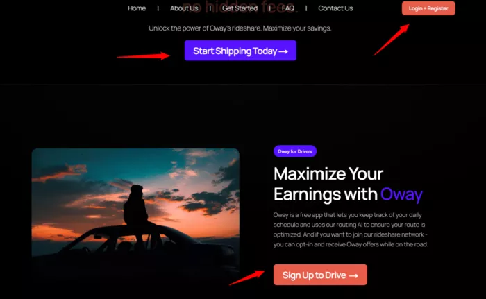
Oway.io does a great job of quickly communicating their value proposition and how their service works. However, they could improve by ensuring visual elements enhance rather than distract from their message and by maintaining consistent CTAs throughout the page.
7. Silurian AI: Earth Simulation Models
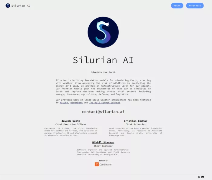
Silurian AI takes on the ambitious task of simulating Earth, starting with weather patterns.
Tactics
- Clear mission statement. The page clearly states their mission: "Building Foundation models for simulating Earth starting with weather."
- Specific use cases. Mentioning applications like assessing wildfire risk and predicting energy grid load
- Sector-specific relevance: Listing target industries (energy, insurance, agriculture, defense, logistics)
Mistakes
- Limited content: Minimal information on the landing page, which might not satisfy all potential customers or investors. The page lacks information about the team behind the technology.
- Missing differentiation. No clear explanation of how their technology differs from existing solutions
- No clear call-to-action (CTA): Missing guidance on how interested parties can engage or learn more
Silurian AI's homepage effectively communicates their grand vision but falls short in providing enough details to fully engage potential customers or investors. When dealing with cutting-edge technology, it's crucial to balance your big-picture vision with concrete details about your approach and progress.
8. Theseus: GPS-Denied Navigation
Thesus takes minimalism to the extreme with their three-word homepage.

Tactics
- Minimalist approach. Using only three words to describe their core offering.
- Focused messaging. Clearly stating their niche (GPS-denied navigation).
- Implied industry relevance. The nature of the product suggests relevance to defense and drone industries without explicitly stating it.
Mistakes
- Lack of context: Failing to provide enough information about what the company actually does.
- Missing target audience identification: Not clearly stating who their product is for (e.g., drone manufacturers, military contractors).
- No call-to-action (CTA): Missing guidance for interested parties on how to proceed or learn more.
- While Thesus's approach is certainly memorable, it fails to provide even basic information about their product or company. Even if you're in a highly specialized field, your homepage should offer enough context to engage potential clients, partners, or investors.
9. XTraffic: Traffic Management Solutions
Our final example, XTraffic, demonstrates the risks of being too vague on your homepage.

Tactics
- Direct call-to-action. The page includes an interest form for cities and towns to fill out.
- Problem statement. They mention "solving the world's traffic problems," which immediately identifies the issue they're addressing.
- Targeting. They specifically target cities and towns interested in reducing traffic congestion.
Mistakes
- Lack of specificity: The page doesn't explain how they plan to solve traffic problems. This vagueness might reduce trust and interest from potential clients.
- Missing information: There's no detail about their solution, technology, or approach. This lack of information might make it difficult for interested parties to decide if they want to reach out.
- Lack of social proof: There are no case studies, testimonials, or examples of successful implementations, which could help build trust.
XT Traffic's homepage leaves visitors with more questions than answers. While simplicity can be effective, it shouldn't come at the cost of providing essential information about your product or service.
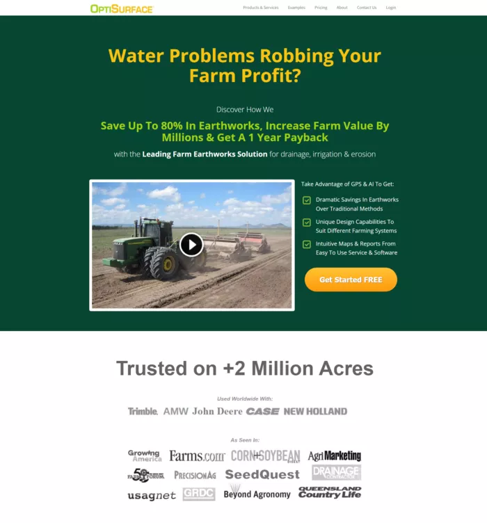
Bonus Site : Optisurface
Tactics
- Clear problem statement. Immediately identifies "water problems robbing farm profit" as the issue they're addressing.
- Targeted audience. Clearly aimed at farmers, specifically addressing their pain points.
- Specific value proposition. Mentions saving "up to 80% in earthworks" and "increase farm value by millions".
Mistakes
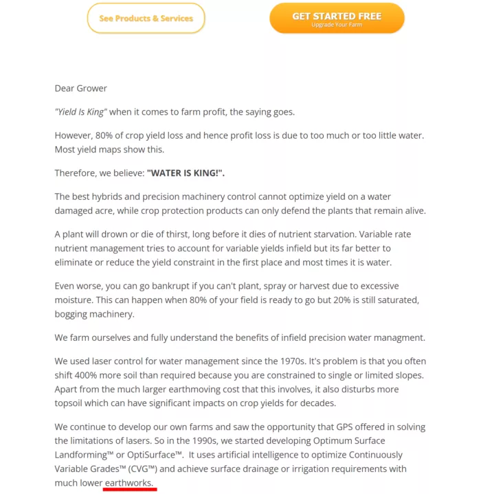
- Jargon usage: Uses terms like "earthworks" without explanation, which might not be clear to all farmers.
- Lack of explanation on delivery method: Doesn't clearly explain how the solution is implemented (software, service, or combination).
- Awkward letter format: The "Dear grower" letter feels out of place and disrupts the flow of the page.
If you want to get great work done for you, then you HAVE to download this free guide: 29 Examples of Marketing Projects You Can Delegate to Growbo to see how we can help you save time and money
Conclusion
We've journeyed through the essentials of crafting a successful startup landing page, highlighting what works, what doesn't, and how you can improve. For entrepreneurs and marketers, these insights are crucial. Your landing page is often the first impression potential customers get of your business, so making it count is paramount.
Here are several key lessons that emerge:
- Clarity is king: No matter how complex your product or service, your homepage should clearly communicate what you do and the value you provide.
- Know your audience: Tailor your messaging to your target audience, but don't alienate potential customers or investors who might not be industry insiders.
- Show, don't just tell: Use visuals, case studies, or demos to illustrate how your product works and the benefits it provides.
- Balance features and benefits: While it's important to highlight your product's capabilities, focus on how these features solve real problems for your customers.
- Provide next steps: Always include clear calls-to-action so interested visitors know how to proceed.
- Use social proof wisely: Leverage testimonials, case studies, or prominent backers (like Y Combinator) to build credibility.
- Optimize for all devices: Ensure your homepage looks great and functions well on both desktop and mobile devices.
- Keep it current: Regularly update your homepage to reflect your latest offerings and achievements.
- Test and iterate: Use analytics and user feedback to continuously improve your landing page's effectiveness.
So, take a critical look at your own homepage or landing page. Does it effectively communicate your value proposition? Is it clear, engaging, and persuasive? If not, consider applying some of the lessons learned from this review. Your perfect homepage might be just a few tweaks away.
Keep Growin,’ stay focused,


