35 Web Design Mistakes: Epic Guide to Guarantee $0 in Sales

Having serviced thousands of clients with Growbo, I can tell you what works for a website (we took a new productized-service offering from zero to a $1.2 million in revenue within 18 months).
And with over 17 years of experience as a founder and marketer, I have also made my fair share of web design mistakes, and can tell you (without a doubt) what doesn’t work.
While learning what does work is valuable, perhaps equally valuable is learning what not to do (or rather, learning how to successfully fail at website design)
And if this epic, tongue-in-cheek guide on website design fails and how to absolutely just crash your conversions helps you achieve the opposite of even one of these points, then I’ll be happy. (And hopefully you’re entertained in the process.)
(Or, you can choose to be smarter than me when I was starting my companies and delegate designing your site to Growbo. )
We’ve separated our list of ways to succeed at failing into categories to make it easy for you to read and skim over:
- Strategy and Planning Web Design Mistakes
- Content and Copy Web Design Mistakes
- Navigation and User Experience Web Design Mistakes
- Visual Design Web Design Mistakes
- SEO and Technical Web Design Mistakes
- Compatibility and Browser Support Web Design Mistakes
- Security and Privacy Web Design Mistakes
- Integration and Functionality Web Design Mistakes
- Accessibility and ADA Compliance Web Design Mistakes
All right, let’s take a humorous (and droll) look at some website design mistakes to avoid like your ex at a wedding.
In a rush? Grab a copy of this article to read anytime, anywhere. Download this article so you can quickly reference it if you notice sales funnel leakage. Click here to download it now.
Strategy and Planning Web Design Mistakes
1. Lack of Clear Goals and Objectives
A grand voyage begins when a client lands on your site… But wait, what’s the destination? Without clear goals and objectives, you’re basically setting sail without a compass. Not cool. Do that if you don’t like money and customers.
2. Inadequate Target Audience Research
Ah, the bliss of ignorance! Want to fail spectacularly? Skip the target audience research. Who needs to know customers’ needs, interests, or preferences? Just throw random designs, colors, and content at the wall and hope something sticks.
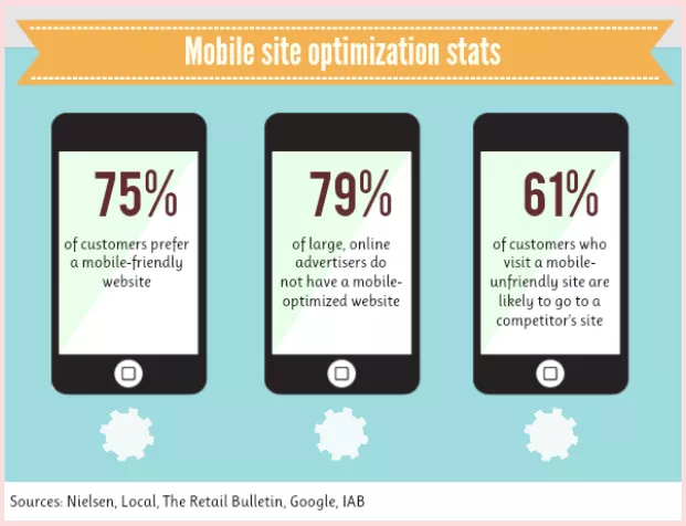
3. Ignoring Mobile Responsiveness and Optimization
It’s not worth the time and energy to create a seamless browsing experience on mobile. Besides, it’s only how 4.32 billion people browse the internet. Here’s a good idea: Let’s frustrate our visitors with microscopic text, broken layouts, and complete disregard for their sanity.
4. Not Having a Backup Plan in Case of a Disaster
Who needs a safety net when you’re walking the tightrope of web design? Embrace the thrill of uncertainty as your website teeters on the edge of oblivion. Forget about backups because why have a Plan B when your website can vanish into thin air one day? Early vacation!
Content and Copy Web Design Mistakes
5. Poorly Written or Irrelevant Content
Don’t worry about compelling, concise copy when you can drown your audience in a sea of mediocrity. Embrace the art of rambling prose that leaves your readers scratching their heads. Forget about relevance and impact, and don’t worry about doing research and speaking to a target audience. Just toss generic words on the page and hope for the best. ChatGPT is good for that.
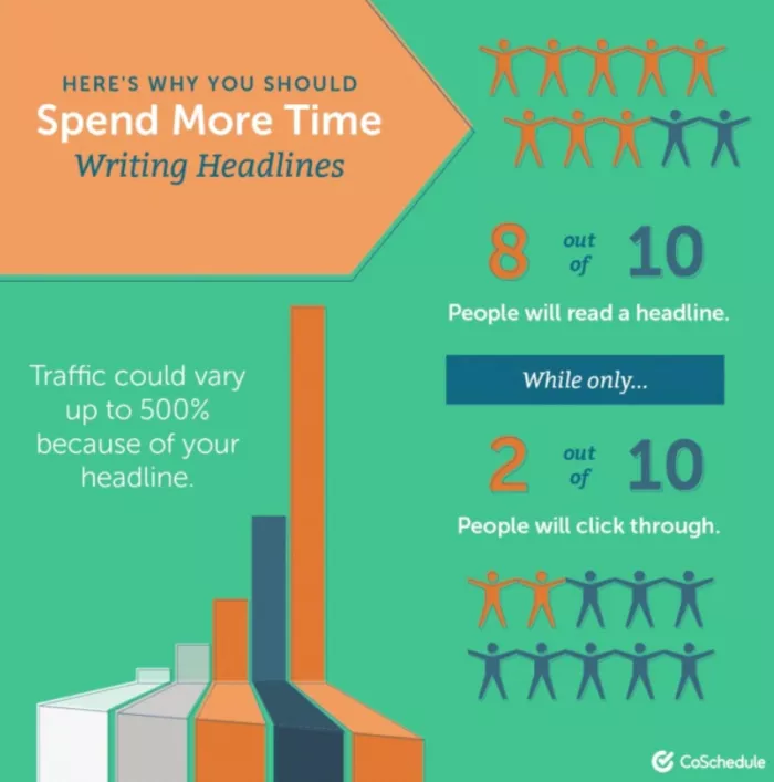
6. Lack of Compelling Headlines and Subheadings
Rule No. 1 of marketing: Be interesting. Rule No. 1 of failing at marketing: Don’t be interesting.
Bland, uninspiring headings are the way to go if you want your website to blend in with the virtual wallpaper. Dull, lifeless headings ensure visitors click away faster than you can say, “I wonder what’s on Twitter today…”
7. Overuse of Technical Jargon or Industry-Specific Terms
Nothing says “success” like confusing your visitors with a barrage of incomprehensible jargon. Want your website to repel potential customers? Then go ahead, flood them with terms they’ve never heard of and leave them scratching their heads. (Use the Hemingway app to avoid this issue.)
8. Inconsistent Tone and Voice Throughout the Website
Everyone loves the thrill of inconsistency. Want to keep your visitors guessing and on a rollercoaster of emotions? Well, just ensure your website’s tone and voice change from page to page. Disorient them with a mishmash of casual, formal, and sarcastic styles. Weeeee!
Navigation and User Experience Web Design Mistakes
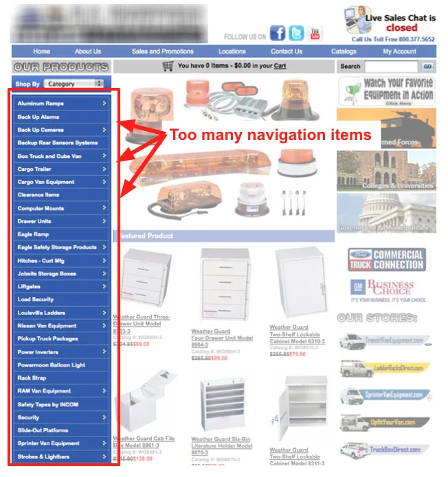
9. Complex or Confusing Website Navigation
Give your visitors a challenging puzzle to solve whenever they try to navigate your website. If your navigation is a convoluted mess of obscure labels, hidden menus, too many options, and dead-end links, you’ve succeeded at failing. Who needs simplicity when you can have a mind-boggling adventure? (A pet peeve of mine is pages with a “Pricing” header but no prices on the page… )
10. Broken Links and Missing Pages
Ah, the thrill of the unknown! Want to keep your visitors on their toes and give them a sense of adventure? Just scatter broken links and missing pages throughout your website. It’s like a treasure hunt, except the treasure is frustration and disappointment.
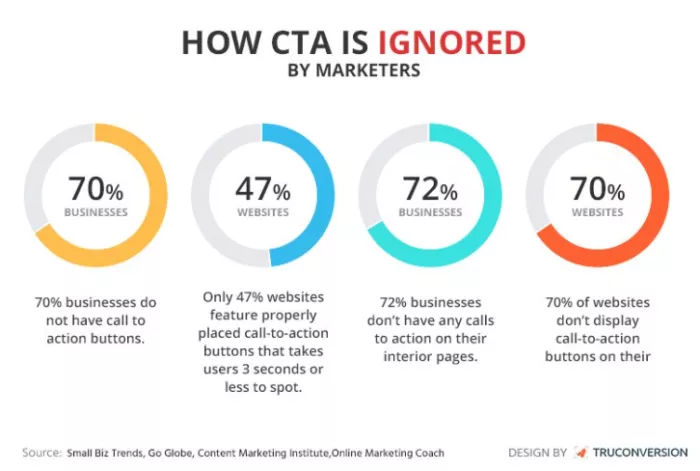
11. Lack of Intuitive User Interface, Straightforward User Journey, and Clear Calls to Action
Let’s play a game of hide-and-seek with your website visitors. Don’t make anything easy to find or understand. Confuse them with a maze-like interface and bury your calls to action deep within the pages. You don’t really need conversions anyway…
12. Not Using Social Media Share Buttons
Let’s keep your content a well-kept secret, shall we? Don’t give your visitors the convenience of easily sharing your content on social media. Limit their ability to spread the word and confine your website’s reach. After all, viral success and increased visibility is overrated.
13. Not Answering Visitor Questions
Don’t bother providing clear and helpful answers to their burning questions. Leave them hanging, frustrated, and eager to bounce off your website. Who needs customer satisfaction, engagement, happy customers, word-of-mouth expansion, and increased sales? Not you.
14. Not Having a Clear Return Policy or Warranty Information
Let’s keep it mysterious and leave your customers guessing. Don’t bother providing any reassurance or peace of mind. Make them wonder what will happen if something goes wrong with their purchase. No guarantees, no warranties, just pure suspense and frustration.
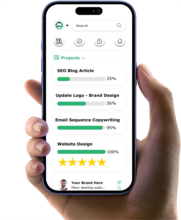
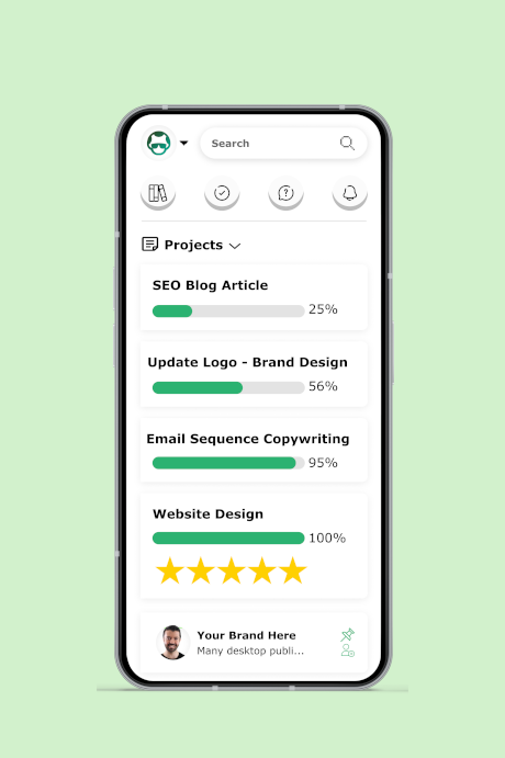
In all seriousness, Growbo’s team of professionals (including web designers) can get your website looking and functioning at its best and generating sales for you. Plus, Growbo.com gets it done-for-you fast. Delegate your marketing projects and tasks to an entire team of professionals. Watch a Demo.
Visual Design Web Design Mistakes
15. Cluttered and Overwhelming Layout
Embrace the chaos! Fill your website with a mishmash of colors, highlights, and graphics. Make it a visual assault on the senses. Confuse your visitors with a kaleidoscope of design element that’s as head-spinning as possible. It’s a design adventure!

16. Inconsistent Branding and Color Scheme
Who needs a coherent brand identity anyway? Throw caution to the wind and use a different color scheme on every page. Your visitors won’t know what hit them, but hey, at least it’s not boring! Keep ’em guessing, right?
17. Low-Quality or Irrelevant Images and Graphics
Visually appealing content or pixelated masterpieces? I think we all know the answer to that… Don’t waste your time searching for high-quality, relevant images. Instead, opt for the grainy, generic stock photos everyone’s seen a million times. Remember, your credibility is at stake, so make sure your website screams “unprofessional” loud and clear.
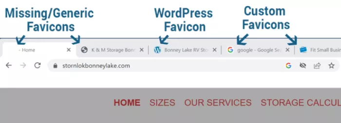
18. Not Using Favicons
What the heck is a favicon anyway? It’s just a tiny icon representing your brand across browser tabs and bookmarks. Why bother with such trivial details? Small mistakes never hurt a company before…
19. Poor Typography and Readability Issues
Make your website a virtual eye chart. Have an eclectic mix of fonts, sizes, and styles. Why settle for one readable font when you can have an entire typography circus? Remember, legibility is for the weak. Make your visitors work hard to decipher your content, or better yet, give them a headache.
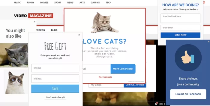
20. Using Overly Aggressive Pop-Ups
Nothing says “friendly browsing experience” like bombarding customers with countless pop-ups begging for attention. Plus, you get the bonus of a nice drop in your Google rankings. You’ll drive visitors away faster than you can say “bounce rate.” Nice.
21. Using Website Sliders, the Silent Killers of Conversions
There’s a thrill of seeing a website slider appear on your screen, only to have it swiftly whisked away before you can even comprehend its message. It’s like playing a never-ending game of whack-a-mole with valuable content. And who doesn’t find whack-a-mole fun?
SEO and Technical Web Design Mistakes
22. Ignoring Search Engine Optimization (SEO) Best Practices
SEO? It’s just a bunch of rules and guidelines to improve your website’s visibility in search engine results. Why bother with that? Let your website get lost in the vast abyss of the internet. Forget about keywords, optimization, images, and title tags. It’s not like Google knows anything about online success anyway…
23. Missing Meta Tags and Descriptions
Just leave meta tags and image description empty and let Google guess what your website is about. Don’t provide any relevant information or enticing descriptions that could attract potential visitors.
24. Nonoptimized URLs and Lack of Proper Redirects
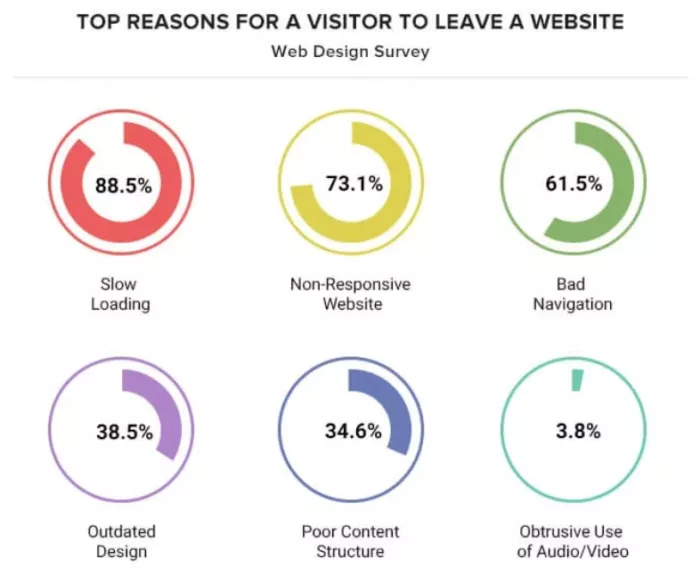
Why settle for clear and concise URLs that actually make sense when you can have a jumbled mess of random characters and symbols? And who needs help being redirected from old links to new pages? I’m sure your customers will do the work themselves to get to the right page. Bad navigation is only the third-highest reason people bail on websites…
25. Failure To Install Analytics and Tracking Tools
Oh, Hotjar and Google Analytics? Those pesky, little tools that can actually help you understand your website’s performance and optimize it for success? Instead of implementing these insightful plug-ins, rely on pure guesswork and blind faith.
Compatibility and Browser Support Web Design Mistakes
26. Nonresponsive Design Across Different Devices and Screen Sizes
Why bother with a flexible, accordion-like design when you can have a fixed, rigid layout that leaves mobile users squinting and frustrated? Pretty sure everyone just uses a fixed desktop screen (or their $3,500 Apple Vision Pro VR Goggles) for browsing the internet and paying for things anyway…
27. Incompatibility With Various Web Browsers
Like Team Edward or Team Jacob from Twilight, just pick one browser and stick with it. Let your website look flawless on one browser and completely broken on another. Then let your customers play browser roulette. Will it load? Will it crash? Who knows?
Seen enough website design mistakes to want professionals to take care of all your digital marketing needs for you? At Growbo.com, we’re ready to assist you on this journey—all you need to do is delegate. Start Your $7-for-7-Days Trial Now.
Security and Privacy Web Design Mistakes
28. Inadequate Website Security Measures
If you want to excel at failing in web design, forget about those pesky security measures. Just go ahead and use “password123” as your fortress gate. After all, who needs SSL encryption or strong passwords when you can welcome hackers with open arms? Speaking of…
29. Lack of SSL Encryption and Secure Payment Options
SSL encryption is only the knight in shining armor that protects sensitive data from the clutches of cybercriminals. But let’s live dangerously. Let’s leave our website unprotected and invite hackers to a digital feast. Credit card numbers, personal information, everything is up for grabs!

30. Absence of Clear Privacy Policy and Data Protection Measures
Will users’ data be sold to the highest bidder? Will it be used to vote in the next election? Are your cookies just for eating? Your guess is as good as theirs without a clear privacy policy and data protection measures.
(On another serious note, check out the 11 Laws of Sales Funnel Physics Every Business Needs To Know to learn about how to get around many of these web design mistakes.)
Integration and Functionality Web Design Mistakes
31. Broken or Dysfunctional Contact Forms and Email Subscriptions
Watch as your customers try their best to fill out crucial details. Be enthralled as they sign up for emails from you that never come. A symphony of missed connections and frustrated sighs, creating a web of confusion. Good stuff.
32. Nonfunctional Search Features or Filters
Why bother making it easy for users to find what they want? Instead, let them navigate a maze of broken links and irrelevant search results. It’s like trying to find your way out of one of those massive corn mazes, but with no pie at the end. Fun, right?
33. Failure To Continually Optimize Your Website’s Performance
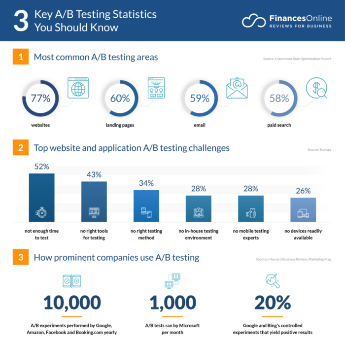
Who needs a fast-loading, functional website anyway? Let it be slow, buggy, and crash-prone. And don’t even think about conducting A/B tests or gathering user feedback. Let your ignorance be your guide, especially when improving your user experience and boosting conversions.
Accessibility and ADA Compliance Web Design Mistakes
Let’s hold off on the sarcasm and jokes for this section, and we’ll just tell you why you should not make these mistakes.
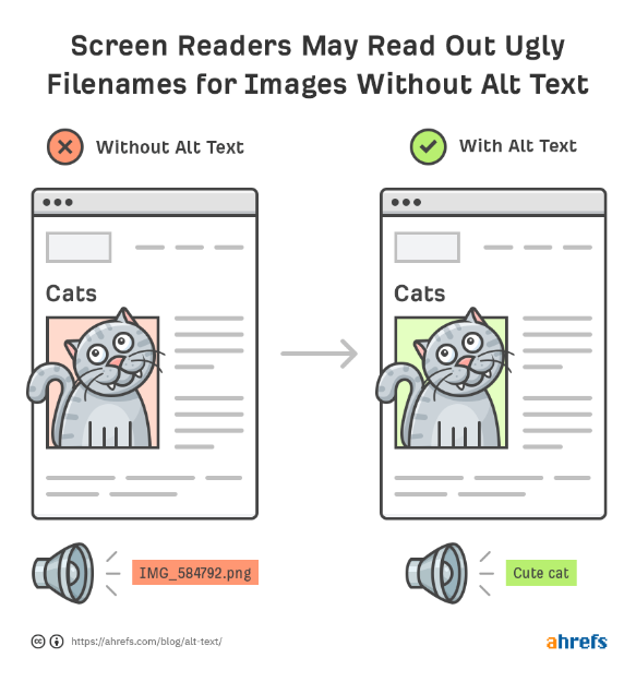
34. Failure To Provide Alternative Text for Images and Multimedia
Alternative text for images and multimedia is like a secret language for your site that only search engines and screen readers understand. Not only does it make your website more accessible to those with disabilities, but it also gives your SEO a boost. Talk about killing two birds with one alt text!
35. Noncompliance With ADA Guidelines and Regulations
Adhering to the American With Disabilities Act (ADA) for websites means ensuring people with disabilities have equal access to your content. Just like steps prohibit some people from entering a physical business, your website might also be inaccessible. To ensure everyone can use your website, avoid things like poor color contrast or using color alone for information, not using video captions, inaccessible forms, or mouse-only navigation.
Conclusion
Ready to elevate your web design game? At Growbo.com, we’re here to guide you through the pitfalls and help you avoid the common mistakes that can hinder your business’s online success. Take the first step toward success with our expert assistance. Start Your $7-for-7-Days Trial Now.
There you have it—35 mistakes that many business website designs make—all laid out for you sarcastically so you remember to avoid them. (Please don’t take those literally!) Here’s a quick recap for you, just in case your memory is as bad as my first website design:
- Strategy and Planning Web Design Mistakes: Failing to plan and align web design with business goals strategically.
- Content and Copy Web Design Mistakes: Poorly crafted content and ineffective copywriting.
- Navigation and User Experience Web Design Mistakes: Confusing navigation, cluttered interfaces, and a lack of intuitive user experience.
- Visual Design Web Design Mistakes: Inconsistent or unappealing visual design elements.
- SEO and Technical Web Design Mistakes: Ignoring search engine optimization (SEO) best practices and technical issues that impact website performance.
- Compatibility and Browser Support Web Design Mistakes: Incompatibility with different web browsers and lack of responsiveness across devices.
- Security and Privacy Web Design Mistakes: Insufficient security measures and lack of privacy protection for user data.
- Integration and Functionality Web Design Mistakes: Nonfunctional features, broken forms, and poor functionalities integration.
- Accessibility and ADA Compliance Web Design Mistakes: Neglecting accessibility features and failing to comply with ADA guidelines.
One surefire way to limit your number of website design mistakes is to have Growbo take a look at your site or build it from the ground up. Our team of professionals will ensure your website design is coherent, engaging, and aligned, allowing you to keep customers and find new ones.
If I’ve left off some website design mistakes you have encountered, I would love to hear about them. Please share your thoughts in the comments below so we can all learn more.
Keep Growin’, stay focused.

Image Bibliography
- https://3dmailbox.com/
- https://razmobile.wordpress.com/2013/11/19/615/
- https://neilpatel.com/blog/powerful-headlines/
- https://neilpatel.com/blog/common-website-navigation-mistakes/
- https://fitsmallbusiness.com/favicon-website-icon/
- https://thumbvista.com/2020/08/the-secret-to-conversions-on-mobile-a-strong-call-to-action/
- https://www.eyequant.com/resources/is-my-website-too-cluttered/
- https://technians.com/blog/9-reasons-to-know-why-visitors-tend-to-ignore-your-website/
- https://ahrefs.com/blog/alt-text/
- https://stefanini.com/en/insights/articles/cyber-security-statistics-for-2022-data-and-trends
- https://financesonline.com/a-b-testing-statistics/