7 Coaching Websites Analyzed To Inspire Your Own

The other day the team sat down with a client named Dylan who's in the fitness industry.
They worked on monetizing his startups’ website traffic.
He gets 10,000+ visits per month. And that’s a cool metric to parade about for being a startup.
But was he making any sales from that traffic?
Zero.
You see, traffic alone does not pay your bills.
A well-crafted and high-converting coaching website will.
So in a matter of a few days, the team had completely revamped his coaching website—both copy and design.
Dylan delegated this project to the team (revamping his site), and he literally didn’t have to do anything but sit and wait.
And do you know what he’s the most happy about right now?
That he’s now actually making money with his website instead of losing it.
Because 1 out of 2 prospects will judge you based on how your coaching website looks according to Top Design Firms.
So if you don’t get both your website copy and design right, your coaching sales funnel will be leaking leads.
And as a coaching startup looking to get off the ground, I’m sure you’ll benefit from what this article has in it…
- First, I’ll be analyzing 7 coaching websites and we’ll go over what converts and what doesn’t.
- You’ll see what best practices will make your coaching website convert like:
- Having eye-catching CTA buttons
- Including social proof from past clients
- Using fonts and colors that are consistent
- And the one affordable tool that will help you monetize your traffic by revamping your coaching site.
Ready to turn your coaching website into a client-acquisition magnet?
Let’s begin with …
Want to delegate all your marketing and funnel work done—without the headaches of hiring? Download our free guide: 33 Marketing Projects You Can Delegate to Growbo and discover how to save 100+ hours a month, grow faster, and scale without the overhead.
Coaching Website Analysis To Give You Inspiration #1: I Speak Life
What Is It?
I Speak Life is an Atlanta-based executive and coaching business run by David Shawn Smith.
With specializations in succession planning, conflict resolution, talent development, and communication skills, David offers great value to a wide range of clients.
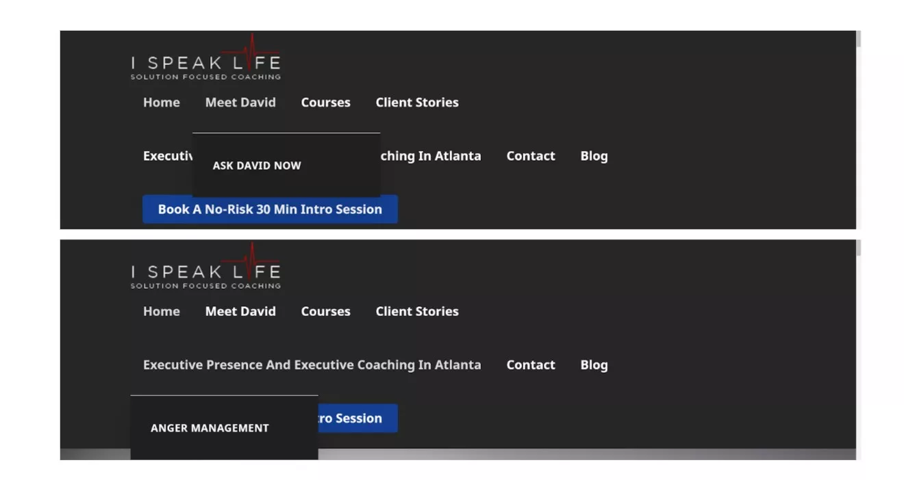
Besides that, he also teaches clients about anger management.
What Works With This Coaching Website?
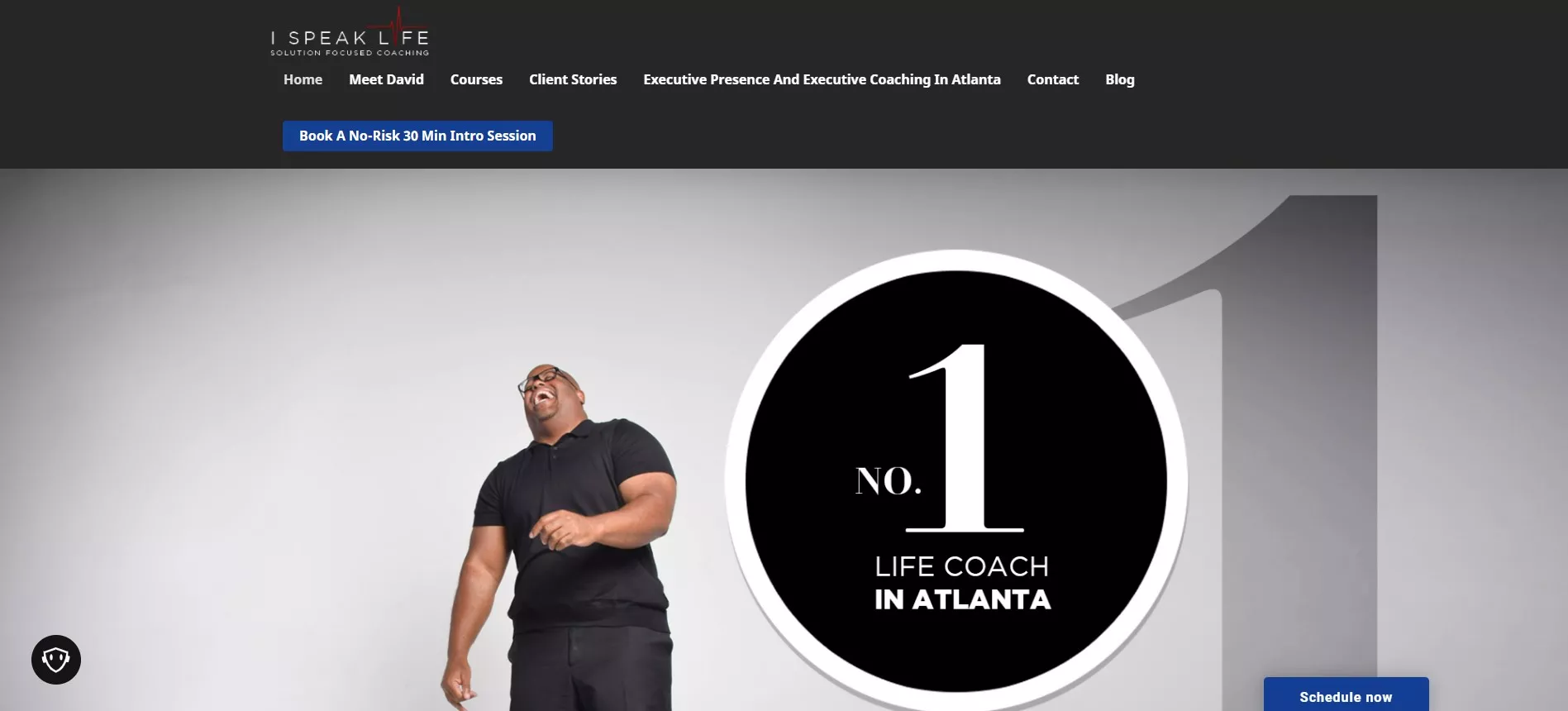
So the first thing that makes this website inspirational is how, right off the bat, David establishes himself as a friendly, outgoing guy with the use of the image of him laughing.
Besides that, “No. 1 Life Coach in Atlanta” is smack dab in your face, establishing credibility.
Moreover, the CTA to book an intro session stands out with the blue and white color scheme. Plus, the copy makes it known that you have nothing to lose by booking the session.
Then there’s also some brand logos of companies that David has worked with in the past to add some social proof.
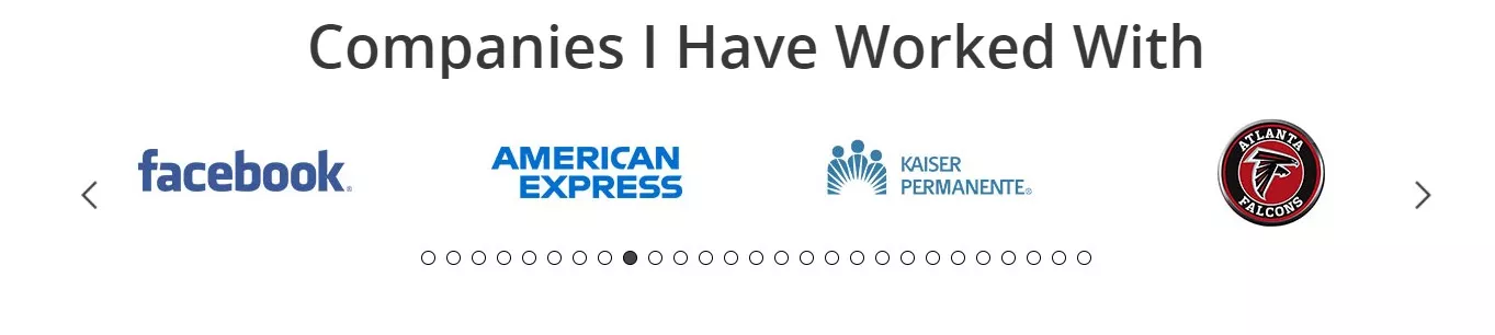
With big-name clients like Facebook and the Atlanta Falcons, David’s coaching services certainly sound a lot more appealing.
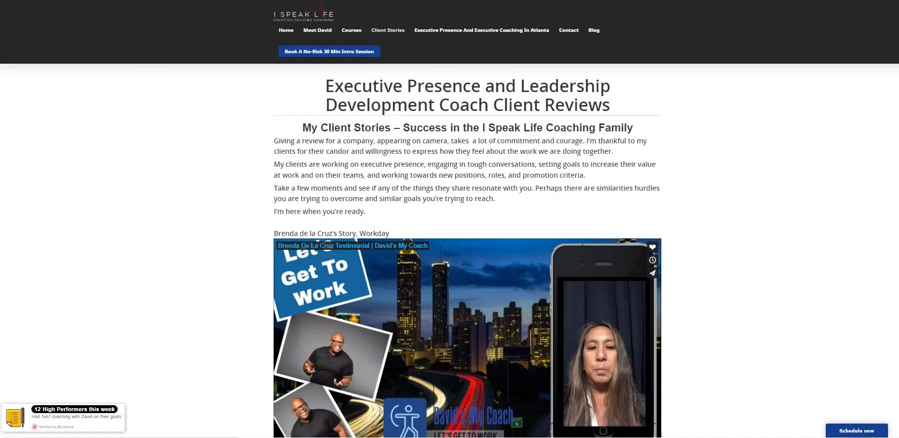
Adding to that, there’s also some client stories with video testimonials.
Considering that Cisco reports that 82% of all consumer content on the internet comes from video, the format choice was a wise decision.
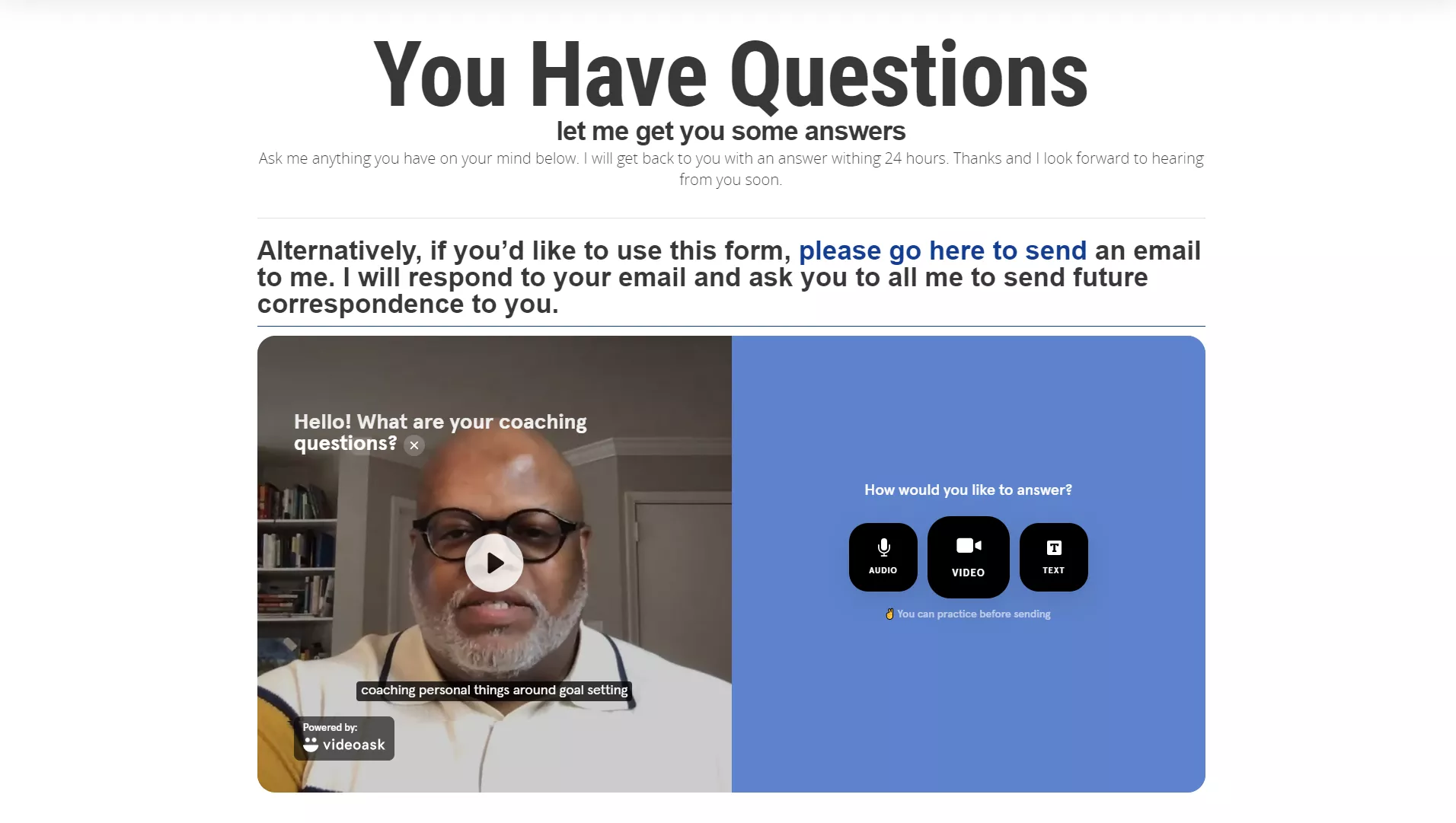
David also has an option for website visitors to ask him anything.
And within 24 hours, you can expect an answer. To me, this act of transparency seems like an incredibly useful way to show thought leadership as well as to initiate a relationship with a potential client.
What Could Use Some Work?
The first thing that comes to mind is the design.
Although there’s good use of color schemes and whitespace, I’m not a fan of the fonts.
To me, it looks all too generic.
Surely there are better font styles to use that would make the website look more professional.
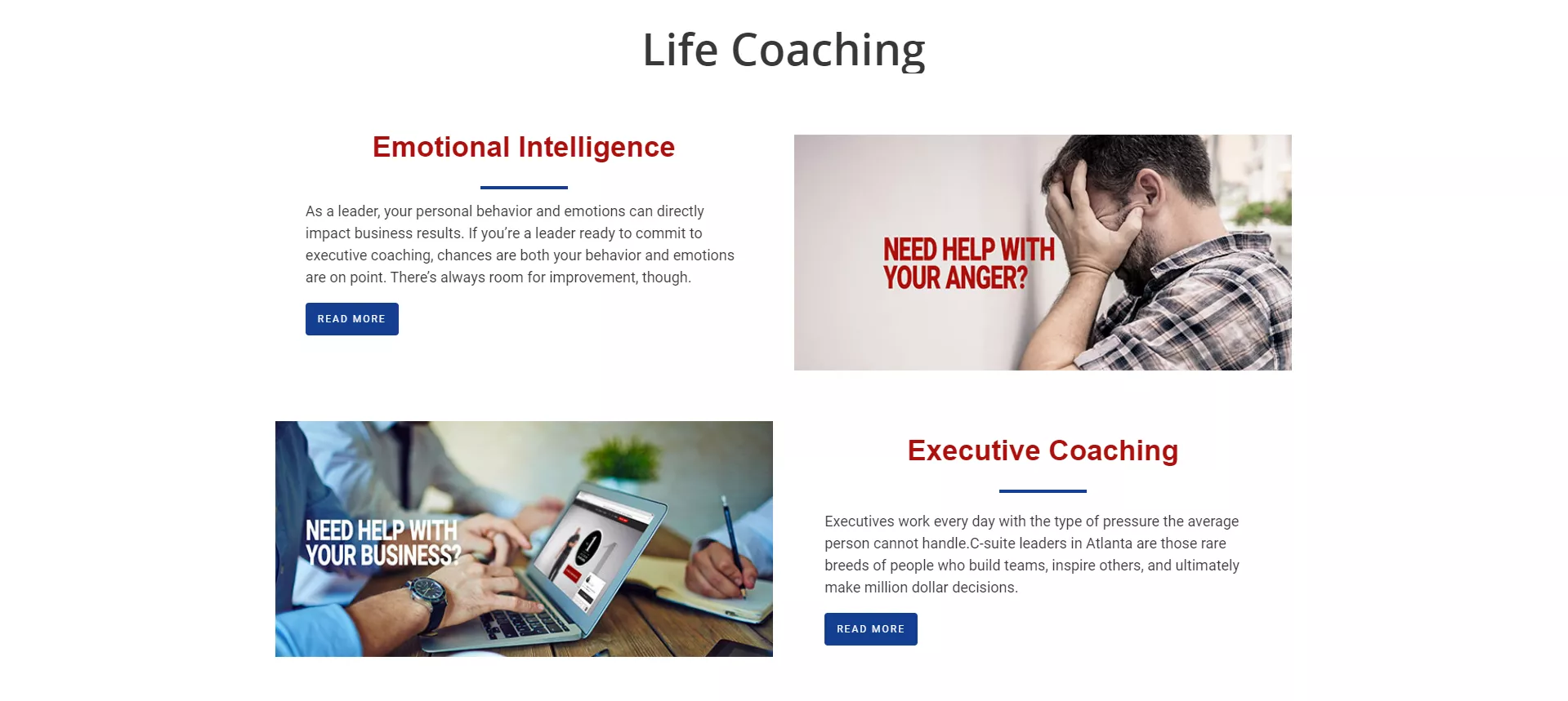

Also, when you hover over some of the tabs on the menu, there’s just one option listed in the drop-down. Seems redundant to even have the drop-down.
Now, heading over to the Client Stories page, the layout could use a major overhaul.
As it stands currently, everything is way too clustered and the client descriptions should be more in-depth.
Lastly, I noticed there’s a company blog but no opt-ins.
Like anywhere on the site.
It’s very possible that David does not have a newsletter, which would be a missed opportunity, even for a local coach.
Coaching Website Analysis To Give You Inspiration #2: Amy Latta
What Is It?
Amy Latta teaches other coaches how to be more confident.
Now that might sound like an atypical niche, but lacking confidence is a pretty universal concept.
Most people doubt their abilities from time to time, depending on context.
In fact, Psychology Today says that up to 85% of people struggle with low self-esteem.
So Amy’s offering may be a little unique, but a much in-demand one nevertheless.
What Works With This Coaching Website?
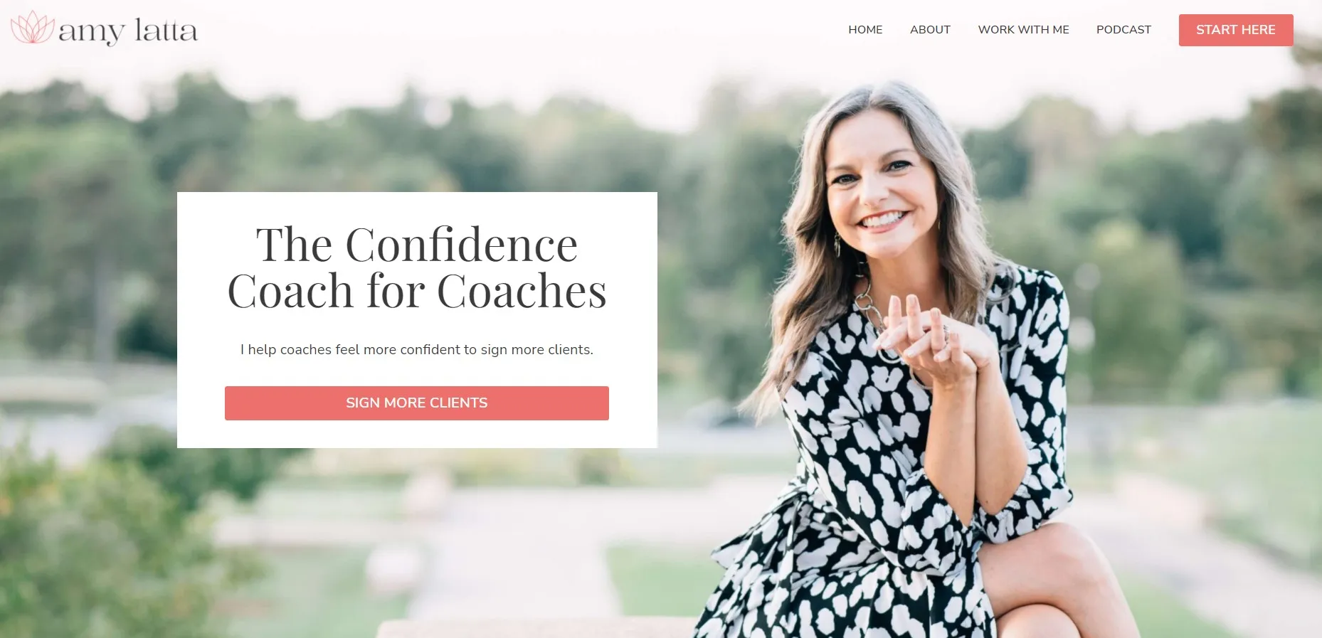
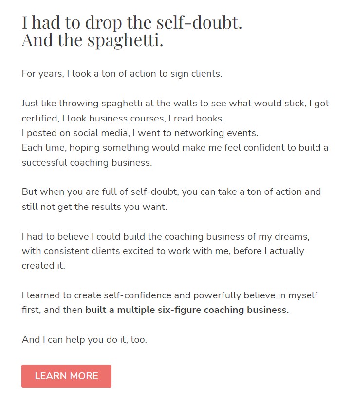
One of the first things you read on her website is her own journey to becoming more confident in her coaching abilities.
By telling her own story of evolving from self-doubt to a six-figure coaching business, potential clients feel an instant connection to Amy.
To put it another way, her personal story is hyper-targeted for her audience.
Like any good website, it sticks to a simplistic design that allows content consumption to be taken in at ease.
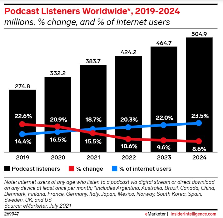
Instead of a blog, Amy focuses on a weekly podcast where she discusses topics that would be valuable to a coach.
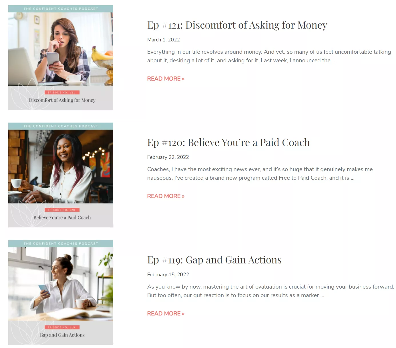
Although having a blog has a whole host of lead-generating benefits, a podcast isn’t too shabby either.
And if you don’t already have a podcast, then take inspiration from this fact: As found by eMarketer, the industry will have grown by 84% since 2019 by the time 2024 rolls around.
Evidently, the demand for podcasts hasn’t even peaked yet.
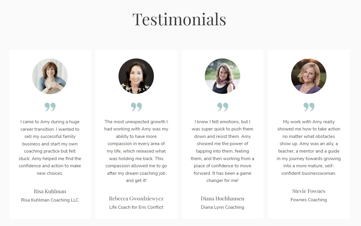
Near the bottom of her homepage, Amy features some testimonials from her clients to give skeptical prospects a little nudge in the right direction.
What Could Use Some Work?
Overall, this is a really effective coaching website.
You should take inspiration from the clean, minimalist design that’s nice to look at and navigate through.
But Amy really should invest in a blog.
A podcast is great, but blogging is still one of the top lead generation strategies.
According to a study by HubSpot, businesses with blogs experience 126% more leads than businesses that don’t.
And since Amy demonstrates the ability to tell captivating stories, blogging about some of her experiences should come easy.
Coaching Website Analysis To Give You Inspiration #3: Scott Laidler
What Is It?
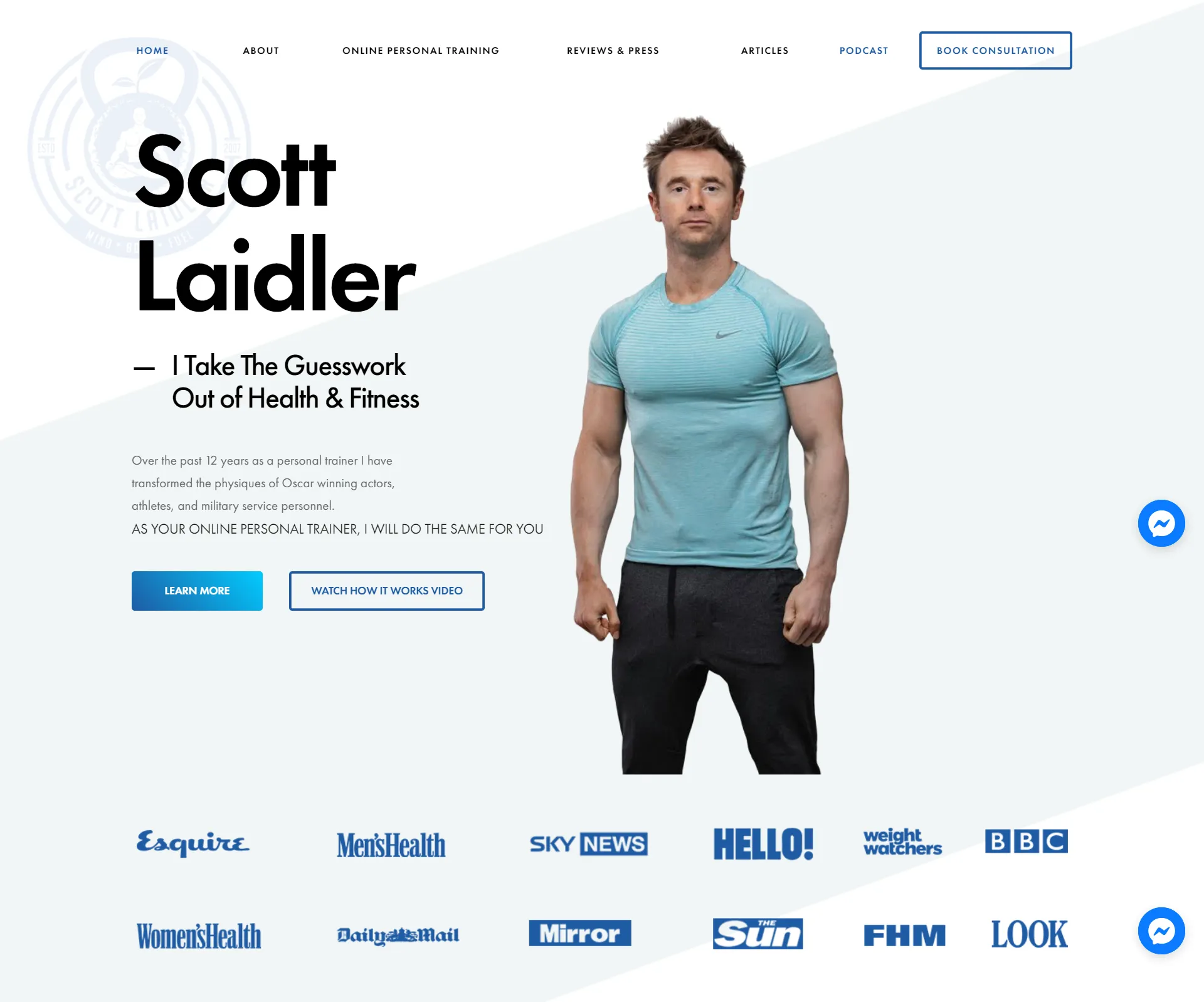
Scott Laidler is a health and fitness coach who’s been featured by Women’s Health and Men’s Fitness magazines.
And this isn’t a bad industry to get into for a coach.
According to Technavio, from 2020 to 2025, the health and wellness market size will increase by $1.39 trillion.
If you’re in this industry or planning to be, then you’ve got some competition.
Especially when it comes to Scott, as his coaching website is really top-notch.
What Works With This Coaching Website?
Let me ask you something …
If you were trying to get more healthy, who would you look to for inspiration?
For a lot of us, we look at famous people like actors and athletes. Others may think military personnel are the standard.
Well, Scott makes it known right away that he’s helped these types of people before. So if he can help them, then he can definitely help you.
And the social proof doesn’t stop there; it’s only beginning.
Underneath his quick opening summary, he’s got a host of brand logos of well-known news sources that he’s been featured in.
Additionally, there’s a slide of 5-star reviews that Scott has received.
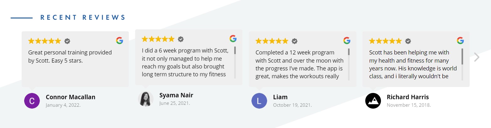
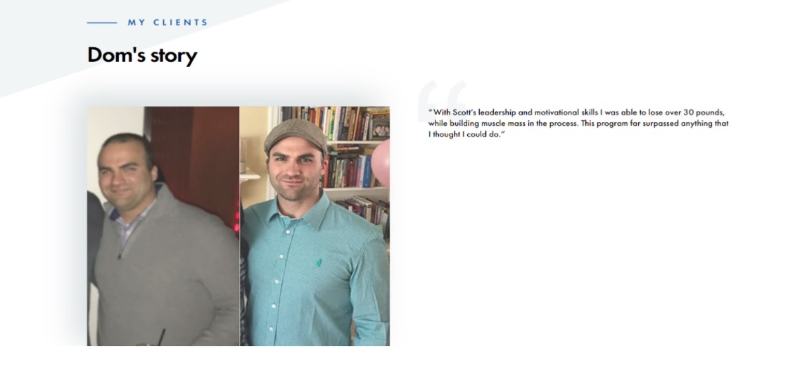
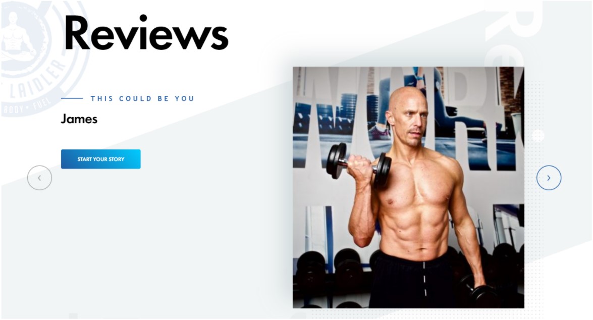
Then, he’s got an entire Reviews page dedicated to showing before and after photos of his clients. At the top of the page, you’ll see a CTA button to sign on with Scott.
As the website visitor looks on in envy, that’s the time when they’re most likely to make a snap decision.
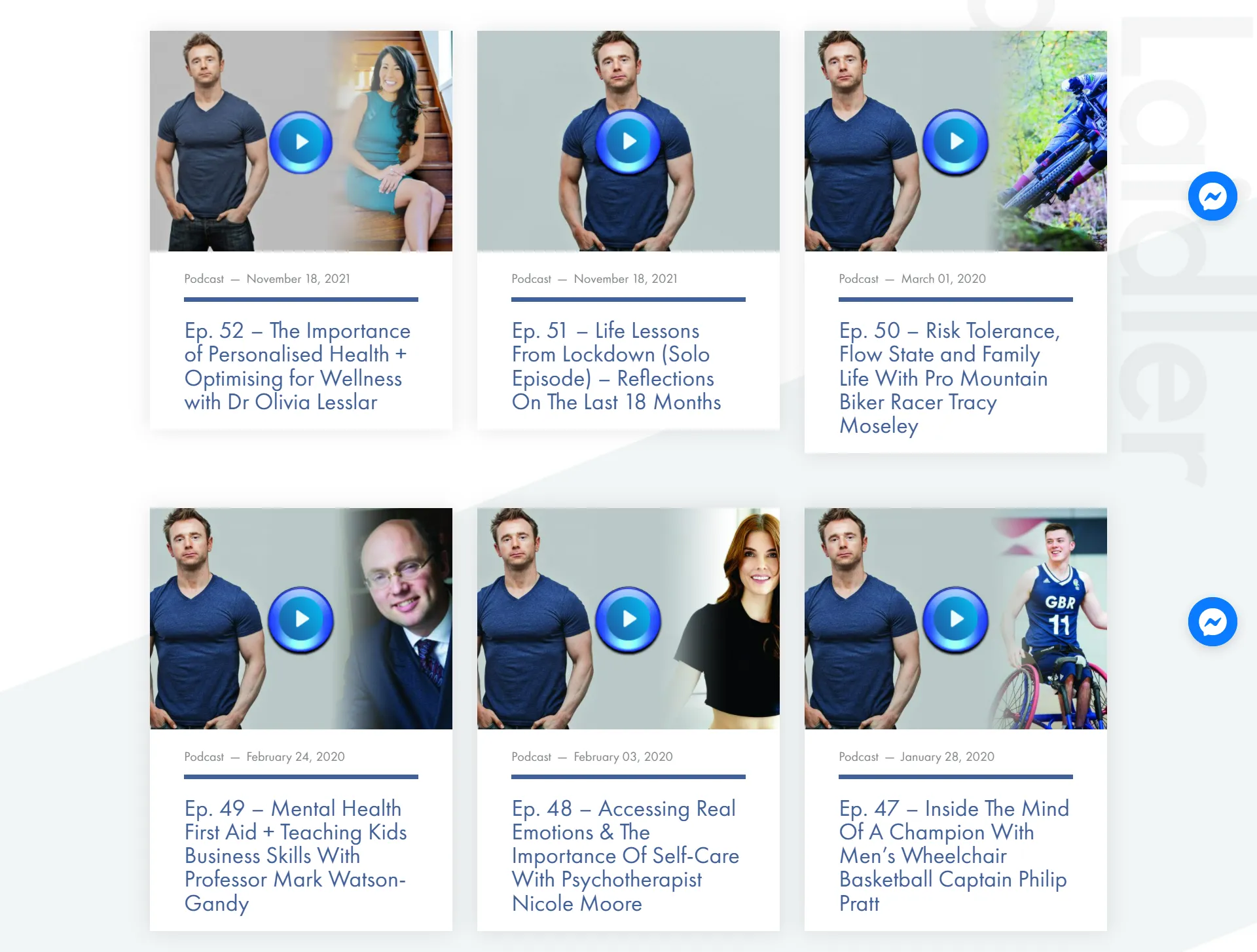
Over on the Podcast page, there’s a wide variety of content where Scott talks about relevant topics such as COVID-19.
Furthermore, he speaks with a lot of industry experts, such as doctors and professors, in his podcasts to add new viewpoints.
What Could Use Some Work?
Something I couldn’t help but notice was his outdated blog.
The last time there was consistent input to the Articles section was way back in 2018.
Not only would he increase his organic traffic, but he could share posts on social media channels to raise more brand awareness.
What’s more is the overabundance of photos.
Granted, people want to see some tangible results of past clients but this website goes a little overboard.
To me, it seems excessive and kind of on the “in your face,” spammy side.
Coaching Website Analysis To Give You Inspiration #4: Strategic Coach
What Is It?
With over 20 coaches to choose from, Strategic Coach offers business coaching services for a diverse audience.
And they also have a handful of speakers too.
As the main idea, Strategic Coach aims to inspire entrepreneurs and give them the confidence they need to succeed.
What Works With This Coaching Website?
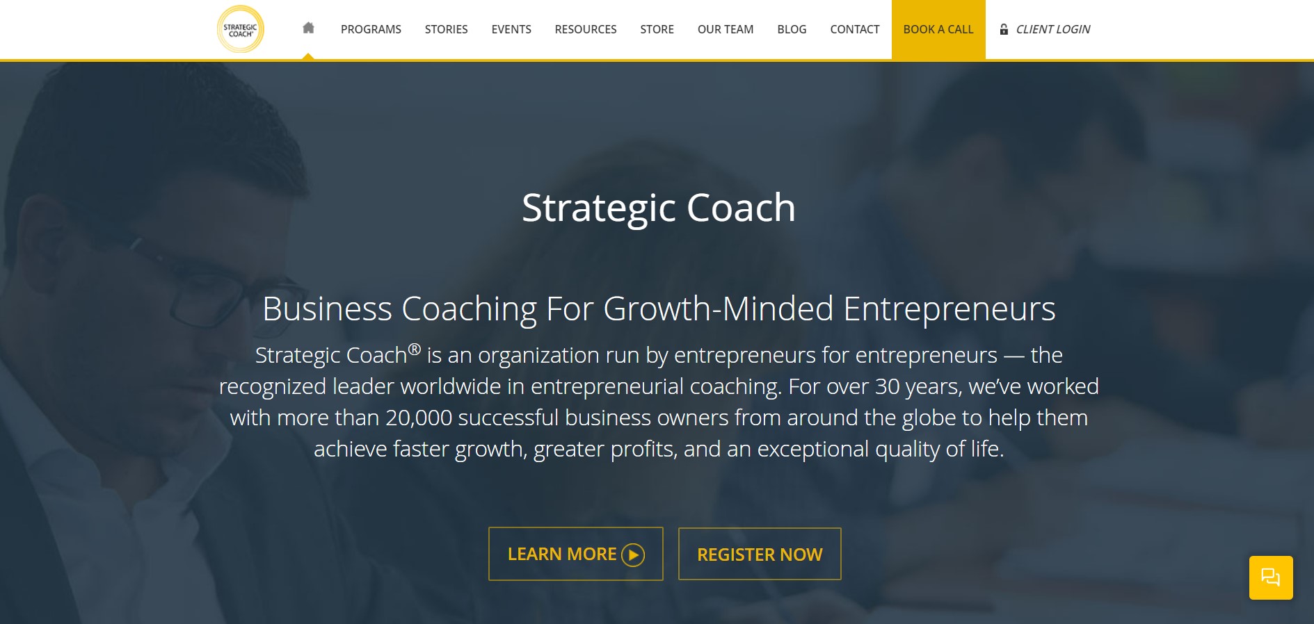
So I like how the first thing you read is about how well-established Strategic Coach is.
By letting the user know the company has helped over 20,000 business owners for more than 30 years, it helps position the brand as a credible source for entrepreneurial growth.
I also like the great use of color on this coaching website. In particular, the aura of professionalism that the dark blue background creates.
There’s a reason why 40% of Fortune 500 companies use the color blue in their logos — it’s associated with trustworthiness.
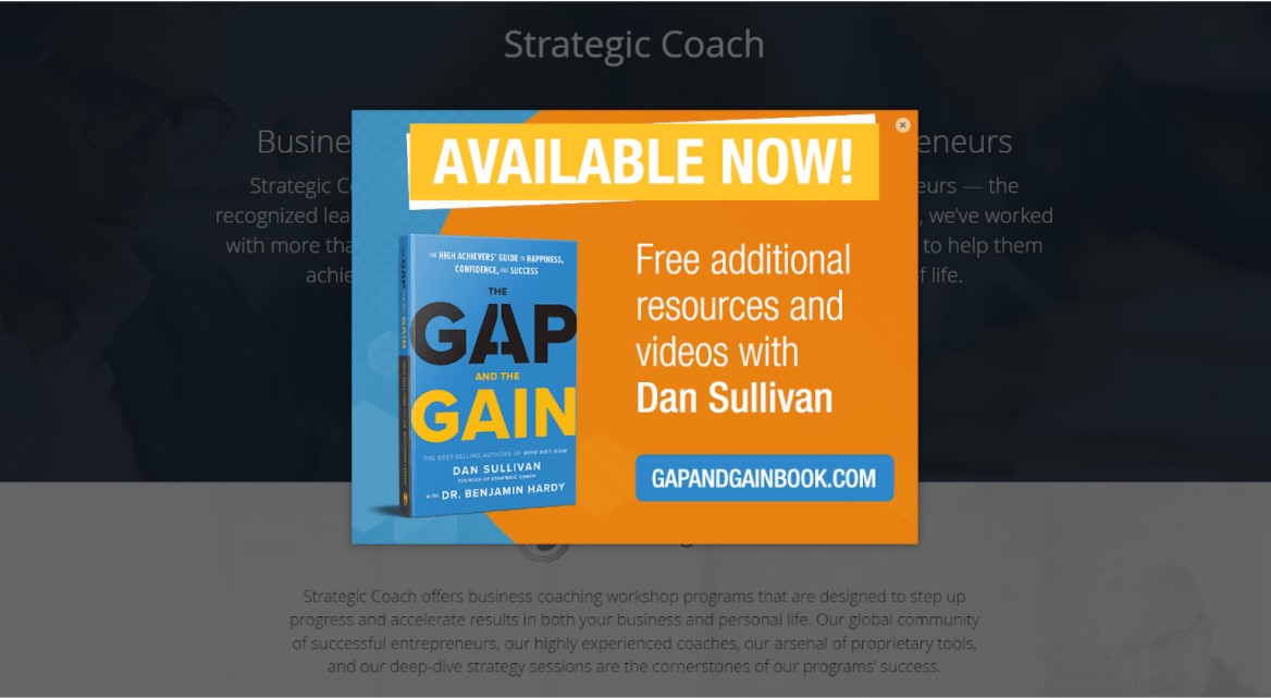
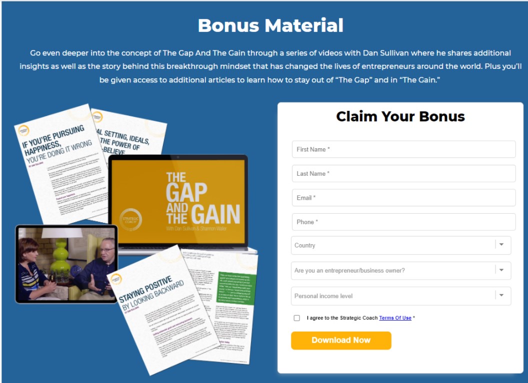
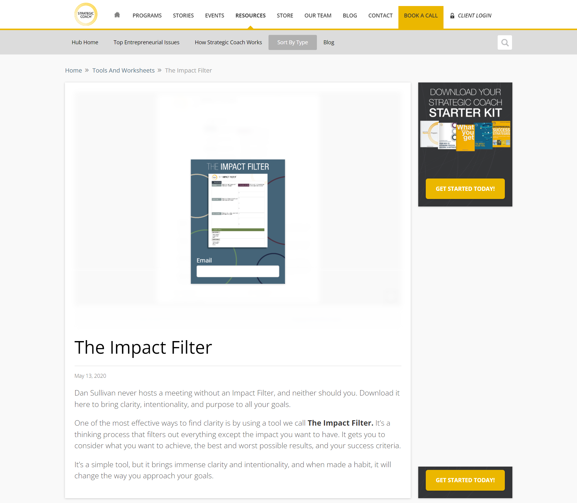
On the homepage, there’s an opt-in to purchase a book with free, additional resources in exchange for some personal information.
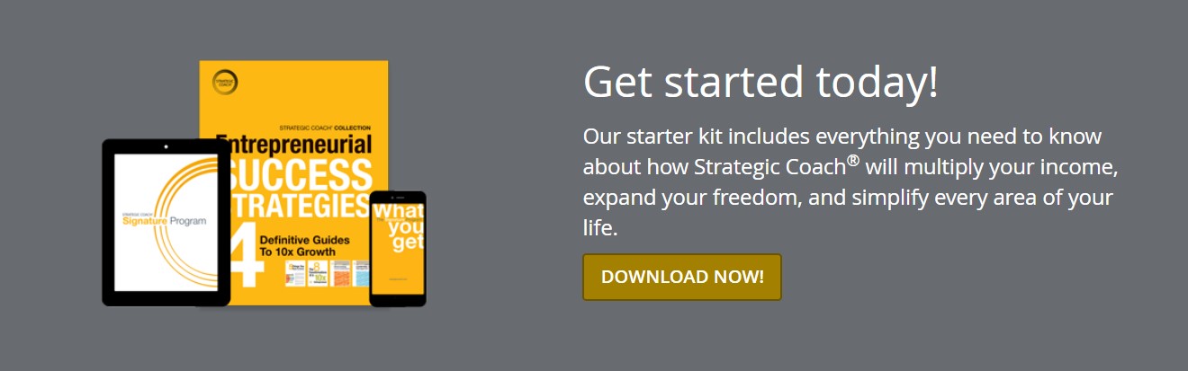
Strategic Coach also promotes another resource on its homepage that’s meant for lead generation purposes.
This time, it’s a starter kit.
And this download offer really catches your eye, as it’s the only section with a gray background.
By the way, all throughout the website, the CTA buttons are very prominent because of the use of contrast.
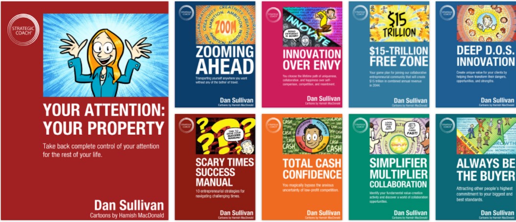
If there’s one thing to be inspired with Strategic Coach’s website, it’s the quantity of content available for prospects to consume.
With so much educational content through the blog, e-books, webinars and guides, the company does an excellent job of establishing itself as an industry leader.
However …
What Could Use Some Work?
The resources hub was where I was a little thrown off.
It’s great that Strategic Coach offers a lot of educational content. However, it’s all created by the same person, Dan Sullivan.
Now, I don’t doubt that Dan is an authoritative source of knowledge for business coaching topics. After all, he is one of the founders of Strategic Coach.
But it’s a red flag when everything is made by the same guy.
Because the brand message is basically, “We’re a world-leading coaching business with numerous options to choose from and a lot of resources at your disposal
when it’s time for you to grow your business.”
With that, why don’t they have other coaches offer their expertise?
How come there’s essentially no marketing team if you’re so successful?
These are the questions I was left asking when I checked out the blog and resources hub.
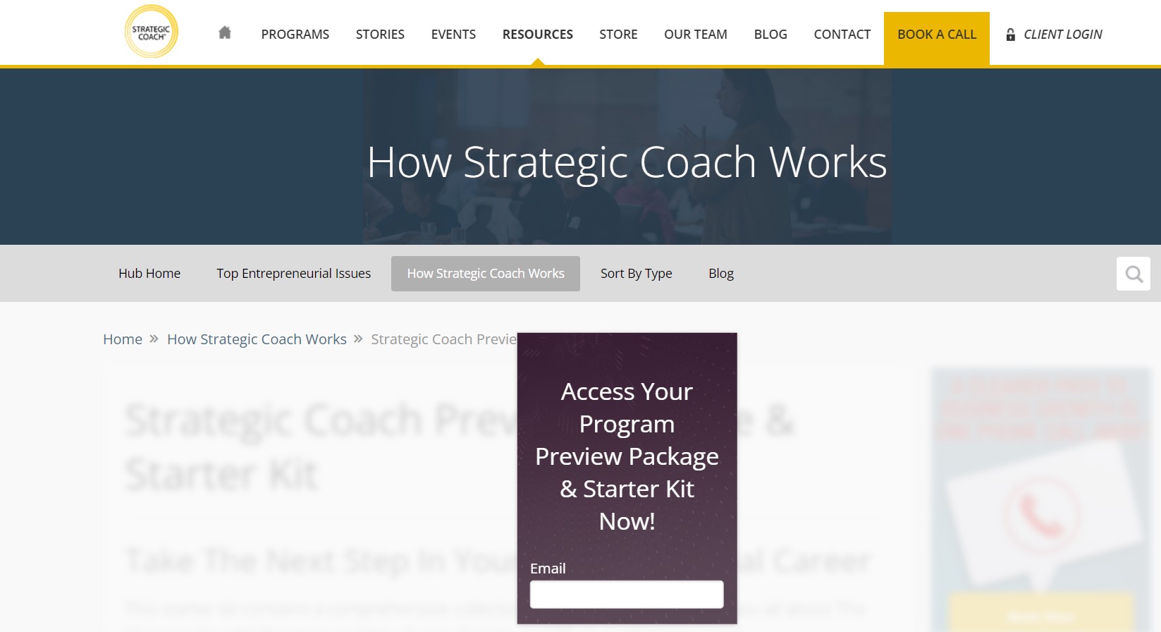
Besides the one-sided nature of the content authorship, I also couldn’t help but notice that some of the download boxes are unoptimized.
I mean, just look at how small these opt-ins are.
These are some relatively minor things that can easily be addressed by the Strategic Coach if they so desired to.
Coaching Website Analysis To Give You Inspiration #5: Brandon Barber Coaching
What Is It?
Brandon Barber Coaching focuses on the mental and emotional strength to help clients strike a balance in their lives.
Where the company really differentiates itself is by addressing one’s subconscious thinking — which accounts for 95% of our thinking, according to Harvard Business School professor Harold Zaltman.
What Works With This Coaching Website?
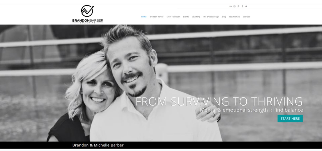
Right off the bat, you see Brandon and his wife. They look like friendly enough people that you’d feel comfortable doing business with.
Plus, they look really happy, which is what their prospects are looking to feel for themselves.
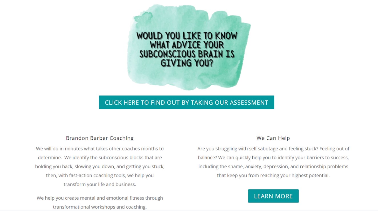
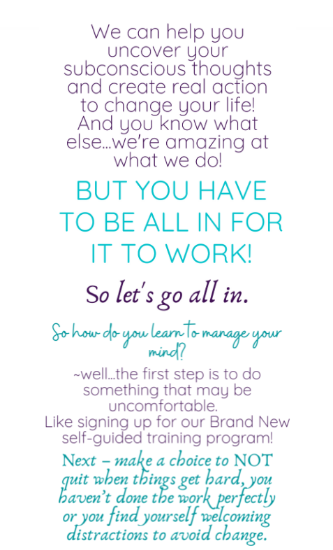
I like how the teal CTA button to take a self-assessment test is very vibrant and demands your attention.
Then there’s a short video that allows Brandon to relate to the prospect’s problem (bad habits or unbalanced energy) and how those problems will be solved through a scientific lens.
And according to Lemonlight, 94% of consumers say a video has helped them make a purchasing decision.
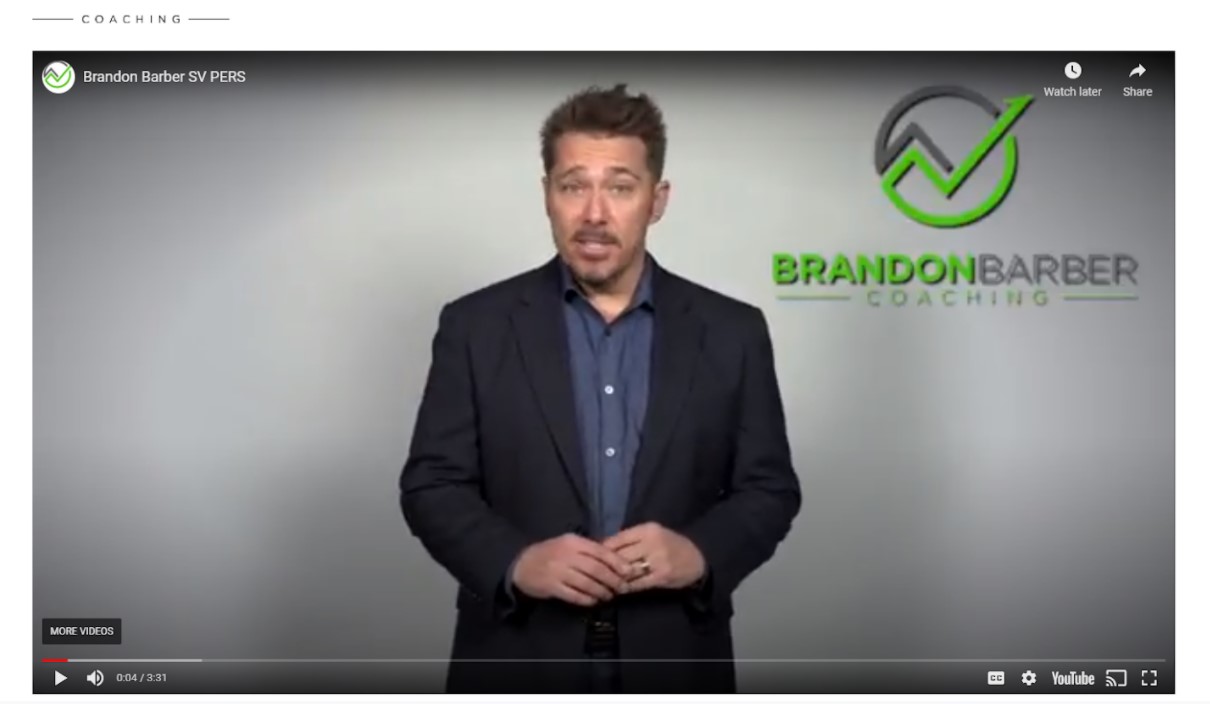
It’s a classic case of agitating the problem and offering a solution, which is something you ought to be really inspired by. If you can’t properly address the problem, how can consumers expect you to find a solution?
A little farther down the page there’s a section that goes a little more in-depth with the original CTA that can be found at the top of the page.
As part of taking the free assessment, the user has to set up an account, which provides lead contact information for the company.
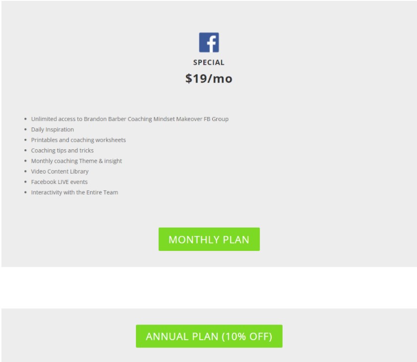
Something else I think that makes this coaching website inspirational is the CTA at the bottom of the homepage that gives users the option to join an exclusive Facebook Group.
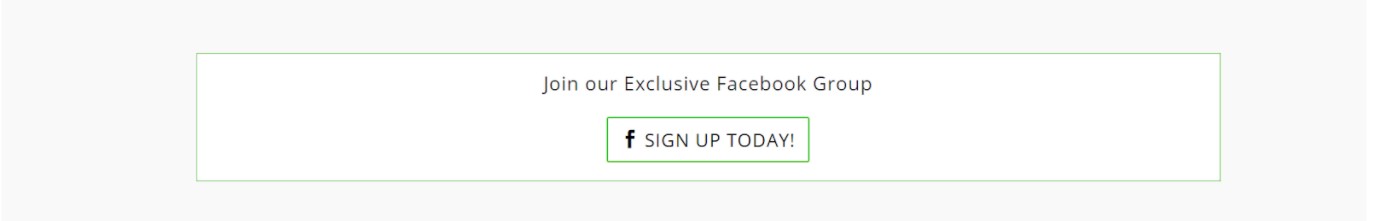
Honestly, I’ve never really seen this before.
Usually, there’s just some social media icons for users to follow but nothing as specific as this.
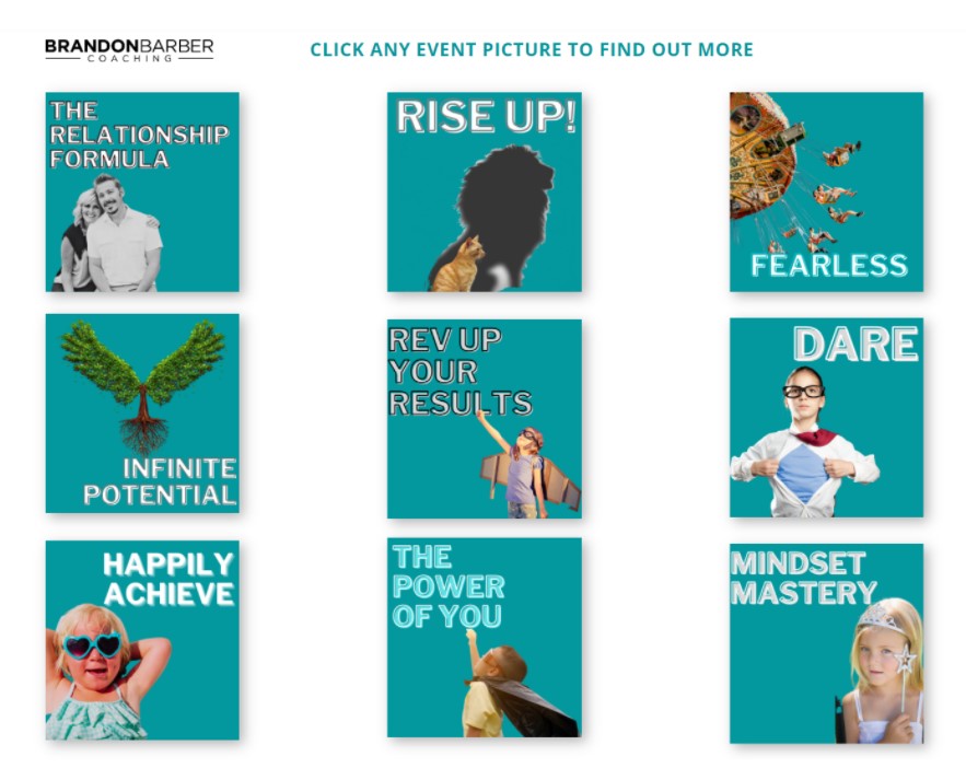
Then there’s the events page too.
Brandon Barber Coaching, like many coaches, is really busy with events.
On the events page, you can see that the company has a bunch of events across different cities.
Even more, there’s a section on the page that breaks up the events into different categories.
That way, the user can see what events will be happening in the areas of focus they care about the most.
What Could Use Some Work?
A lot of parts of this website look subpar.
Not to sound too critical but there are aspects that look really amateurish and may turn away some prospects.
For example, some of the designs are really blurry and hard to make out.
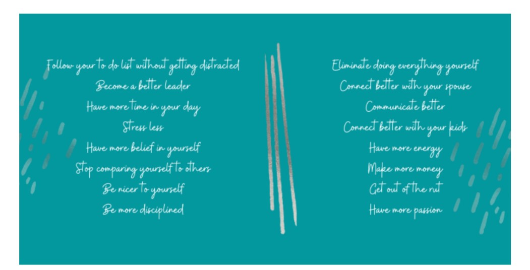
And no, this image isn’t the result of upload compression either. It’s just that blurry.
There’s also some fonts that simply don’t work.
Just take a look at this section from the Breakthrough page.
So I can understand why they were trying to make a cool design that really stands out.
But the end result is just not very nice to look at. Moreover, it doesn’t make for an easy read as the styles change for each line.
It just feels off.
Another thing I don’t think adds any value to this coaching website is the price tag associated with signing up for a Facebook Group.
To the average person, that seems a little sketchy.
After all, Facebook is a free platform already.
Forcing someone to pay $19 per month just to engage with other users seems like a cash grab.
Especially when the average Facebook Group subscription is around the ballpark of $4.99 per month.
Coaching Website Analysis To Give You Inspiration #6: Jessica Ashley
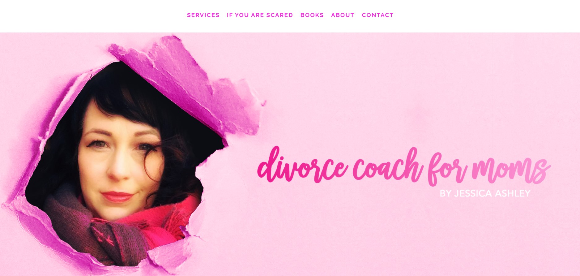
What Is It?
Jessica Ashley helps moms through the divorce process.
Anything from legal suggestions to teaching self-love, Jessica is there for women that are dealing with this difficult life stage that so many face.
What Works With This Coaching Website?
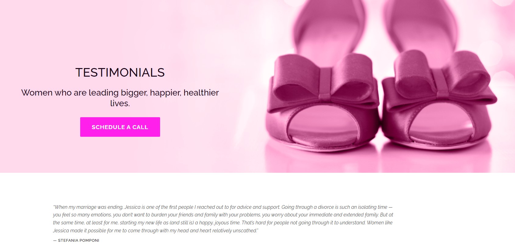
Well let’s start with the obvious … the pink colors.
According to a report from Top Designs, 39% of consumers care more about color than any other website visual element.
Since Jessica’s target audience consists entirely of females, the decision to use pink in the design is the perfect choice.
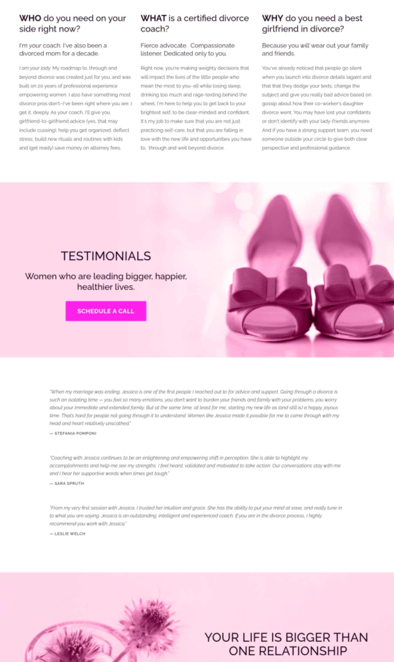

But it’s not obnoxious since in the rest of the website the background is white and most text is black.
Rather, the pink is sprinkled into the design. It lets them know that this website is clearly made for their demographic.
Other than the use of pink, I also think Jessica effectively uses storytelling to resonate with her target audience.
Since she’s been divorced herself, she puts herself in the shoes of her target audience quite effectively.
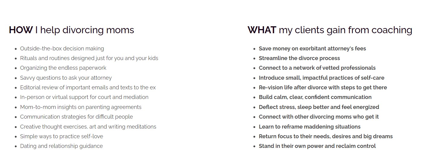
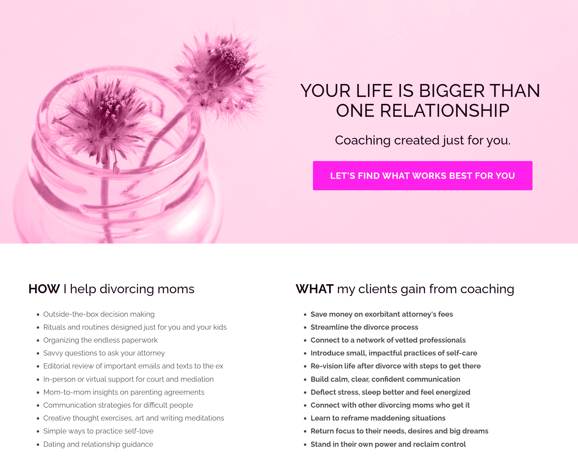
The website also breaks down exactly what a divorced mom can expect by partnering up with Jessica.
And this comes from two different sections.
The first section explains the who, what and why of Jessica’s services. Note the use of bolding and enlarging the words throughout to grab attention.
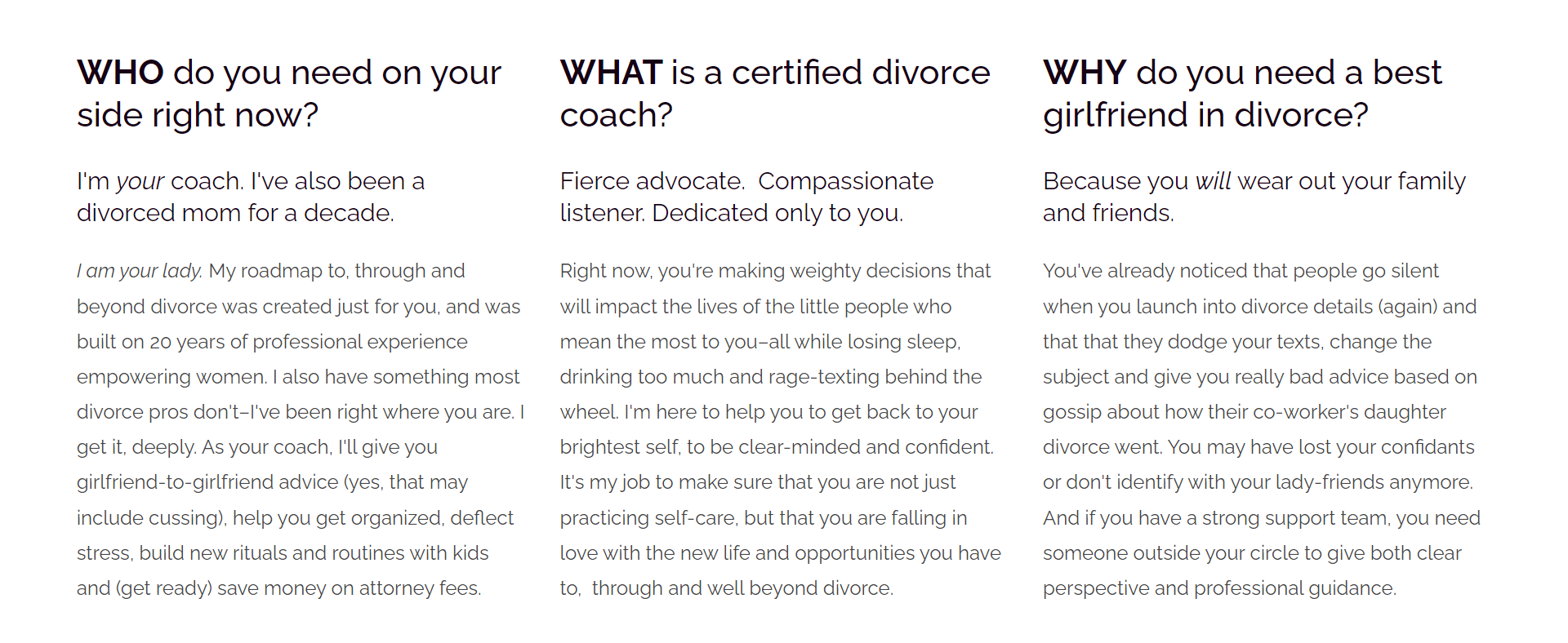
Here’s a breakdown with bullet points to make for an easy-to-read format.
And if you’re going to spend time and money on a divorce coach, you want to make sure the coach will actually help you, right?
That’s where the testimonials come in for Jessica.
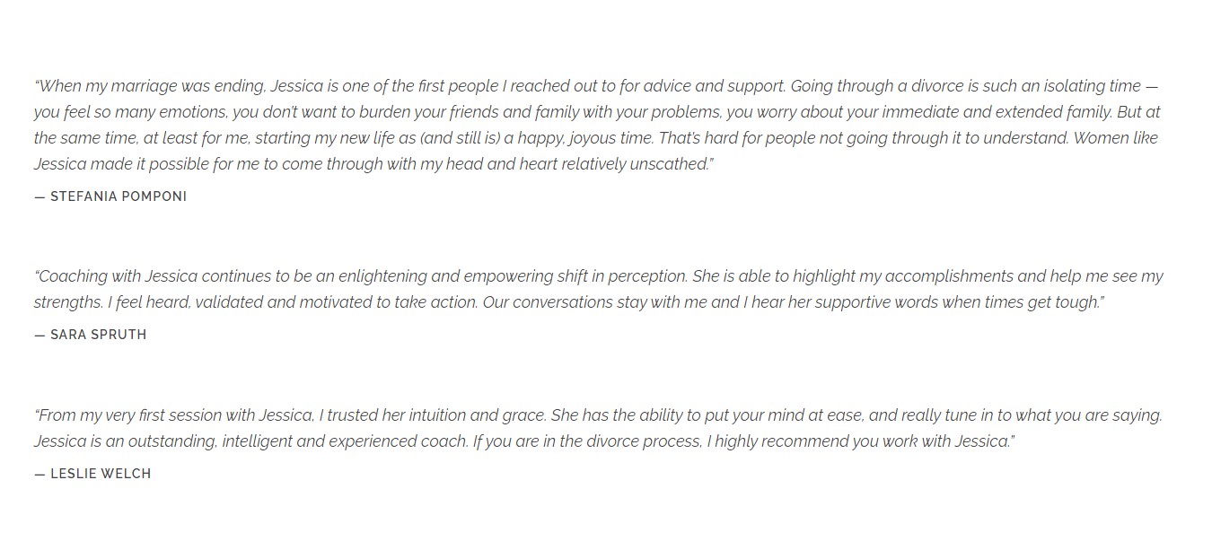
All the CTA sections on the website are striking, as they use the pink design on a page that’s predominantly white in color.
Here’s another one farther down the homepage.
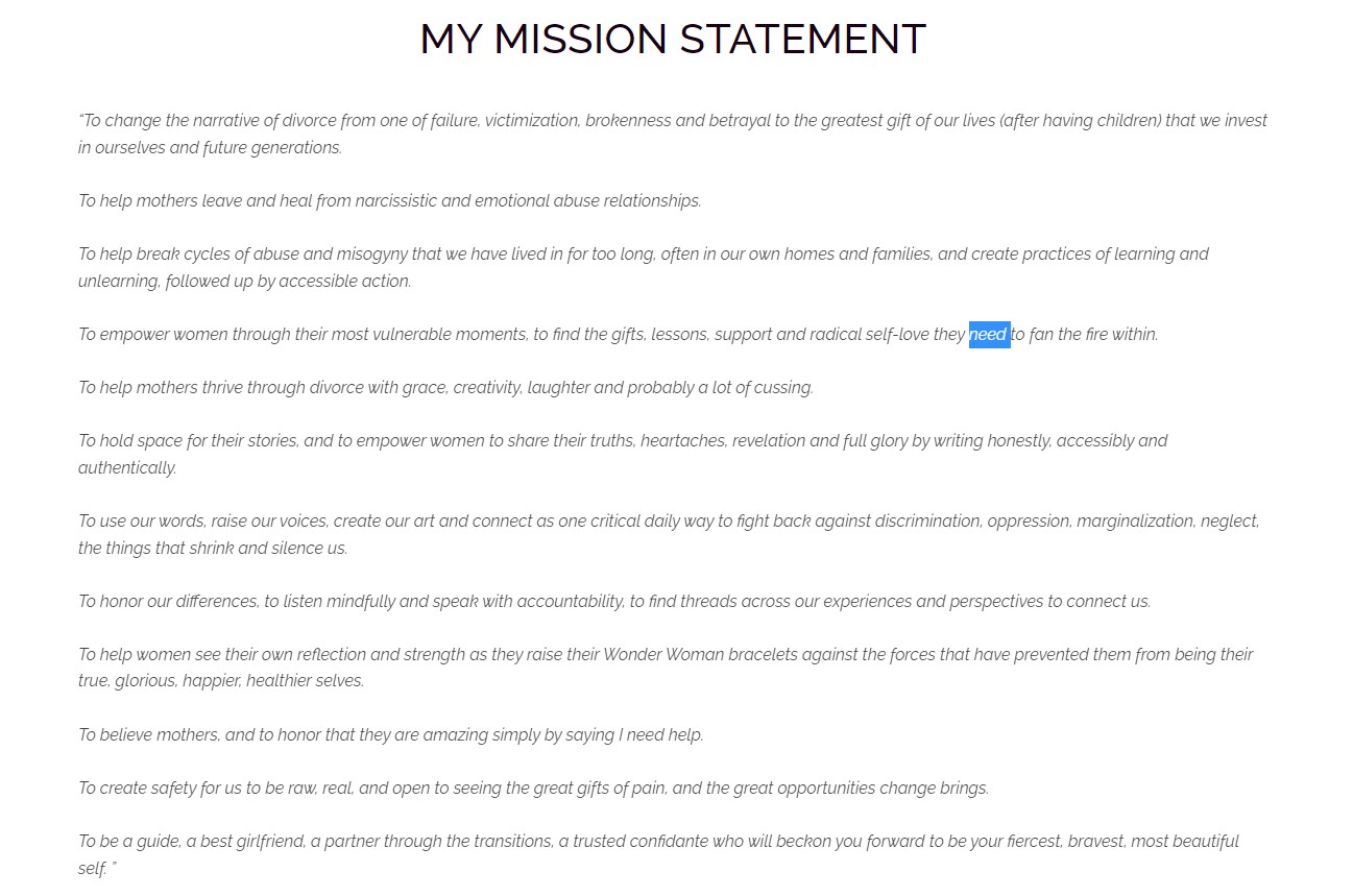
One final thing I like about this website is the mission statement.
It talks about how Jessica aims to change the narrative on divorce. Instead of being this dark period of time in one’s life, it can be a time for empowerment and a new beginning.
This, of course, is inspirational in nature.
What Could Use Some Work?
By far the biggest fallback of this coaching website is the poor placement of content.
For the longest time, I assumed Jessica had no newsletter or other lead generation tactics.
But finally, I realized that it’s all linked at the very bottom of each page.
It’s essentially hidden away and out of sight.
Besides the newsletter, she’s got links for:
- Joining Single Mom Nation
- Her podcast
- Books for sale
- Her contact information
- Divorce Girlfriends Group
If I were running this website, I’d definitely have these things presented more out in the open.
As it stands, it’s just not maximizing potential.
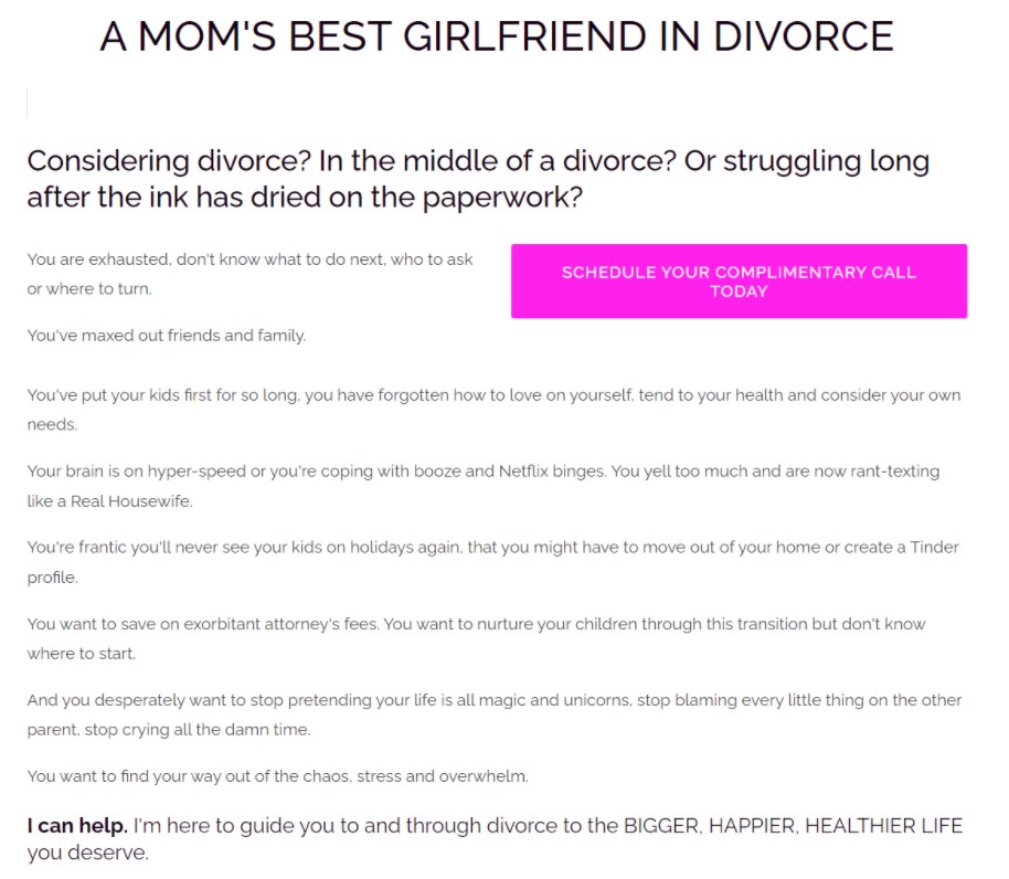
Coaching Website Analysis To Give You Inspiration #7: PDX Money Coaching
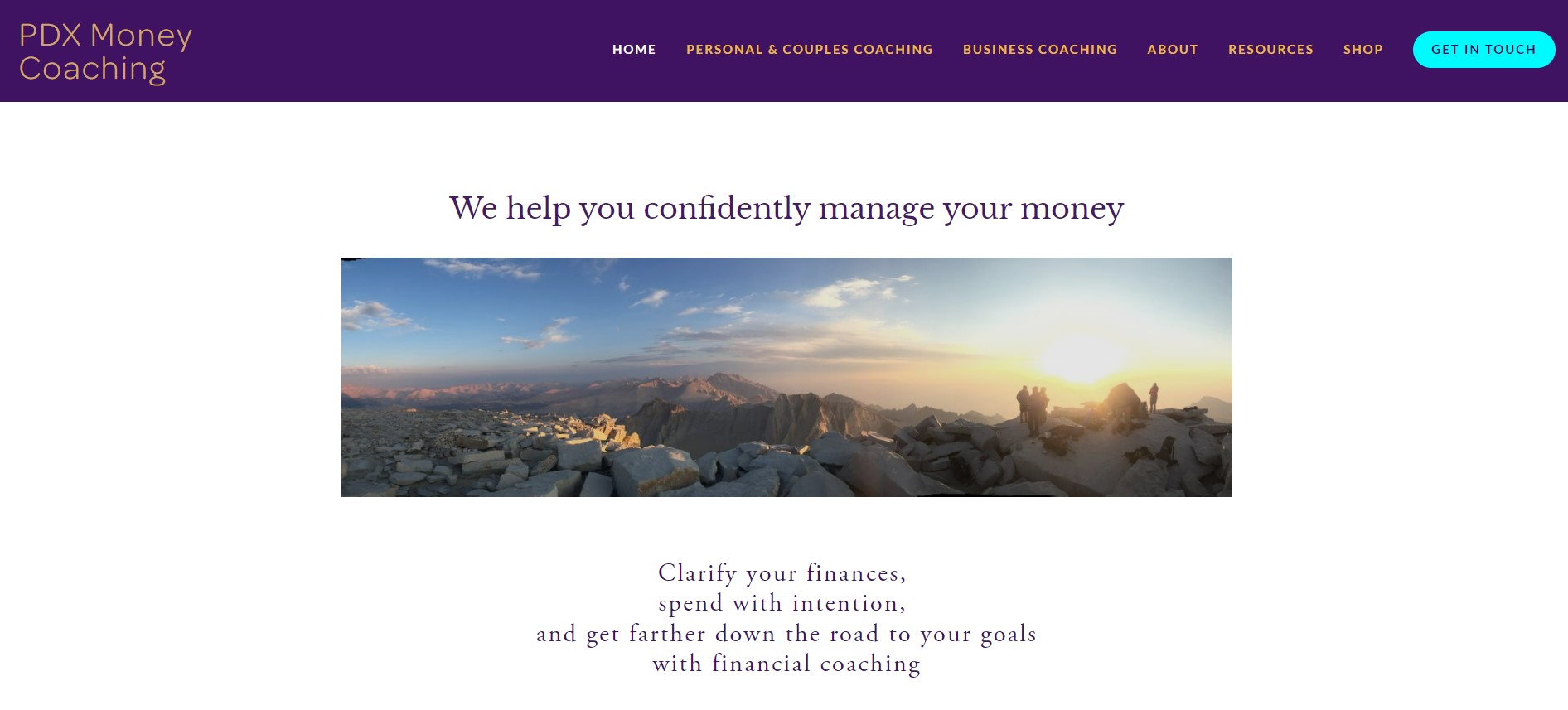
What Is It?
Everyone wants to save up for a big house, go on vacations, and have a stress-free retirement.
After all, that’s why anyone starts their own business.
PDX Money Coaching assists clients with personal financing as well as small business owners with sustaining a good future.
The company is run by Emily Gowen.
As someone who’s had a history of debt problems as well as teaching positions, she’s well suited to be a guide for inspiration among individuals facing financial stress.
What Works With This Coaching Website?
What really took me by surprise is how transparent Emily is about her own life.
On the About page, she openly tells the world about her history of financial burden, which is something most people are ashamed of and hide even from their family and friends.
And sharing her story can help acquire new clients.
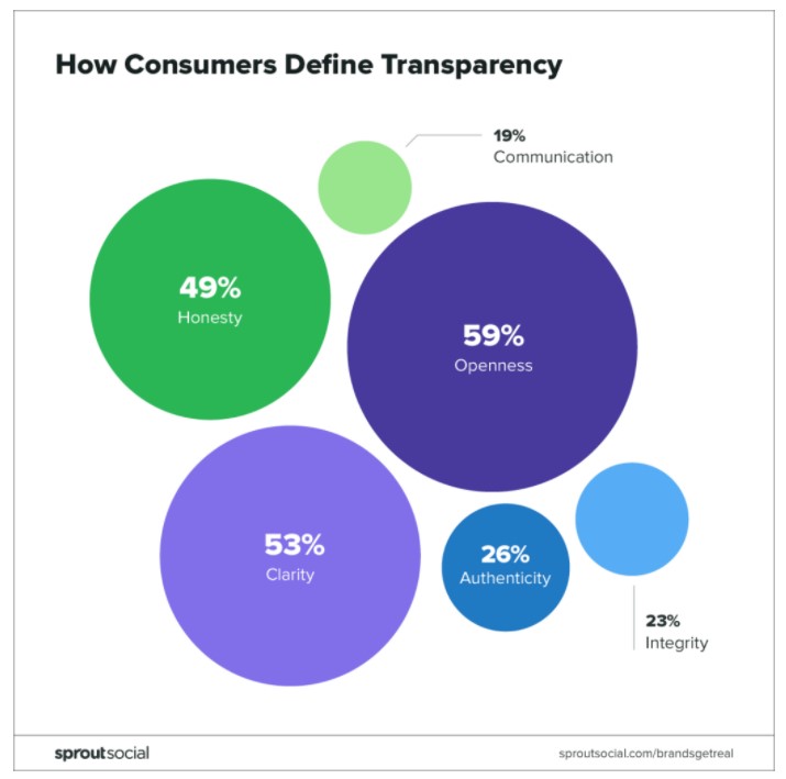
According to Forbes, over 90% of consumers think transparency influences their purchasing decisions.
Emily uses effective copywriting to relate to the consumer’s problem and promises to take the stress out of finances. While reading the homepage, you can just visualize a brighter future for yourself.
And visualizing a brighter future goes hand-in-hand with the photo of a sunset in a mountain range — you feel a sense of optimism on Emily’s website.
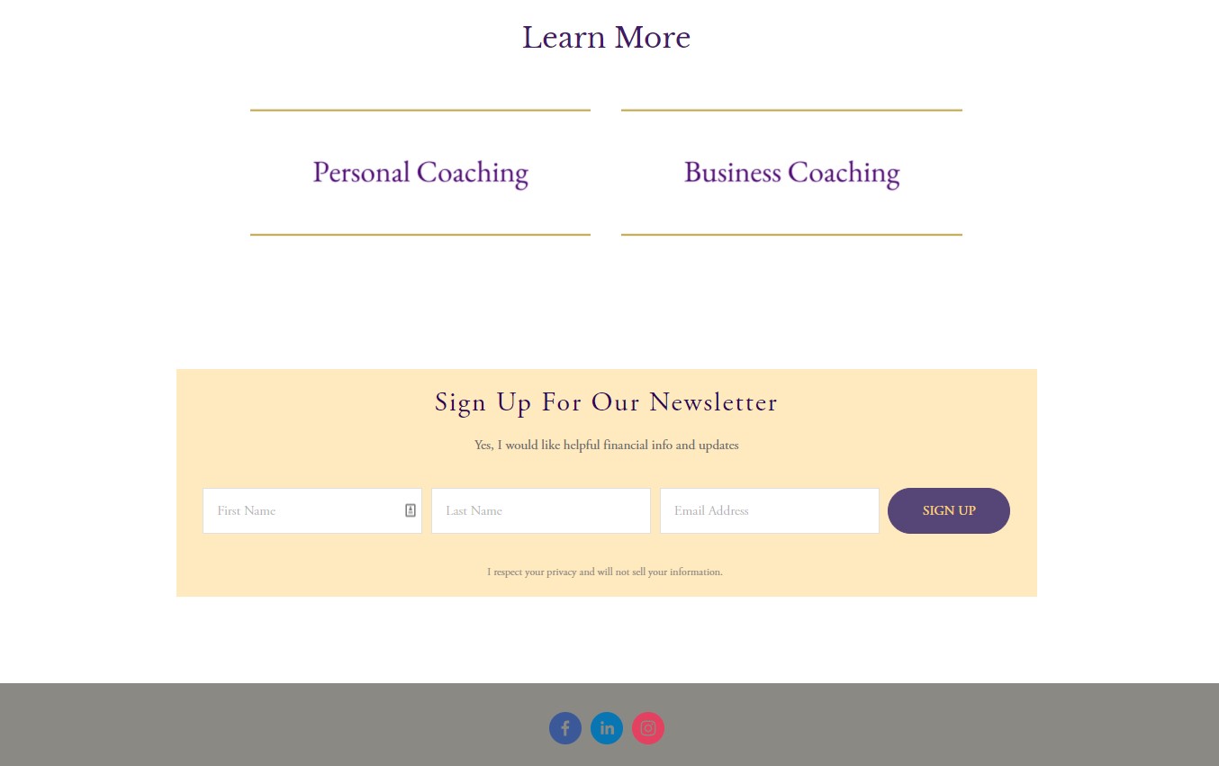
At the footer of the website, there’s an opt-in for Emily’s newsletter.
And I like the use of color here to make it really stand out on the page.
So Emily offers coaching services to two key segments: individuals/couples and business owners.
On each page, I like how she includes a testimonial that’s relevant to the segment.
For example, on the Personal & Couples Coaching page, there’s a quote from a woman named Ruth talking about how she and her husband are finally getting out of debt thanks to Emily’s services.
And over on the Business Coaching page, a business owner named Jessica vouches for Emily’s financial coaching services.
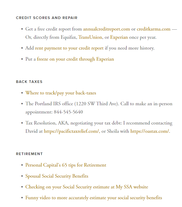
Emily also has a resources page that’s a little different from the usual resources page.
You see, she provides links to numerous online resources that would be useful for anyone dealing with their finances.
Luckily for the user, Emily breaks it all down section by section to keep it organized.
What Could Use Some Work?
For this coaching website, the main thing that must be addressed is the design choice.
Currently, it looks very outdated.
Emily has a lot of value to offer folks, but this website design will definitely turn some people away.
Some of the things I noticed were:
- Some of the text is small and clunky.
- Minor grammatical errors here and there.
- Some of the fonts are blurry.
- CTA buttons are small, and the color isn’t consistent with the website color scheme.
- None of the key ideas are bolded.
- Bullet points look bland.
- The website URL says it’s not secure
Conclusion
Want to delegate all your marketing and funnel work done—without the headaches of hiring? Download our free guide: 33 Marketing Projects You Can Delegate to Growbo and discover how to save 100+ hours a month, grow faster, and scale without the overhead.
So there it is …7 coaching websites that I analyzed so that you can find inspiration for your own.
Remember, your website is the face of your company these days.
And if users don’t like what they see, they’ll bounce and go elsewhere.
To recap, some of the best practices for a coaching website are:
- Having strong and eye-catching CTA buttons.
- Including social proof from past clients to vouch for your services.
- Using fonts and colors that are consistent and pleasing to the eye.
- Making navigation as effortless as possible for the user.
Of course, if you don’t have time to revamp your coaching website, then you can always ask Growbo’s team of pros to take care of it for you.
Now tell me …
Did you learn anything new today?
Let me know in the comments below.
Keep Growin’, stay focused.
Matt