9 Elements to A/B Test on Your Landing Page [+Case Studies]

When I first started with A/B testing, I fell into a trap…
...A trap of believing that the most impressive case studies were the norm.
What I quickly learned though is that a great A/B test doesn’t come from changing the color of your CTA button from red to green and seeing a 50% increase in sales.
That’s the exception, not the rule.
Instead, a great A/B test that will bring you high-quality, ready-to-buy leads, or increase the bottom line for your eCommerce business, is an A/B test that is done based on real evidence or proven theory.
It can be a simple comment in a live chat from a potential buyer or it could be a hunch that you develop from taking 5 minutes to walk through your own funnel.
Whatever the case, there are 9 key elements that are really proven to be high “money” points of leverage. And that you should absolutely be A/B testing right now.
These money points of leverage, with as little as under an hour of work, can grow your sales to 20-50% in many cases.
And unlike hyped cases studies, this is not an exaggeration because I speak from experience.
Today, I’m going to tell you:
- The 9 elements on your landing pages that you should A/B test to boost conversions—and the massive results they can bring.
- How sometimes, even if your landing page is perfect, the rearrangement of the elements will make your conversions rise like a phoenix.
- And why sometimes the “prettier” version of your landing page isn’t always the highest-converting version—and what’s the best way to know what prospects really like.
Ready to start uncovering the power of landing page A/B testing and how it can change your conversions forever?
In a rush? Want to download this article as a PDF so you can easily take action on it later? Click here to download this article as a PDF guide.

Why Do You Need to A/B Test in the First Place?
A/B Testing is like conducting a science experiment.
You create a hypothesis based on existing data.
For example, “Changing one or several elements on my landing page design will optimize its conversion rate.”
From there, you begin a test in which you compare two variables.
And then, examine the data to see which variable has the best outcome.
Finally, conclude whether your hypothesis was correct or incorrect. And plan future tests around this conclusion.
So why do you need to A/B test in the first place?
Simple: A/B testing lets you see where you can improve our conversion rates on your landing pages.
You see, sometimes your landing page is perfect but the arrangement or position of the elements isn’t converting as well as you need.
Or sometimes the prettier or nicer version isn’t the highest-converting version.
The only way to know what works best is to test both versions.
So rearrange the page and start A/B testing.
But the thing is that when you do A/B testing, you are looking at human behavior. So sometimes results may vary.
Even still, the truth is that any A/B testing works to boost conversions.
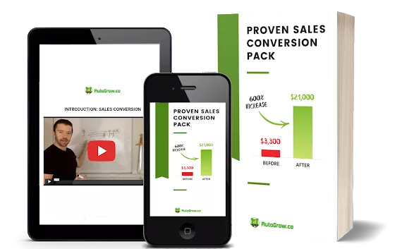
And it’s something we’ve seen is proven to convert in the 313 conversion rate case studies analyzed in our Proven Sales Conversion Pack.
Now let’s take a look at the obvious and not-so-obvious elements on your landing pages that can be A/B tested and increase your conversions. And we’ll also look at the proven case studies that will show the numbers from real life.
Conversion Element #1 to A/B Test: Your Landing Page’s Design
All visual elements on your landing pages must feel integrated in order to convert.
Because graphic/web design amplifies the copy and your whole website.
When your design elements on your landing page aren’t properly placed, your website won’t meet its goals (to convert leads into buyers).
Let’s take a look at the first conversion rate optimization rate case study that will show you the power of A/B testing.
Results of the Conversion Rate A/B Test Case Studies:
Using an emotion triggering redesign for a landing page skyrocketed revenue by 65%.
Before...
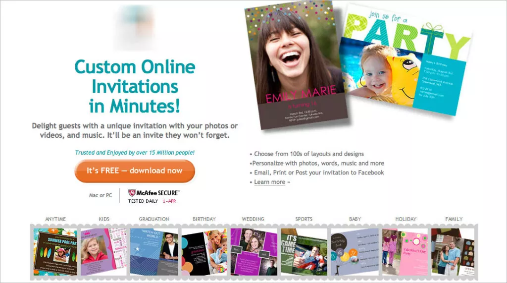
After…
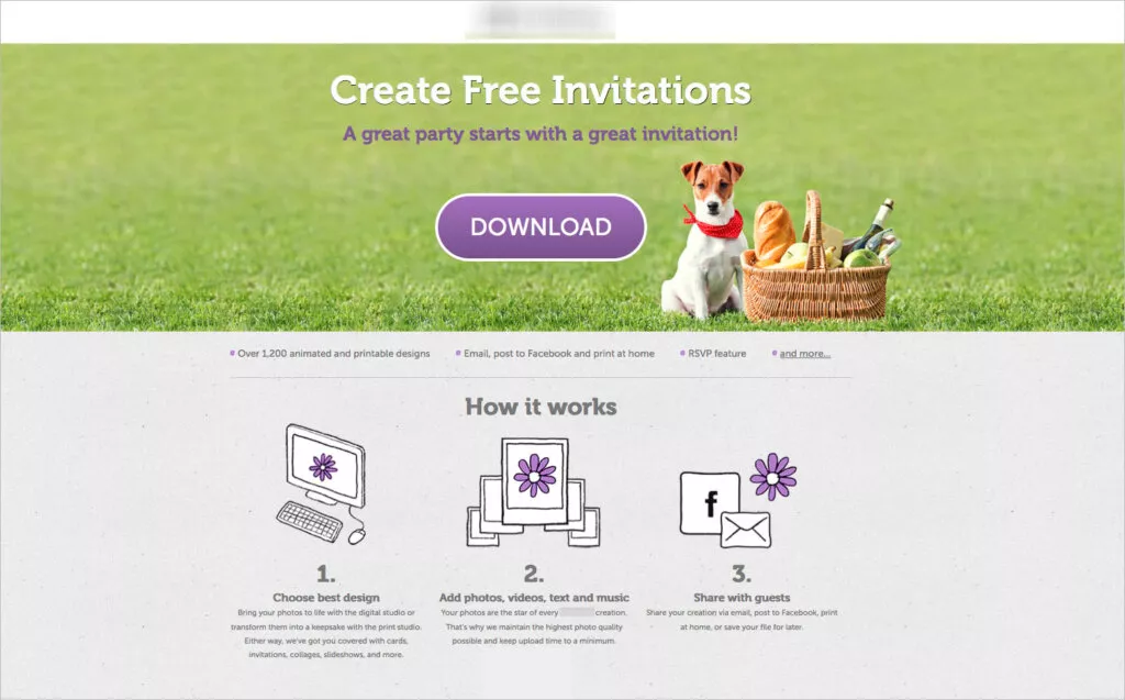
See how the numbers don’t lie?
So when looking to improve conversions on your landing pages, A/B test the following design elements:
Text (Headlines, Sub-headlines, Body Text, Pricing)
All headlines, subheadlines, CTA button text, and body text on your landing pages must have good readability.
Letters should have enough space between them and there should be enough space between lines too.
Results of the Conversion Rate A/B Test Case Studies:
By increasing the font size of the price, there was 36.54% more clicking on the "add to cart" button and a 10% increase in revenue.
Before...
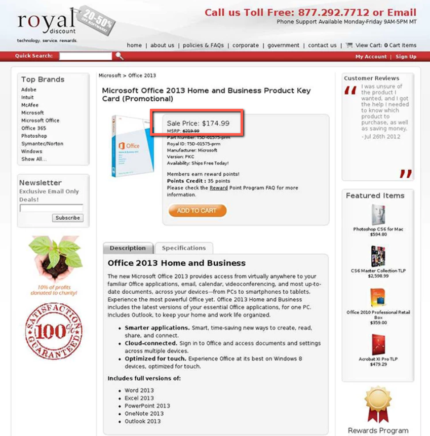
After…
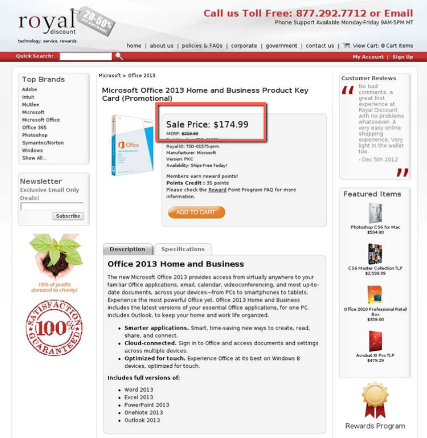
And by tweaking a headline to make it more clear, there was a 388% increase in opt-ins to download a lead magnet in another case study.
Before...
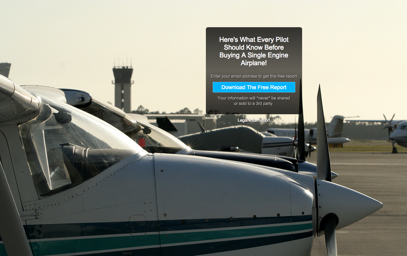
After...
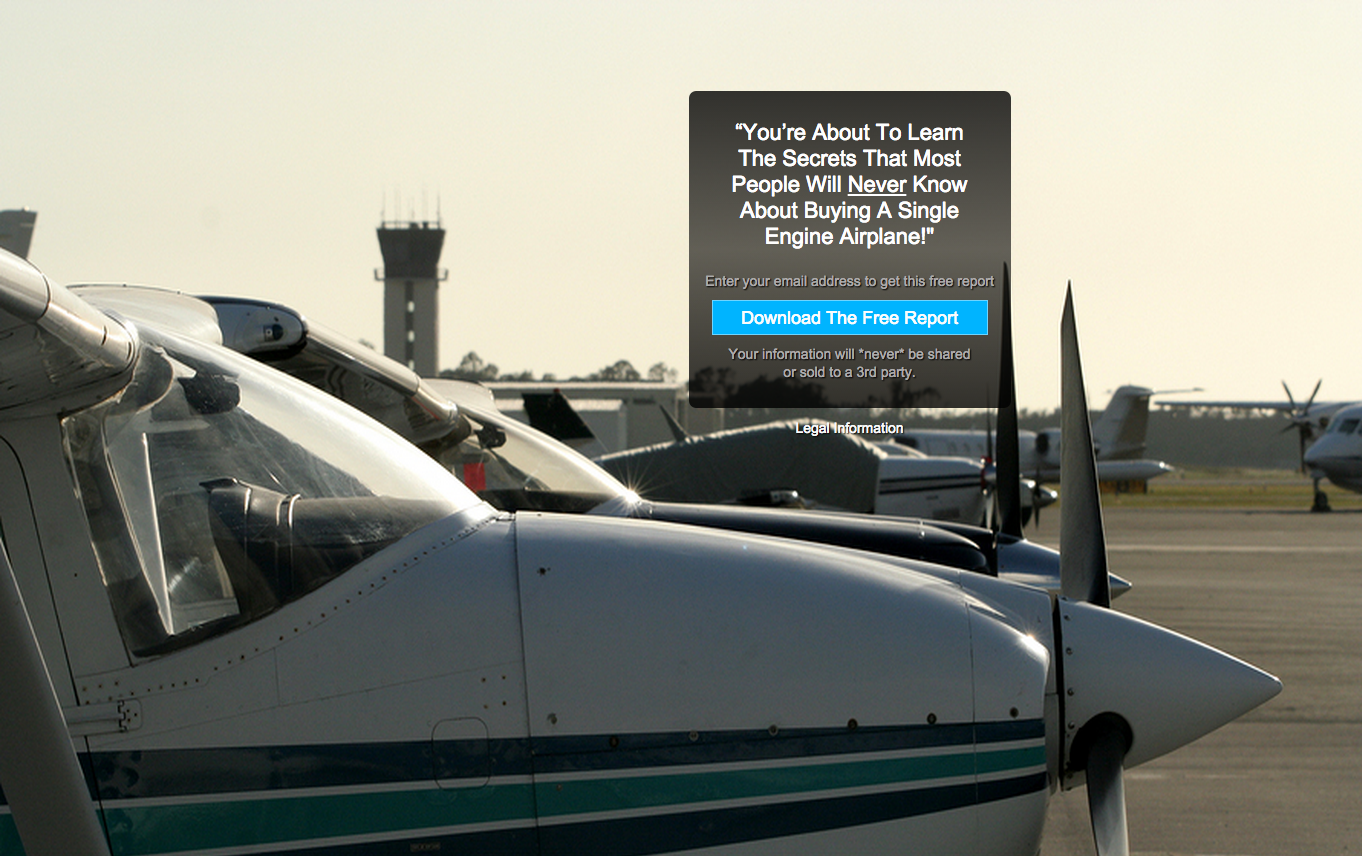
Logo
Your logo is the strongest symbol of your brand.
It builds brand recognition and it helps your target market recognize you wherever you are displayed on the web.
So in order to give your logo maximum legibility and exposure, you must use a high-contrasting background color to make it stand out.
Add some areas of clearance around the logo to give prominence.
And don’t forget to keep the logo high-res.
Background Colors
Use a background color that contrasts with the text.
Don’t make your prospects work to read some simple text.
Make the reading experience for them as smooth as possible.
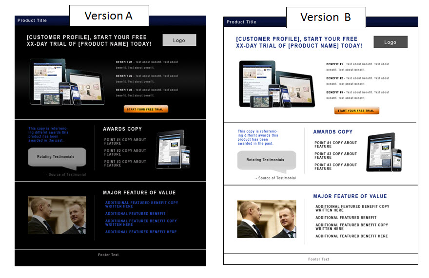
Results of the Conversion Rate A/B Test Case Studies:
A color change on the landing page background translated to 10.66% increase in sign-ups.
Font Color
The color of your font is critical to making the reading experience pleasant to the reader.
So don’t use passive colors, especially for the body text. Instead, use dark colors and lighter colors for your background.
Opt-In Widgets
Your opt-in widgets, wherever they’re placed, must have a clear CTA button so prospects can actually find what to click on.
Mockups
When you include a mockup of the lead magnet, tripwire, or product you’re offering to prospects, it must be hi-res and look as real as possible.
Layout
The whole layout of your landing page design must have a proper use of white space and there must be consistency and symmetry along with the website.
Images
Your images shouldn’t be cookie-cutter or seem like they were just “thrown” on the page for instance.
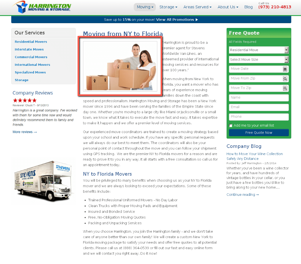
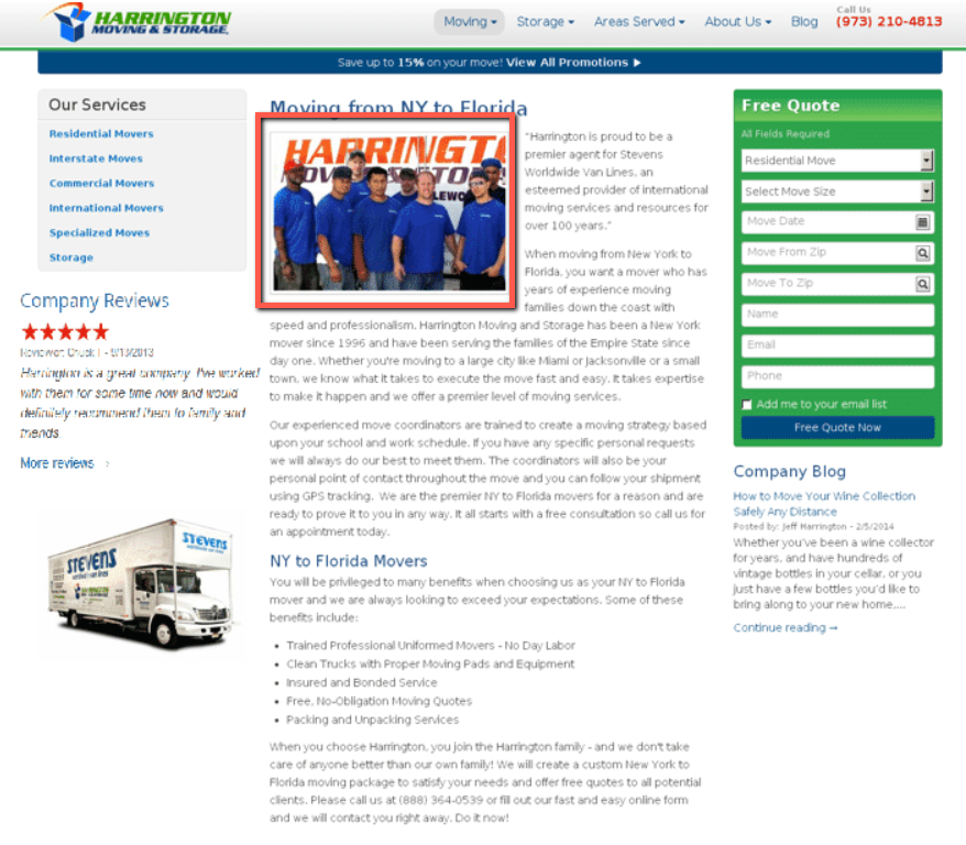
They must be real images (that means no stock photos). They must speak to the right audience. And they must connect with the reader.
Results of the Conversion Rate A/B Test Case Studies:
Showing real images of people improved sign-up rates by 45.45%.
Before…
After...
Video
HubSpot’s data shows that most people pay close attention to videos. And that 45% of the people surveyed watch one hour or more a week of video content on different platforms like Facebook and YouTube.
Don’t underestimate the power of a well-placed video on your sales page for increased conversions.
Results of the Conversion Rate A/B Test Case Studies:
Adding a video on the sales page moved 96% more people to the pricing page.
Conversion Element #2 to A/B Test: Your Landing Page’s Copy
Your copy is one of the most important elements on your landing pages.
It’s what makes a prospect understand what you’re selling, and eventually buy from you.
But what converts? What doesn’t convert?
There are copywriting formulas that certainly help you remove some of the guesswork from the equation.
Whether you’re just getting started as a copywriter or you’ve just hit a wicked case of writer’s block, persuasive copy leads prospects through your sales funnel until they click “buy”.
When looking to improve conversions on your landing pages, A/B test the following copywriting elements in your copy:
Tone
Nail the right tone and language.
Talk to your audience in the way they want you to talk to them.
Keep a conversational tone, avoid using corporate and formal language (we all hate that!), and inject some emotional language into your copy.
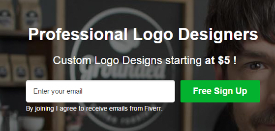
Results of the Conversion Rate A/B Test Case Studies:
Writing a headline and subheadline with an action-oriented and conversational tone led to 29.81% more people to register for their trial.
Before...
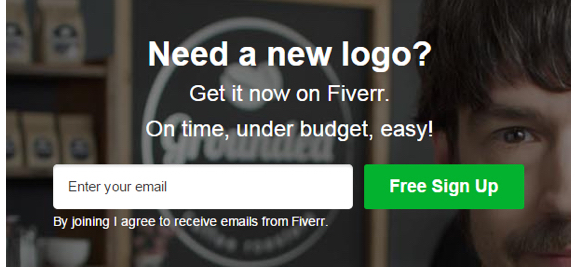
After...
Target Audience
Cater your copy to the right target audience.
Talking directly to your audience is one of the highest converting points on copywriting.
You can’t write solid copy if you don’t know who you’re writing it for.
Unique Selling Proposition
Your Unique Selling Proposition is a clearly stated statement that explains what your service does and why it’s different.
It is what sets you apart. It tells your prospect why they should buy from you—and not someone else.
It’s what you do differently that makes your selling proposition unique.
We are all unique in some way.
But what is it that sets your business apart?
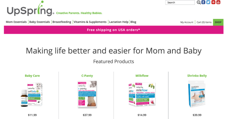
Results of the Conversion Rate A/B Test Case Studies:
Highlighting the USP in a headline increased revenue per visitor by over 28%.
Before...
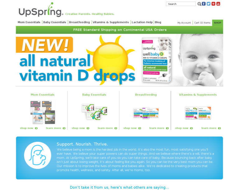
After...
Pain Points
By calling out your readers’ pain points, you’re utilizing both fear (fear that they’ll keep feeling that pain) and empathy because you understand what they’re going through.
Emotional Words
With the right words in your copy, you can tap into very specific emotions in your readers.
And with enough practice and skill, you can actually inspire them to feel those emotions themselves.
This can give you a substantial edge (maybe even a superpower) when it comes time to motivate your audience to buy.
Results of the Conversion Rate A/B Test Case Studies:
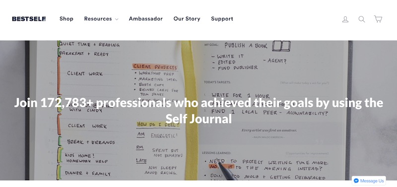
An e-tailer company saw a 27% increase in sales by rewriting a headline.
Before...
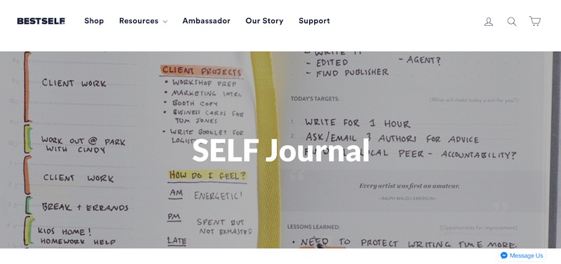
After...
Conversion Element #3 to A/B Test: Your Products or Productized Service
It’s always useful to know which of the packages or products you offer converts better.
If you sell products, then you probably have a sales page filled with the different products people can buy.
And if you sell a productized service, then you probably offer different pricing packages so people can choose which one to sign up for.
Either way, by A/B testing you can actually find out which option is the best seller.
And all you have to do is rearrange the way you present those pricing packages or products.
But if you already know which are your best-selling products, then show which they are specifically for better audience engagement.
Results of the Conversion Rate A/B Test Case Studies:
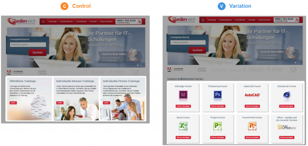
MedienReich Computer Trainings got nearly 41% more engagement by pushing its best-selling products to its homepage.
Conversion Element #4 to A/B Test: Your Landing Page’s CTA Buttons
CTA buttons are one of the most important elements of any and every sales funnel and landing page.
You see, a lot of the time our decisions have already been made by our subconscious long ago.
It’s the driving force behind the old marketing adage, “People buy on emotion and justify with logic.”
And that is why you need to make your CTA as visible, clear, and magnetic as possible.
Because the perfect customer will be able to figure out how to get in touch with you or the next steps that they need to follow.
But for everyone else, you simply have to spell it out for them.
And if you don’t, your funnel may be leaking leads.
Two of the Laws of Sales Funnel Physics, the Law of Alignment and the Law of Visibility play a critical role in your landing pages’ conversions.
Because what is aligned with your prospects’ interests converts.
And what’s visible to your prospects’ eyes converts too.
Results of the Conversion Rate A/B Test Case Studies:
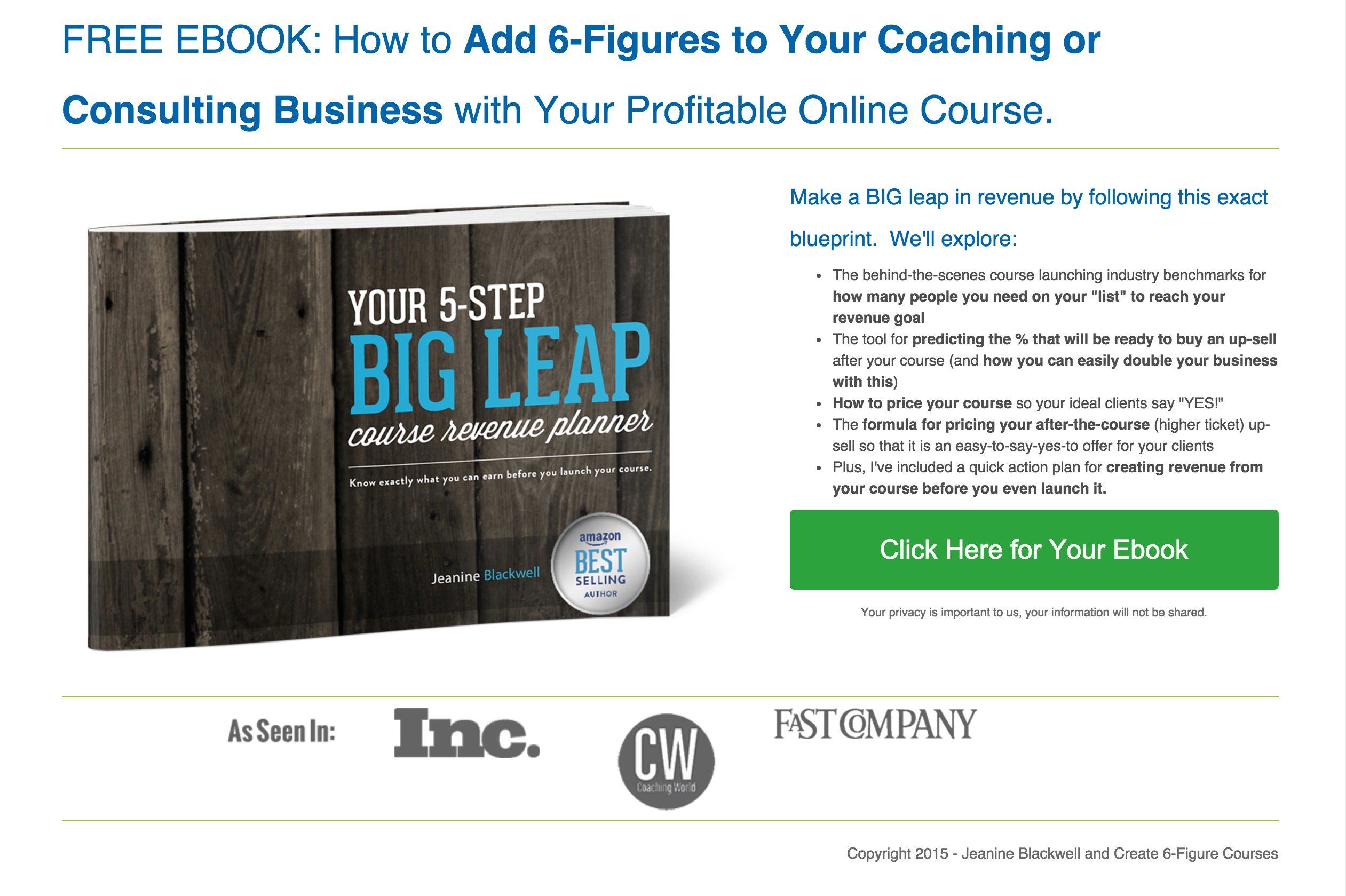
A single CTA button that had a prominent color change on a landing page generated 86.91% more opt-ins.
Before…
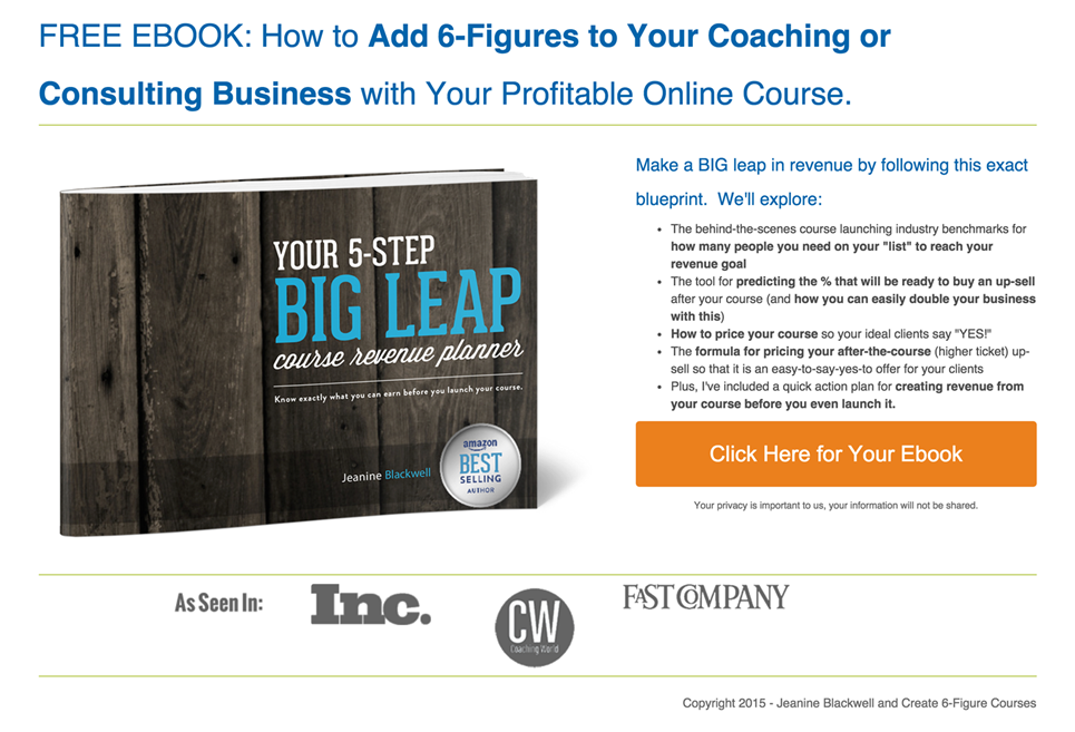
After...
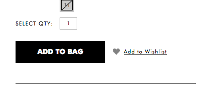
And by adding contrasting colors on the CTA button, purchases increased by 57%.
Before...
After...

Conversion Element #5 to A/B Test: Your Lead Magnet Offer
If you see zero conversions for your lead magnet, then you can A/B test reframing your offer.
You see, reframing your lead magnet is an especially simple—yet powerful way to give your conversion rate a kick in the pants in no time at all.
When prospects move through your funnel and their expectations are met at every step of the way, it’s because your funnel is well aligned.
And that leads to better conversions.
But in that same way, your lead magnet has to align with the unique preferences of the customer themselves.
And that means offering the right kind of lead magnet for them can make it all the more clickable.
So let’s say your current lead magnet offer is a checklist or an ebook, then consider reframing it
as a different type of lead magnet.
There are plenty of lead magnet examples you can model, in fact.
Results of the Conversion Rate A/B Test Case Studies:
WPCurve started targeting specific lead magnets to specific types of posts.
So if it was a post about content marketing, they would offer a content marketing checklist. Or if it was a post about recruitment, they’d offer a downloadable opt-in template.
Well, after doing this, they saw a 10.12% conversion rate.
Conversion Element #6 to A/B Test: Your Sales Funnel Strategy
Consumer and buyer behaviors have made a shift over the years.
Their journey through your website is different than it used to be.
So, your sales funnel strategy is what accurately reflects that path of least resistance.
It must align with your expectations and anticipate their needs.
With that being said, if your sales funnel strategy is not bringing in the desired results, then you must tweak it.
Results of the Conversion Rate A/B Test Case Studies:
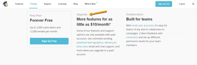
MailChimp was offering a free trial to test their services. But when they changed their strategy and started offering a free forever plan, they saw a 150% increase year over year in revenue.
Conversion Element #7 to A/B Test: Your Landing Page’s Opt-in Forms
Your opt-in forms are basically your data collector. They’re the vehicle for prospects to give you their contact information such as email address, name, or phone number.
So try tweaking them in terms of reducing or adding form fields. Or changing their color or size. Or simply place them somewhere different in your landing pages. If you do, you’ll see a conversion boost.
Results of the Conversion Rate A/B Test Case Studies:
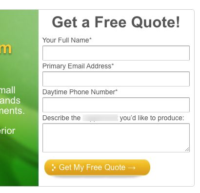
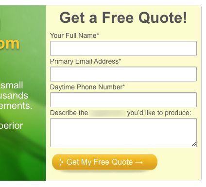
Form background color change led to form submissions uplift by 91.7%.
Before…
After...
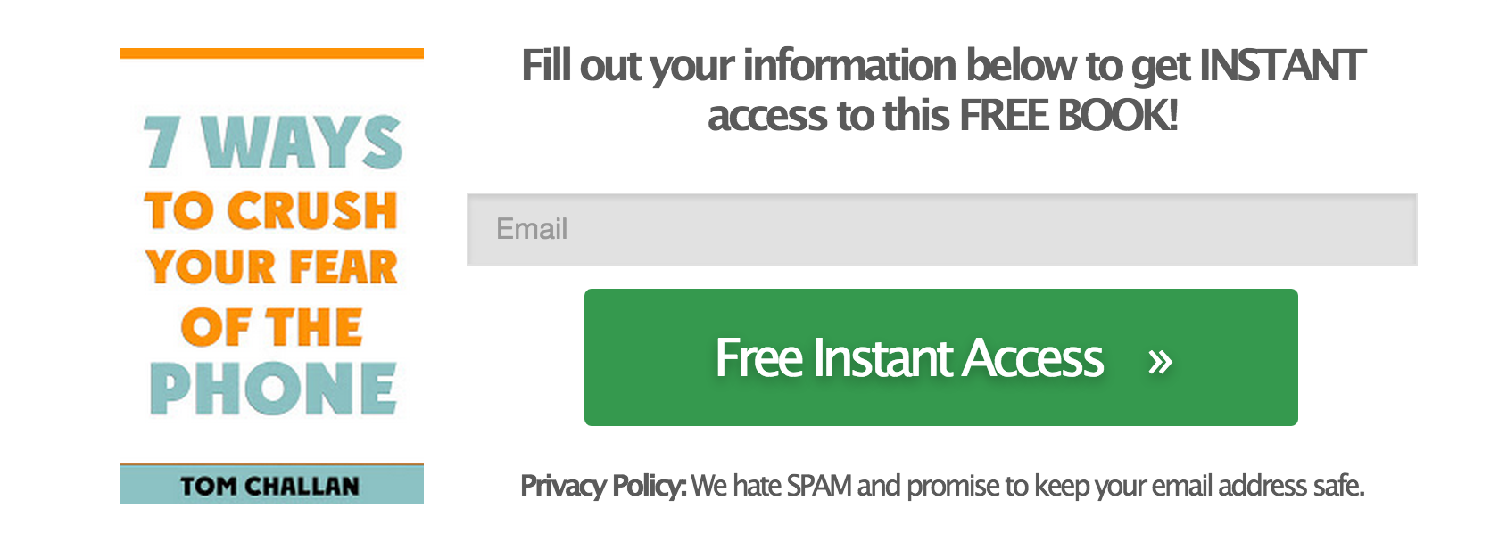
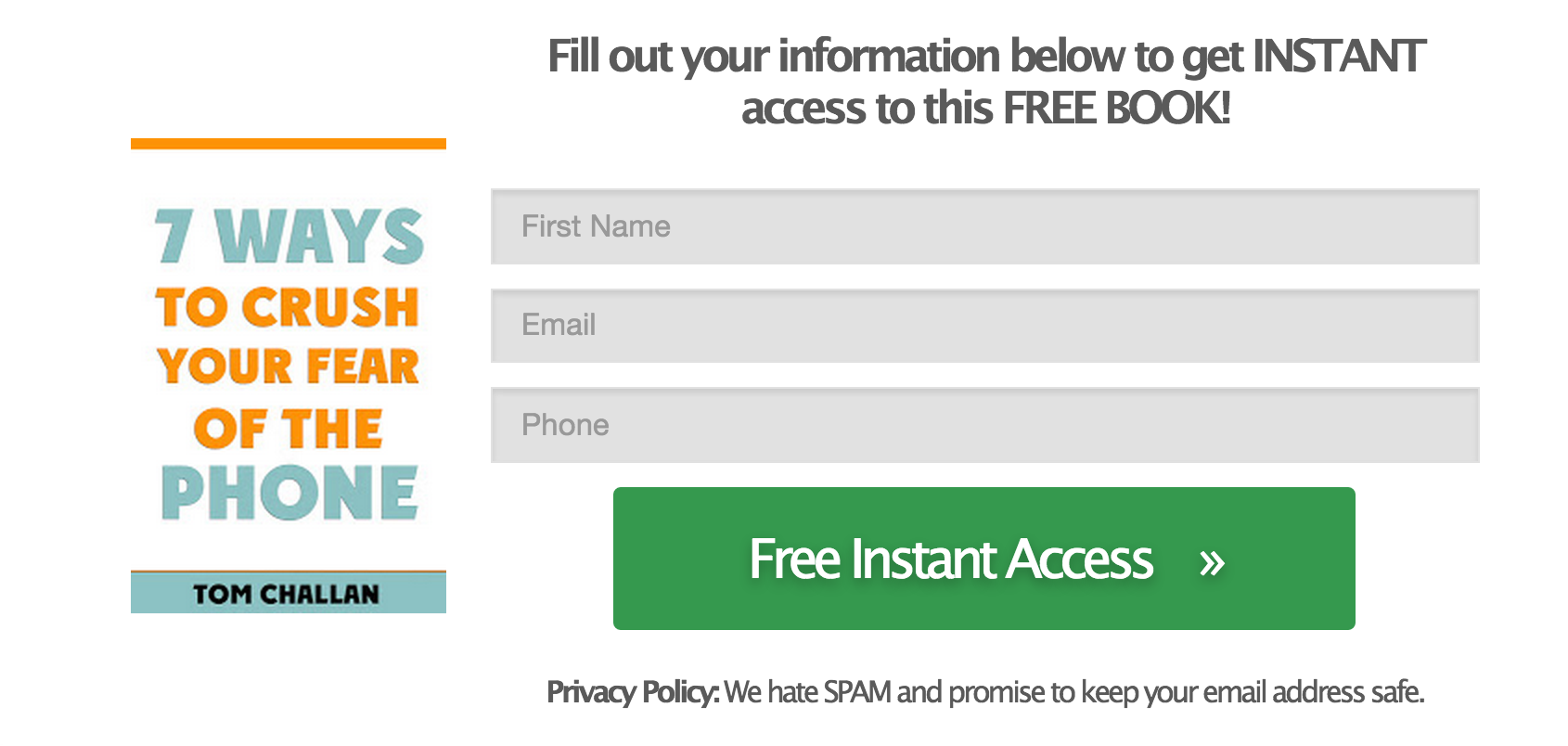
And utilizing a 3-field opt-in form increased ebook downloads by 120.39%.
Before...
After...
Conversion Element #8 to A/B Test: Your Product’s or Service’s Pricing
Price anchoring is a specific copywriting sales or persuasion tactic. You use it to better convey the value of your product or service and/or make it appear more affordable. So that way the price point is, therefore, more persuasive.
When it comes to selling your products or services, you must clearly communicate to prospects what the value of those are.
Prospects shouldn’t have to blindly wander around trying to find a price tag.
But when it comes to landing page A/B testing, there are a lot of ways you can actually improve conversions with your pricing.
Whether you make it big, small, or put it at the top or at the bottom of your landing page, the Law of Visibility, the Law of Clarity, the Law of Friction, the Law of Repetition, and the Law of Alignment—all do their magic.
Because those Sales Funnel Physics Laws say that:
- What’s visible to the eye of the prospect
- What’s aligned with the prospect’s need
- What’s clear for the prospect
- What’s repeated across your landing pages
- And what doesn’t create friction…
...you guessed it: CONVERTS.
Results of the Conversion Rate A/B Test Case Studies:
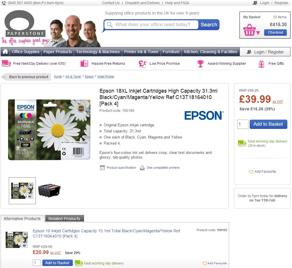
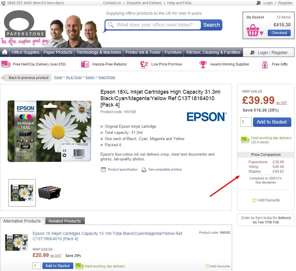
Providing price comparison increased conversion rate by 10%.
Before...
After...
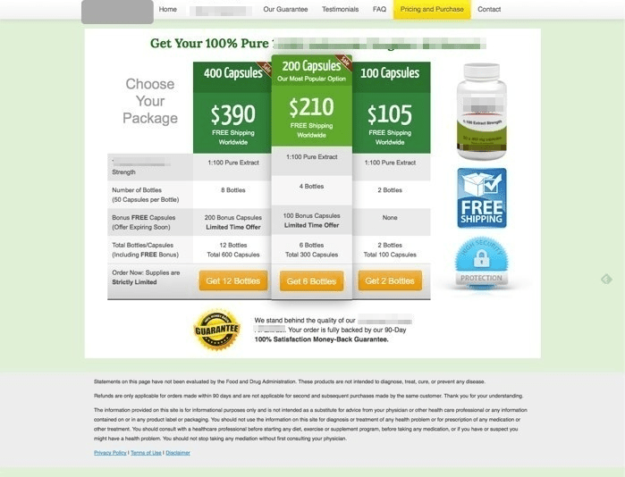
And by improving the copy of the pricing table headline and CTA, and by adding prominence to one of the pricing packages, revenue grew by 61% and 49.5% more sales.
Before...
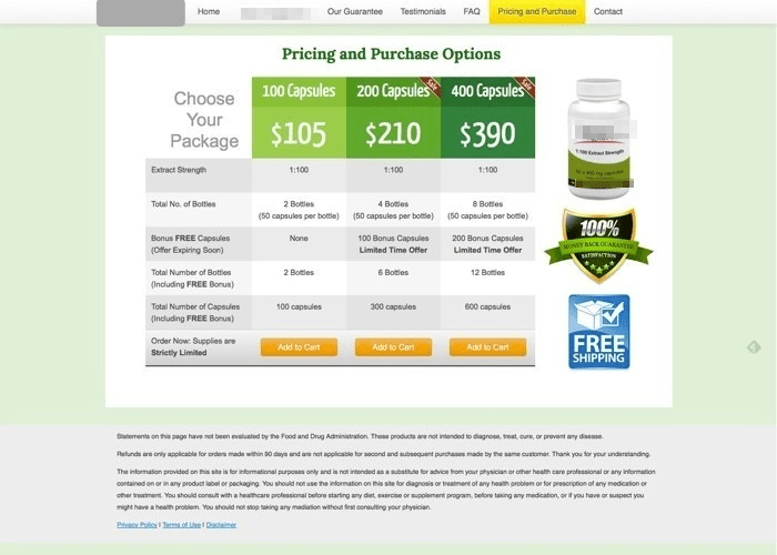
After...
Conversion Element #9 to A/B Test: Your Landing Page’s Social Proof
Adding any form of social proof to your website reassures potential customers and grows sales.
Including trust badges on your landing pages can uplift sales conversions by a whopping 32%.
This is because relevant trust badges are an easy way to unlock sales growth.
In fact, according to Medium, landing pages that have social proof in the form of copy have an average conversion rate of 12.50%.
And landing pages without social proof only convert at 11.40% on average.

A trust badge can be something as simple as a reassuring visual element with some copy like a checkmark + “free shipping”.
And depending on how you strategically use social proof on your landing pages, you can see positive results.
Again, when A/B testing your landing pages, play with what you’ve learned so far about social proof.
Results of the Conversion Rate A/B Test Case Studies:
A non-profit organization improved their conversion rate by nearly 12% after including an FAQ section, social proof, and statistics.
Before...
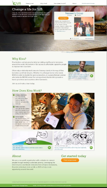
After...
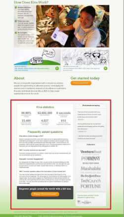
Once the second variation, there was an 11.5% jump in donation revenue. And this was reported with a confidence rating of 95%.
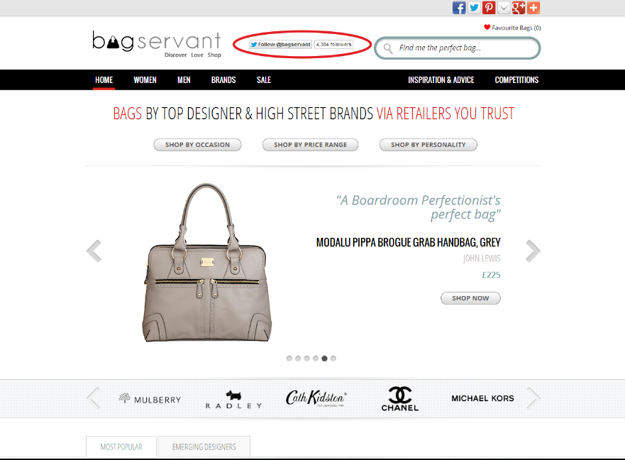
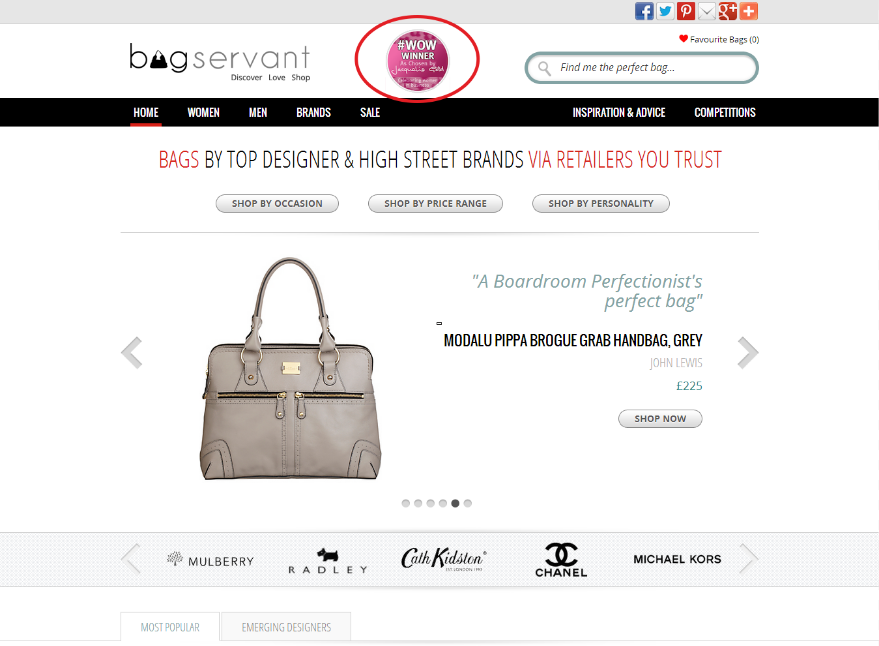
Additionally, a purse and bag retailer added social proof in the form of a logo and saw a 60.4% increase in product exploration, a 72.1% improvement in visits to affiliate partner sites (which had 98% statistical confidence), and a 10.3% jump in site engagement.
Before…
After...
Conclusion
Download the “9 Elements to A/B Test on Your Landing Page [+Case Studies]” so you won’t forget to take action on it later. Click here to download it now.
I’ve listed a lot of different case studies here that show you how by A/B testing elements in your landing pages, you can elevate your conversions.
Every business is different and serves different audiences.
But with landing page A/B testing, you can see for yourself what your audience prefers.
In all, these case studies from our Proven Sales Conversion Pack provide a ton of useful ways to start testing different elements on your landing pages.
To review, here are the key takeaways from this article:
- A/B testing is always the best way to know what your specific audience would prefer.
- Sometimes your landing page is perfect, but the arrangement of the elements isn’t converting as highly as you’d prefer. Rearrange the page and A/B test.
- Sometimes the “prettier” version isn’t the highest-converting version. The only way to know what works best is to test both versions.
- Split testing doesn’t always have to be between two options. You can test as many variations as need be.
- Don’t be afraid to give your landing page an overhaul, testing whether it’s the headlines, copy, images, or page placement that are hurting your conversions.
- Users want to know why they should trust you, and social proof is a good way to establish that trust. If you can’t use badges for your company, display positive social proof or customer reviews if you have them.
- The fewer distractions on your landing page, the better. Try to make your page clean and include as few outbound links as you can.
- If you have best-selling products, show what they are specifically for better audience engagement.
- Trust badges establish your company’s authority, so add them if you can.
And if you prefer someone else take care of your landing page A/B test, just reach out to us.
At Growbo, we take care of all of your digital marketing tasks (including landing page A/B testing, development, optimization, and more).
Now tell me something, which of these landing page case studies resonated with you most? Which conversion elements do you plan to A/B test first?
Let me know in the comments below.
Keep Growin’, stay focused.


